• Cart
  • Checkout
  • My Account

Infrared Conversions, IR Modifications & Photography Tutorials | Life Pixel IR

The world leader in infrared conversions, modifications & DIY IR conversion tutorials. Scratched sensor replacement, UV & Full spectrum conversions.

The world leader in infrared camera conversions

866.610.1710
  • Home
  • → Start Here ←
    • 1 – Introduction
    • 2 – Filter Choices
    • 3 – Focus Calibration
    • 4 – Lens Considerations
    • 5 – Camera Considerations
    • 6 – Start Shopping
  • Galleries
    • Infrared Photography
    • Infrared Time Lapse
    • Infrared Cinematography
    • Infrared Stop Motion
    • Ultraviolet Photography
    • Forensic Photography
  • Education
    • Training Sessions
    • How To Shoot Infrared
    • AR Coated Infrared Filters
    • Lens Hot Spot Database
    • Photoshop Video Tutorials
    • Infrared Issues & Solutions
    • IR Basics in Photoshop
    • Camera Quick Start Guide
    • DIY Conversion Tutorials
    • IR Photography Primer
    • Secondhand Cameras
    • Wall Of Shame
  • Workshops
  • FAQ
  • Blog
    • Tutorials
    • Inspiration
    • Locations
    • Gear
    • News
    • Other
  • Why Choose LifePixel?
    • Submit Your Review
  • Contact
  • Shop

Profiled Photographers – Jordan Banks

jordan-banks

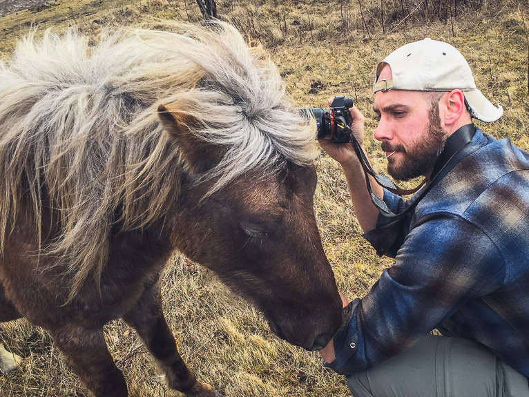
UK based photographer Jordan Banks has been photographing the world for the last 20 years. His work has seen him shoot assignments, stock photos and work with some of the biggest brands in the world. But for Jordan, it was simply the desire to earn a living whilst travelling the lured him into a career as a travel photographer. He says, “I wanted to travel and needed to make money and I was already into photography so it seemed like the perfect combination”.

Jordan’s photography journey started out in the days of film when in his own words “it was a lot easier to get clients as the market wasn’t so saturated”. His main clients were tourist boards from developing sectors and specialist travel magazines. Along with these, he had a few long term assignments before digital photography took over in Peru and Guatemala. Upon his return to the UK, editorial assignments were dying out and the stock photography market was still strong. So he decided to concentrate on stock and travel related commissions. As the stock industry started to wain he began to focus solely on travel commissions for tourist boards, brands and hotels.

Jordan also runs That Wild Idea, a landscape, travel and documentary photography workshops, tours & training company based in the UK. They include everything from 1-day workshops for beginners up to extended trips to some of the most exotic places in the world.

jordan-banks

Jordan, where are you from?

I was born in Yorkshire and raised in Saudi Arabia. I have also lived in Croatia, Mexico and a host of other places around the world.

Where do you currently live?

I currently live in beautiful Berkshire in a town called Maidenhead.

What genre of photography do you specialise in?

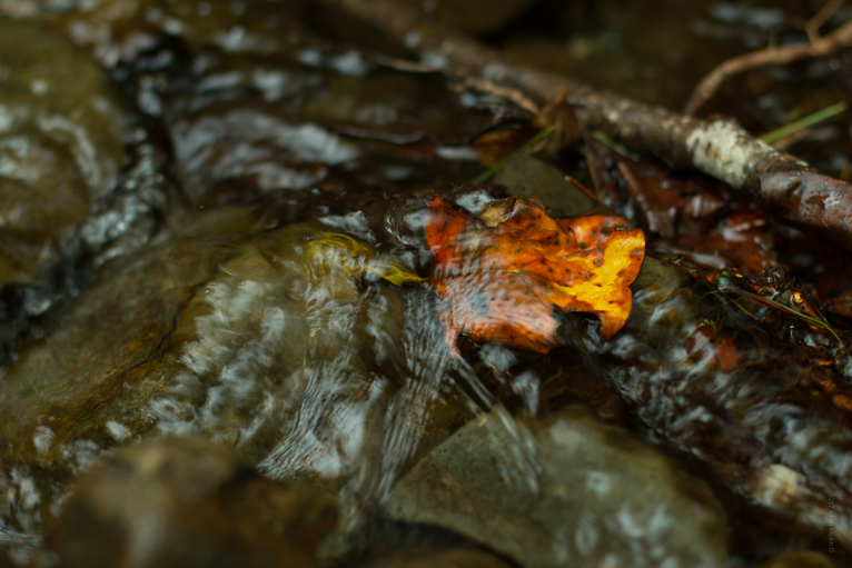
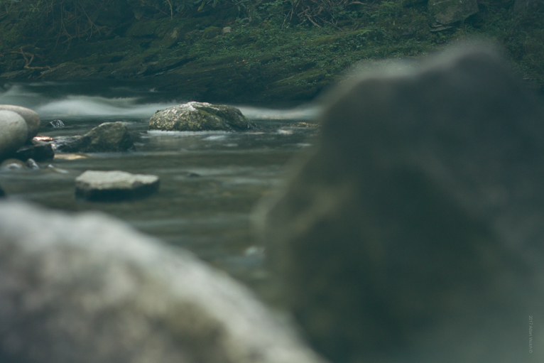
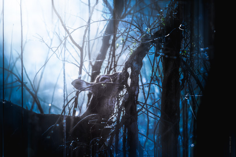
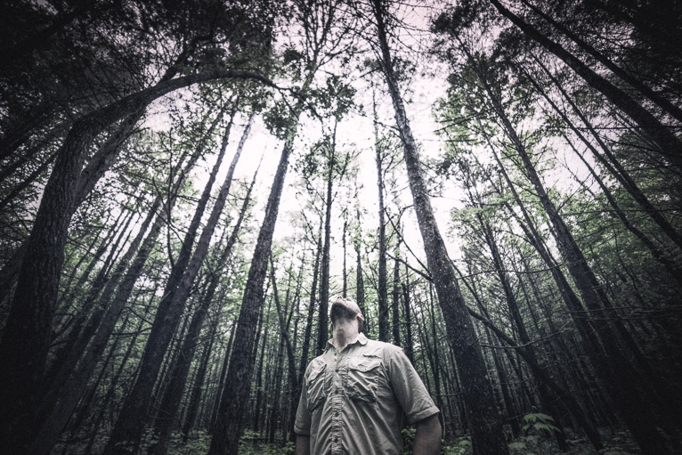
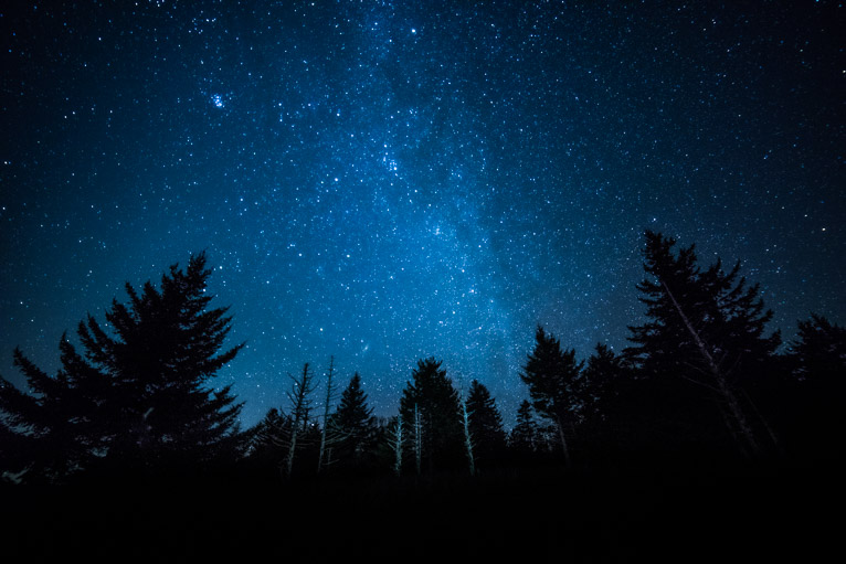
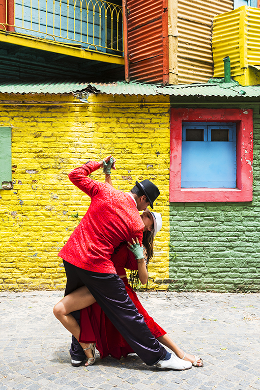
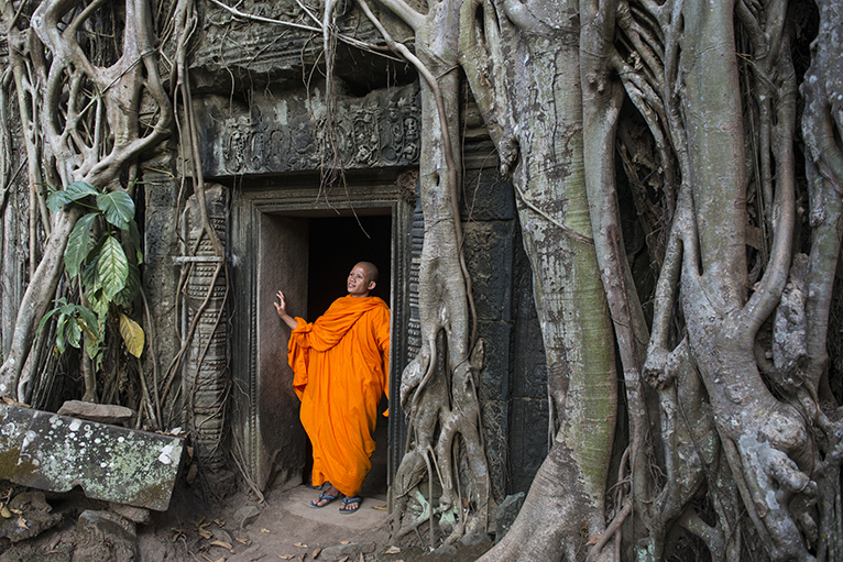
These days I mainly specialise in travel and landscape photography.

jordan-banks

Describe your style of photography?

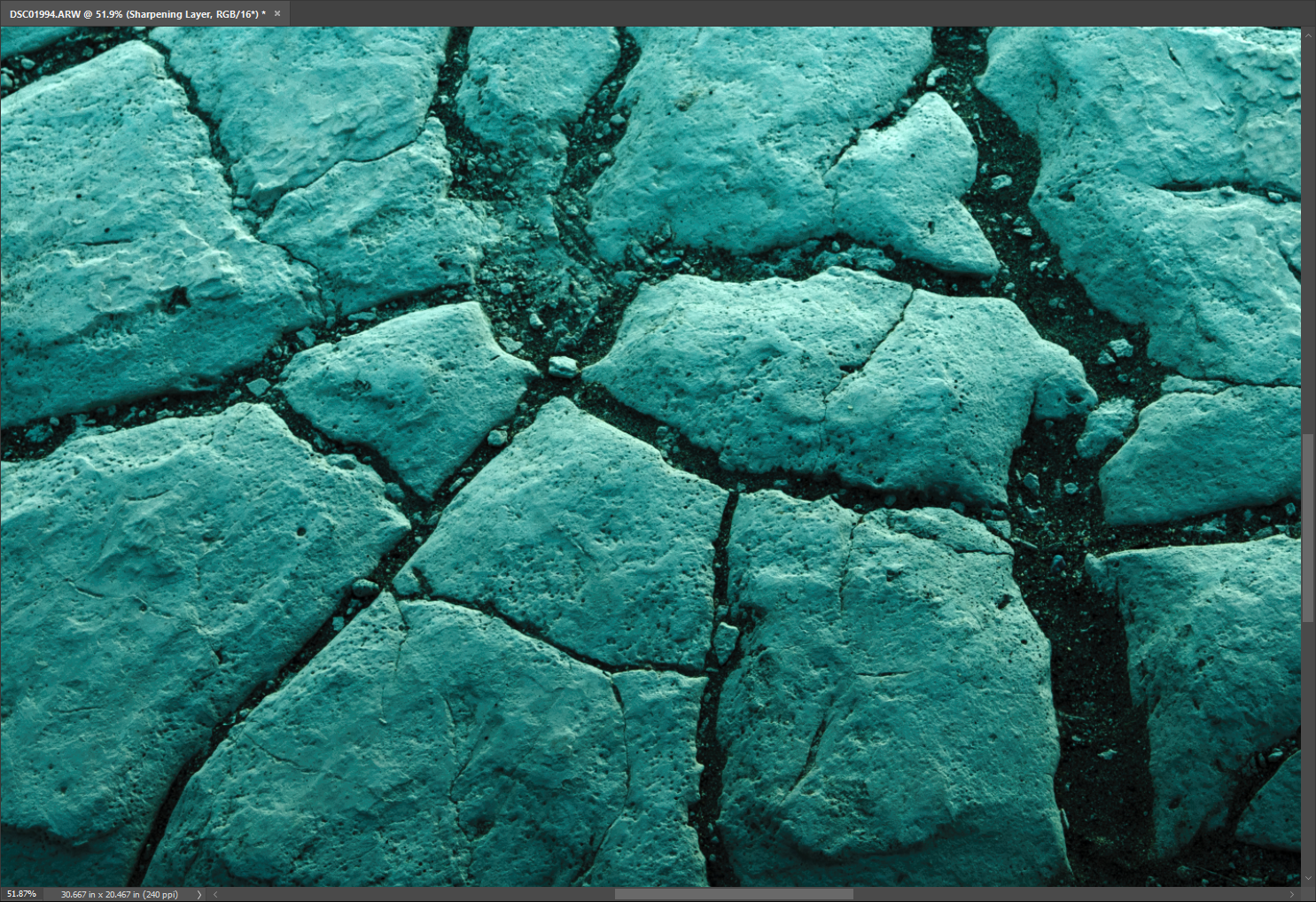
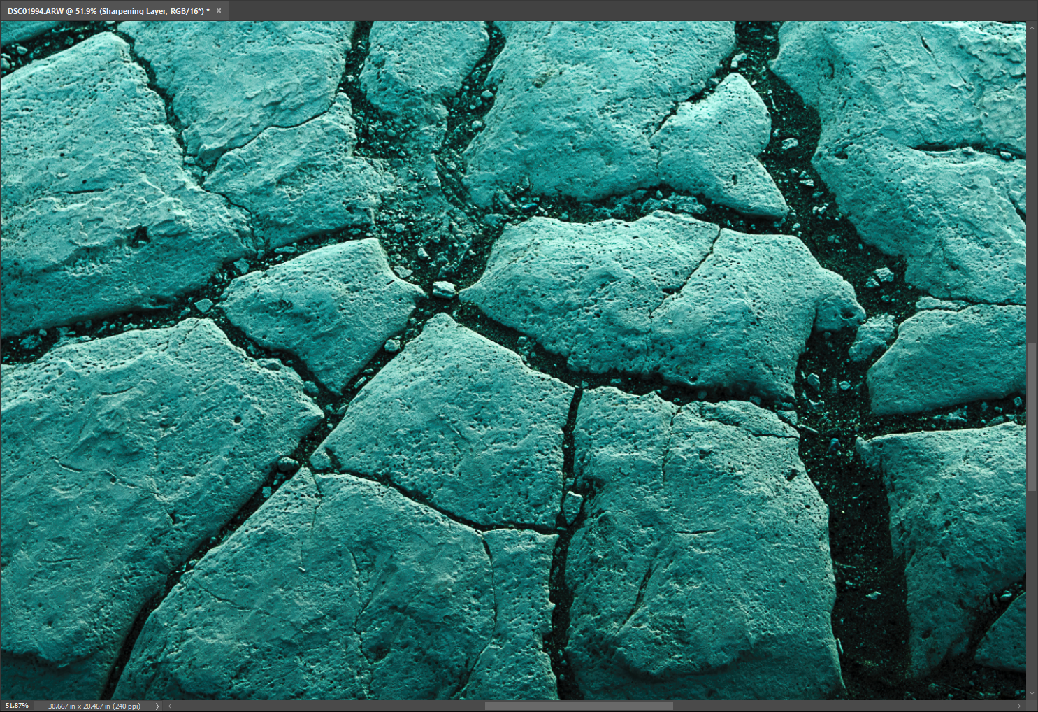
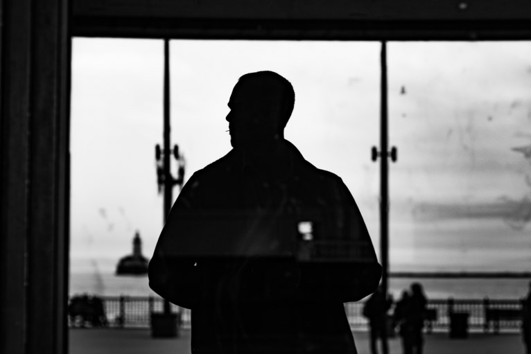
I would class myself as a documentary photographer that specialises in travel, landscapes and people.

What are you working on at the moment?

I am covering the national parks of the USA for a Cruise America RV as well as running photography tours and workshops with That Wild Idea.

What is your next project or assignment?

My next assignment is in Japan for an editorial client shooting the cherry blossom.

jordan-banks

Are there any photographers whose work/style you admire?

There are so many to chose from. I love the work of James Nachtwey, Gregory Crewdson and Thomas Hoepker. These are just a few of my favourites.

What is your favourite memory of your experiences?

Not sure I would class it as a favourite exactly but at the last Maha Kumbh Mela (2011) festival in India I was lucky enough to meet a much respected Sadhu who I bathed with, in the Ganges. As a result, I earnt his respect and he got me access to areas that no other photographer could get to. These images then got me my first cover for National Geographic.

What’s the biggest photographic challenge you overcame?

Marketing. I think it’s very hard for a creative person to also be good at the daily hustle that is required to make yourself a success in this business. It’s a big part of any business and in this day and age, it is essential.

jordan-banks

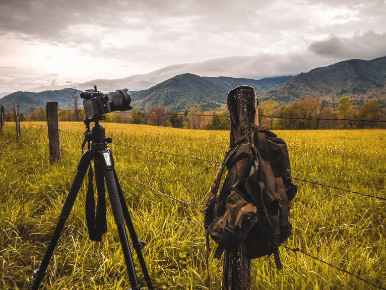
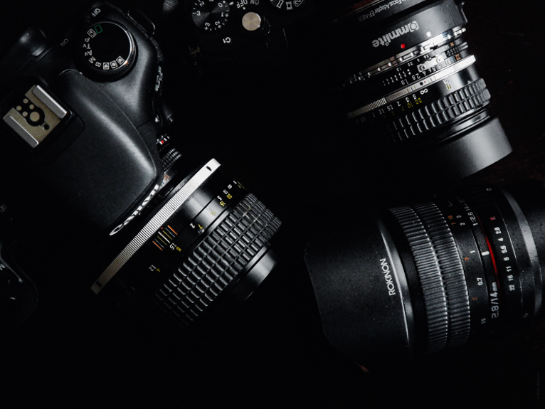
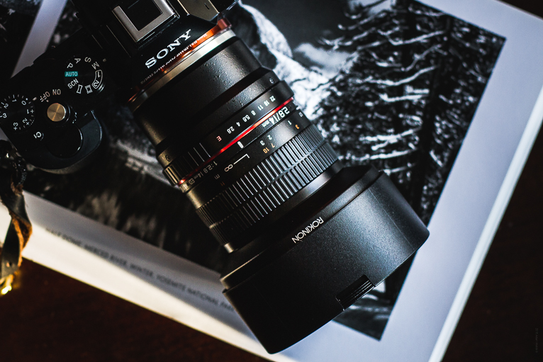
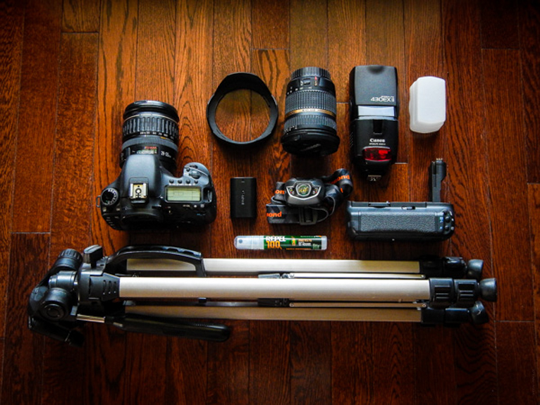
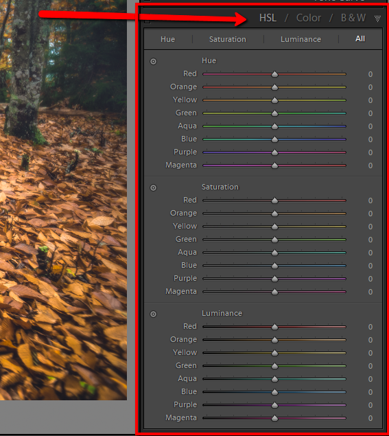
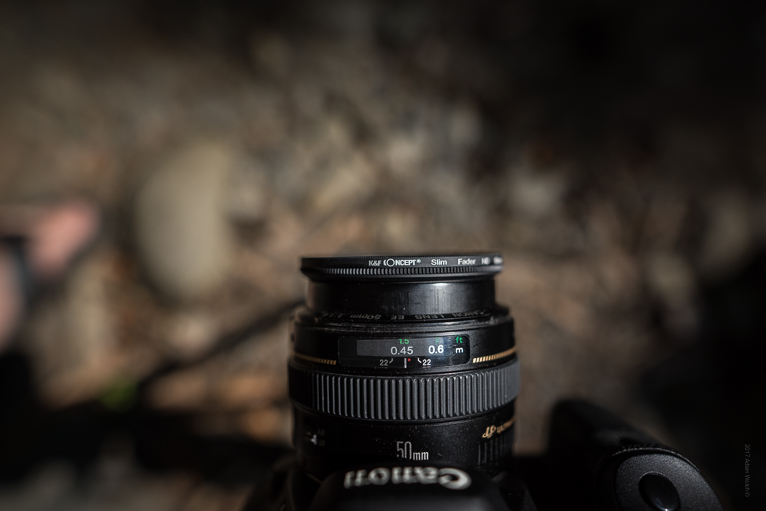
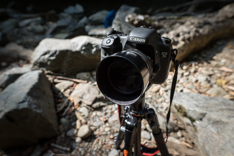
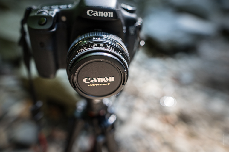
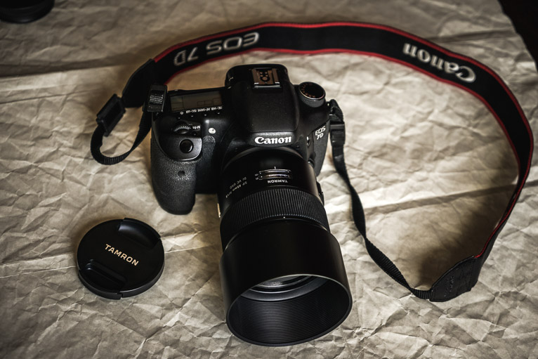
What’s in your camera bag?

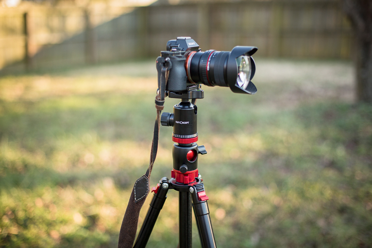
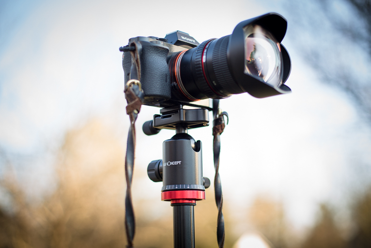
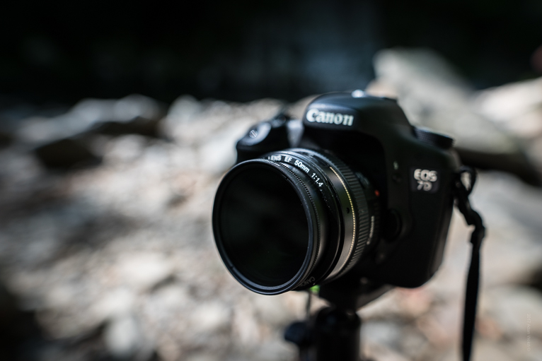
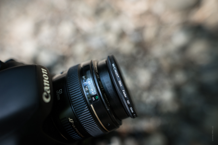
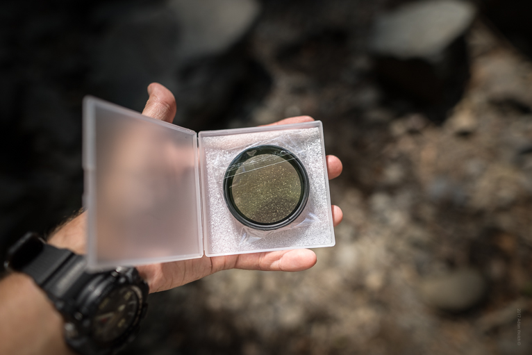
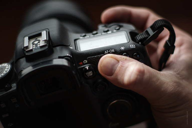
Nikon D850 and D800 as a backup body with 24-70mm 2.8, 17-35mm 2.8 and 70-400mm f4 lenses. Lee neutral density graduated filters, neutral density filters and a landscape polariser.

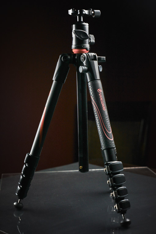
I use Manfrotto tripods with ball heads and Low Pro bags. For my drone work, I carry the Mavic Pro. I have just recently added the Nikon Z7 to my bag but haven’t had a chance to use it yet.

What photographic equipment would you never leave home without?

When I go on a shoot I would have all of this equipment with me but if I had to choose it would be the Nikon D850 and 24-70 lens.

What advice you would give anyone who is starting out?

I think the best advice I can give anyone is to practise and be willing to “hustle” for work. Also, don’t believe the hype about anything.

Any pitfalls they should avoid?

Don’t get caught up in the social media game and believing that everyone else is being successful – especially on Instagram.

Lastly… if you weren’t a photographer what would you be doing?

I am a qualified diver so I would probably be a technical diver on oil rigs or something along those lines.

To see more of Jordan’s work visit www.jordanbanksphoto.co.uk or to find out about photography workshops or tours visit www.thatwildidea.co.uk

You can follow Jordan on Instagram, Facebook or Twitter

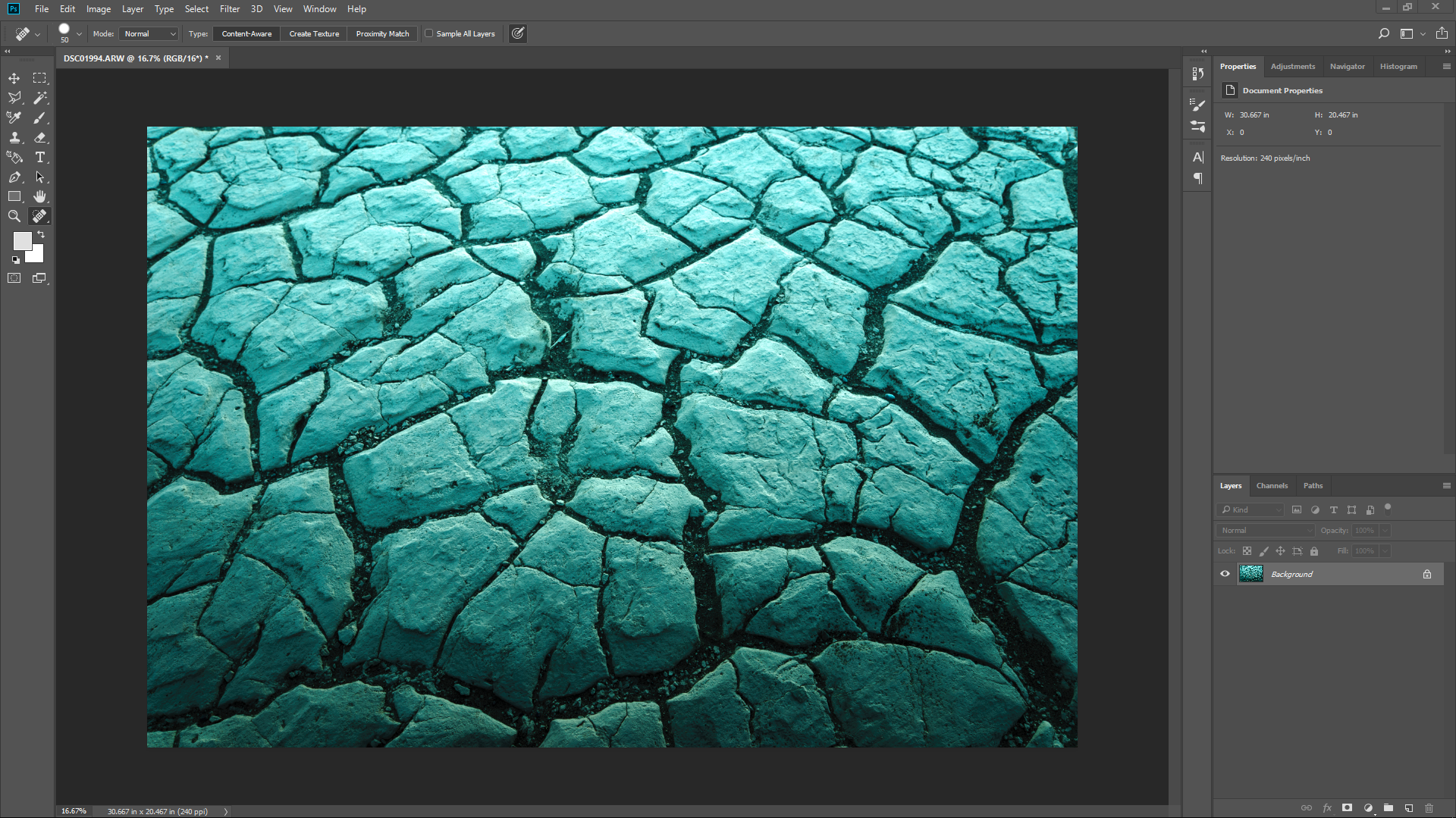
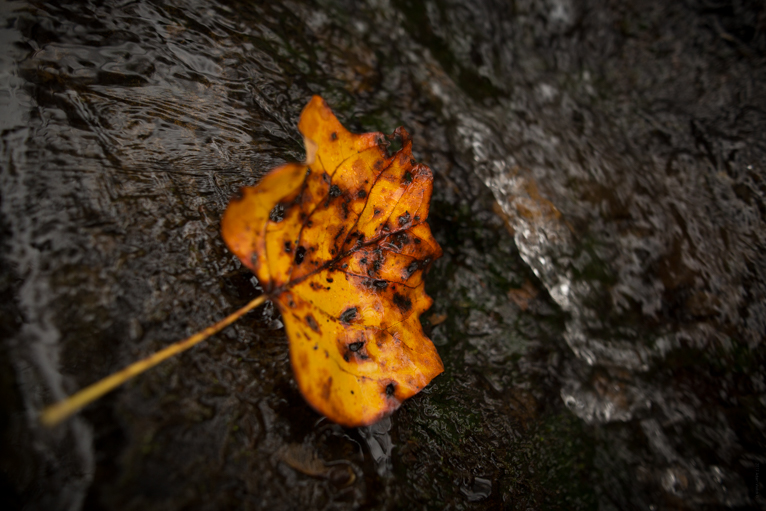
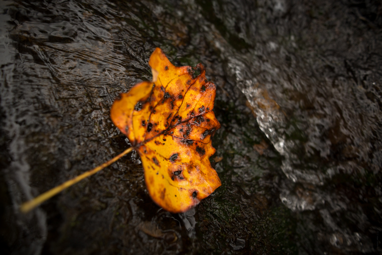
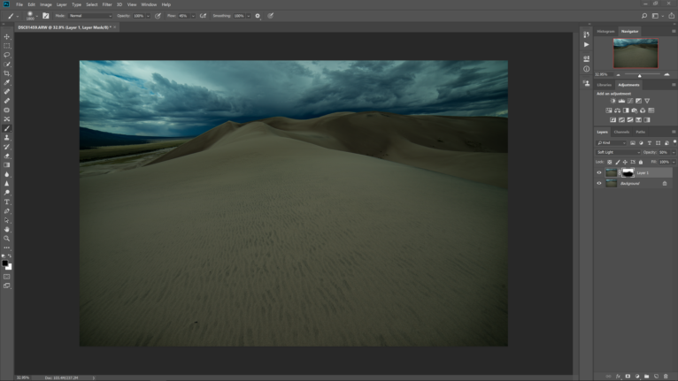
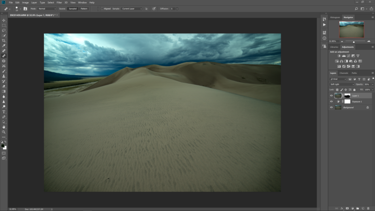
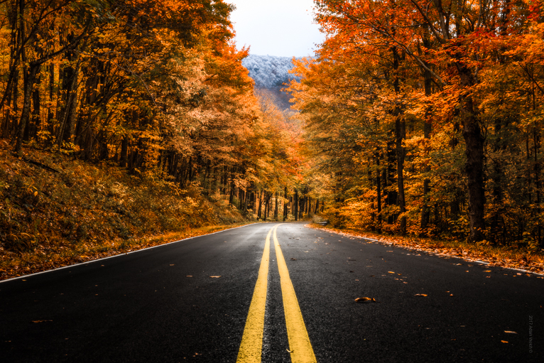
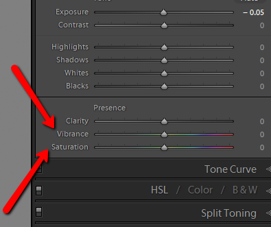
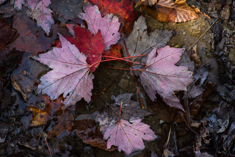
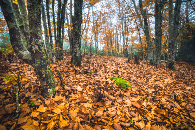
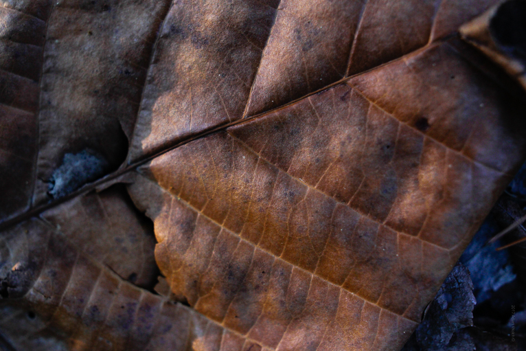
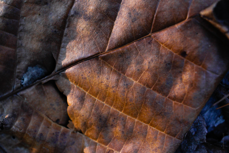
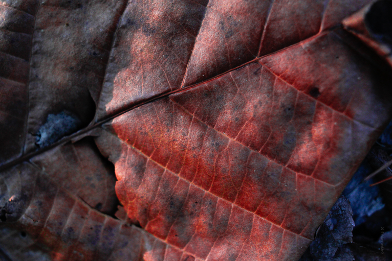
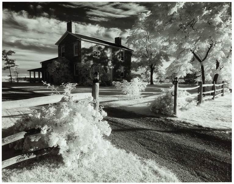
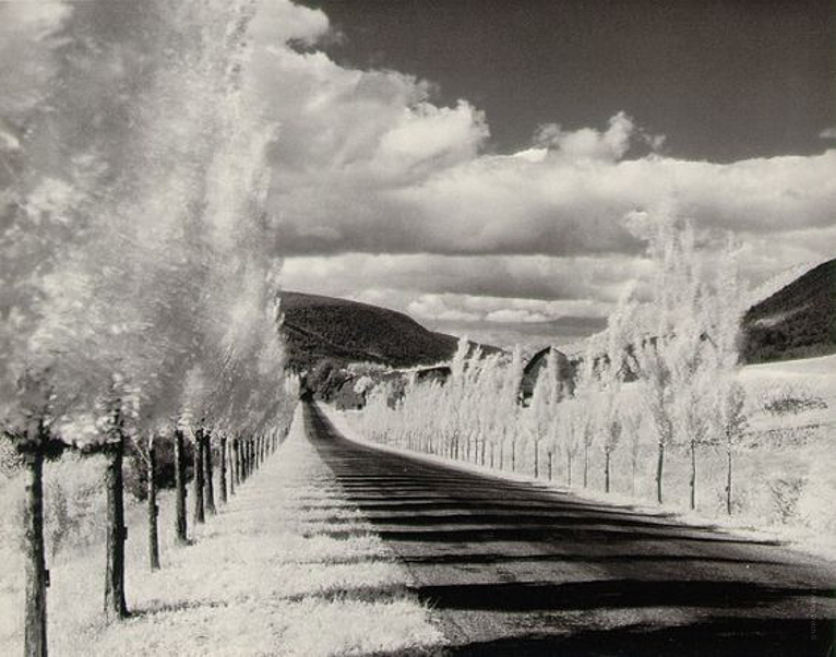
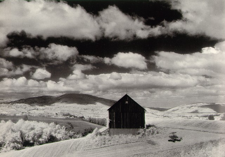
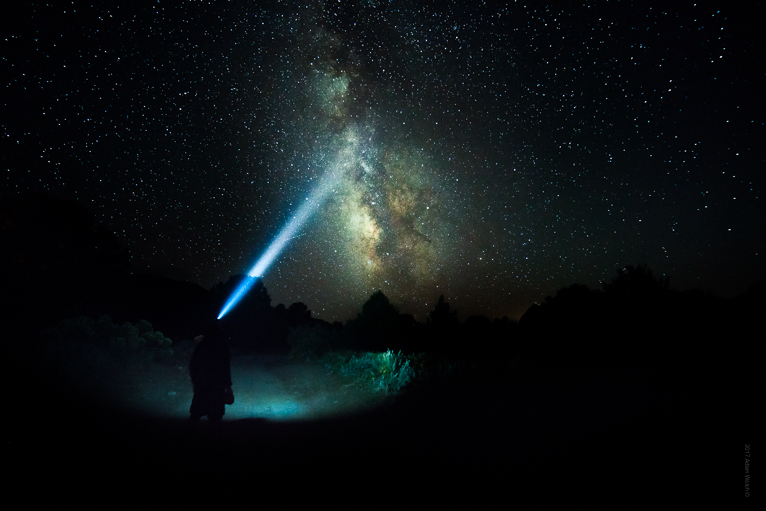
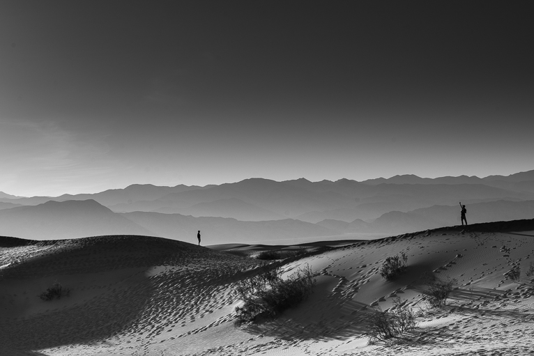
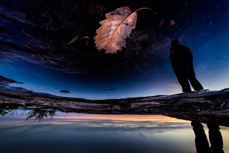
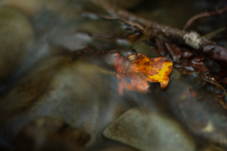
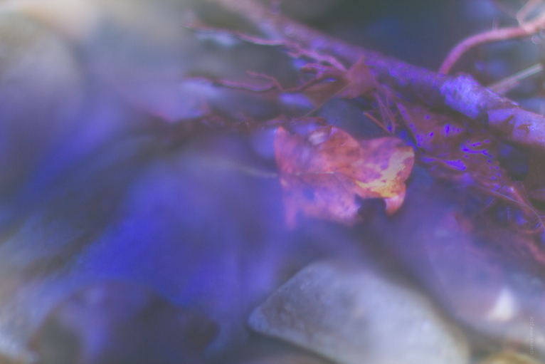
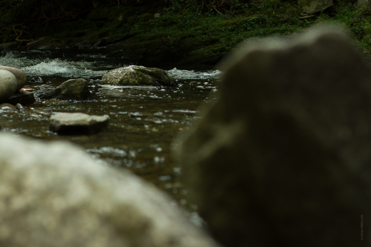
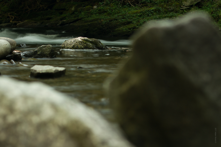
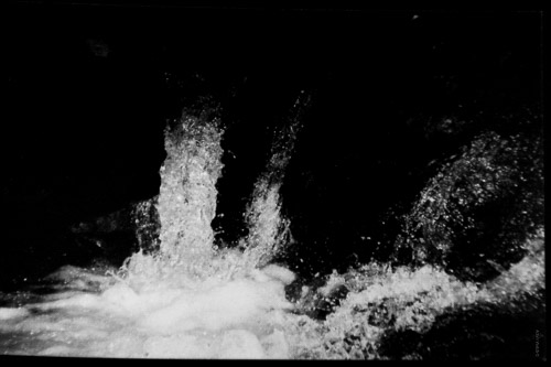
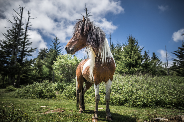
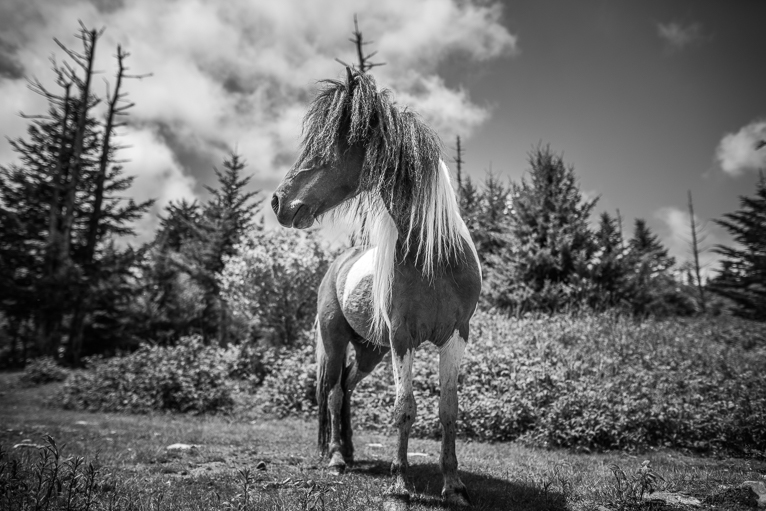
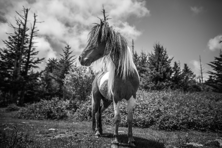
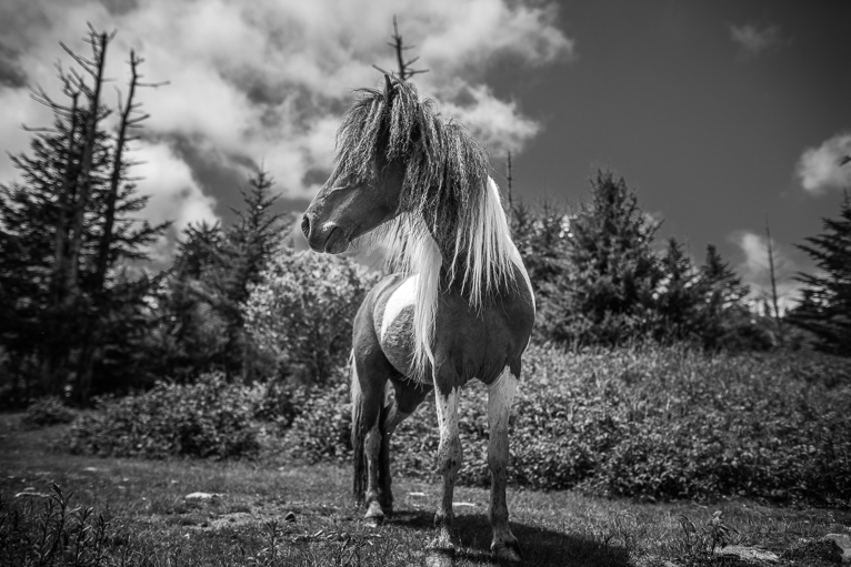
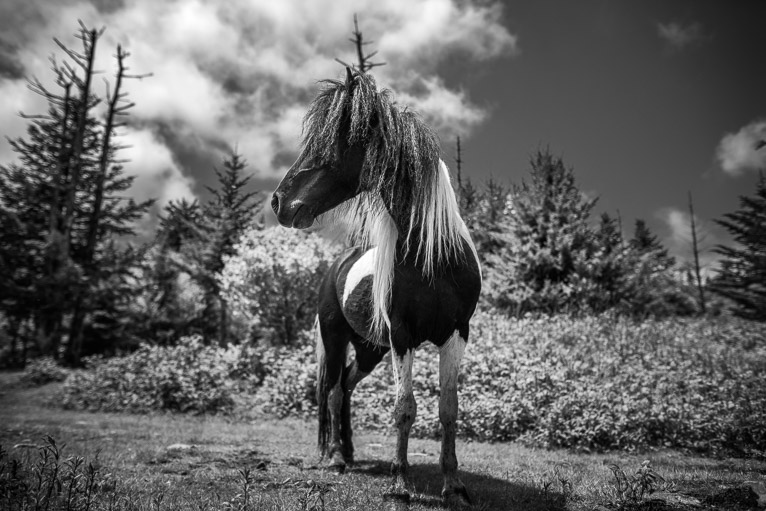
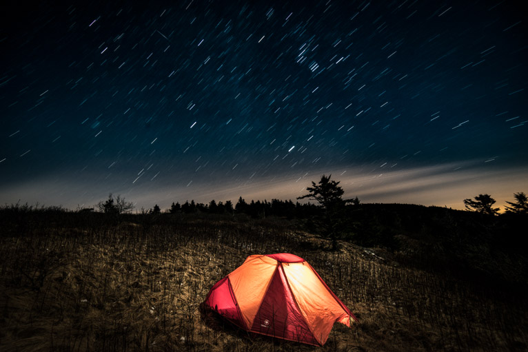
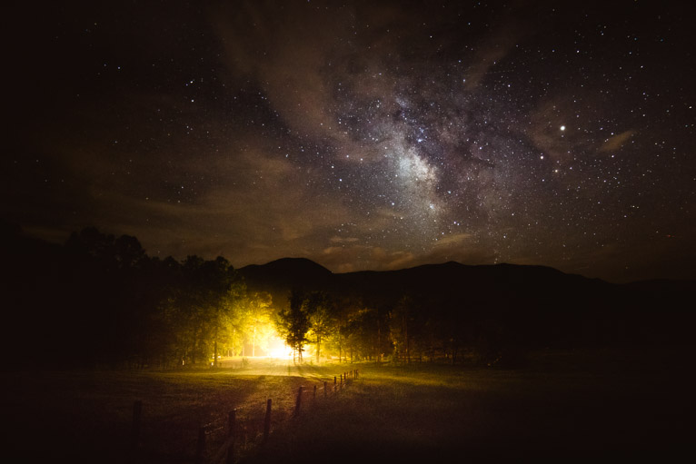
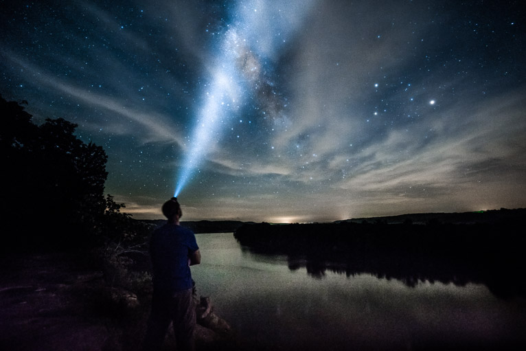
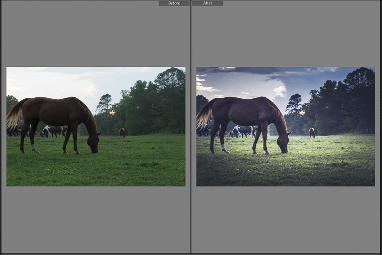
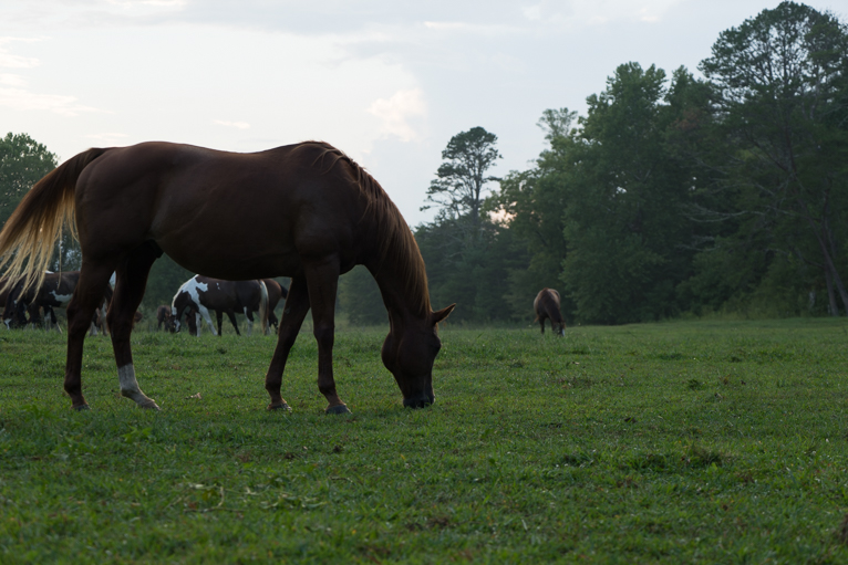
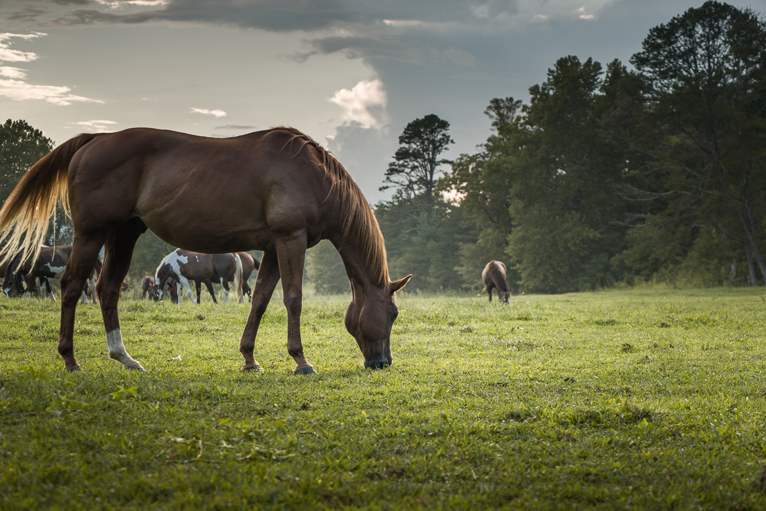
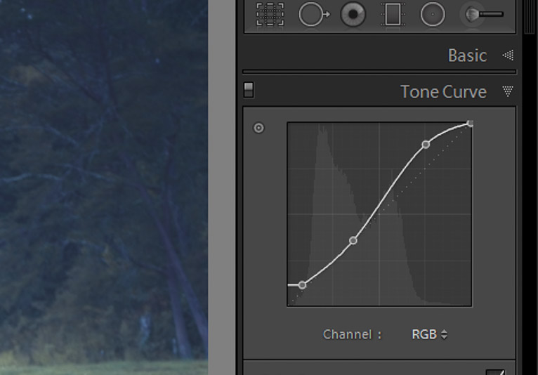
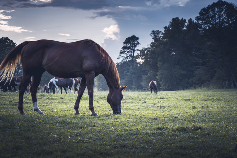
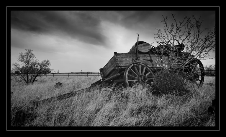
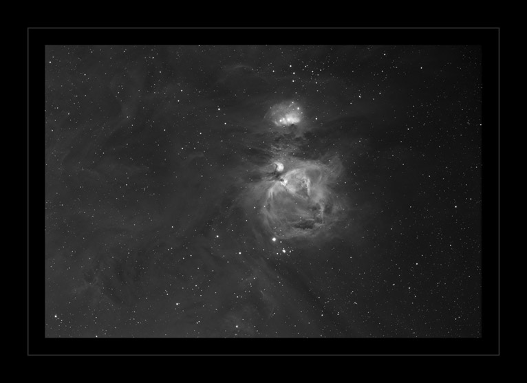
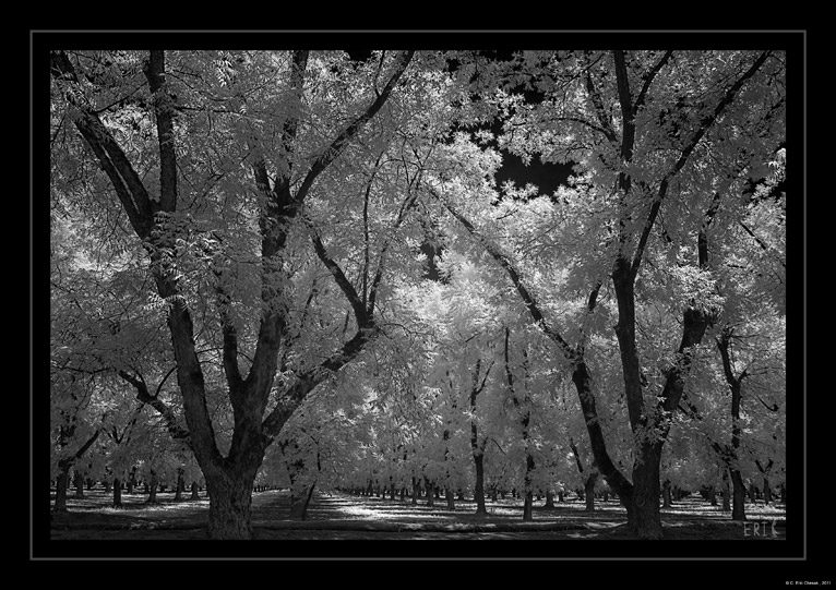
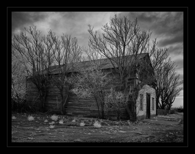
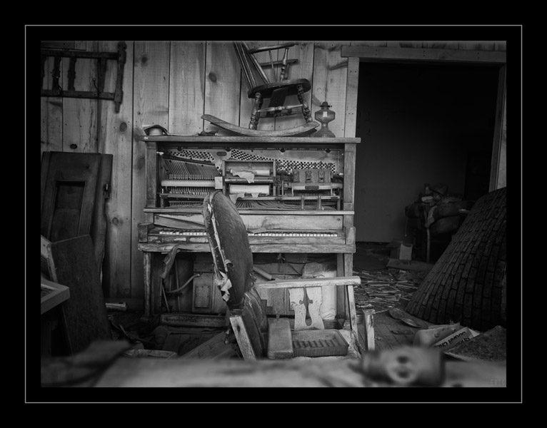
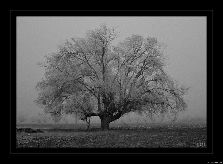
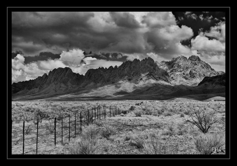
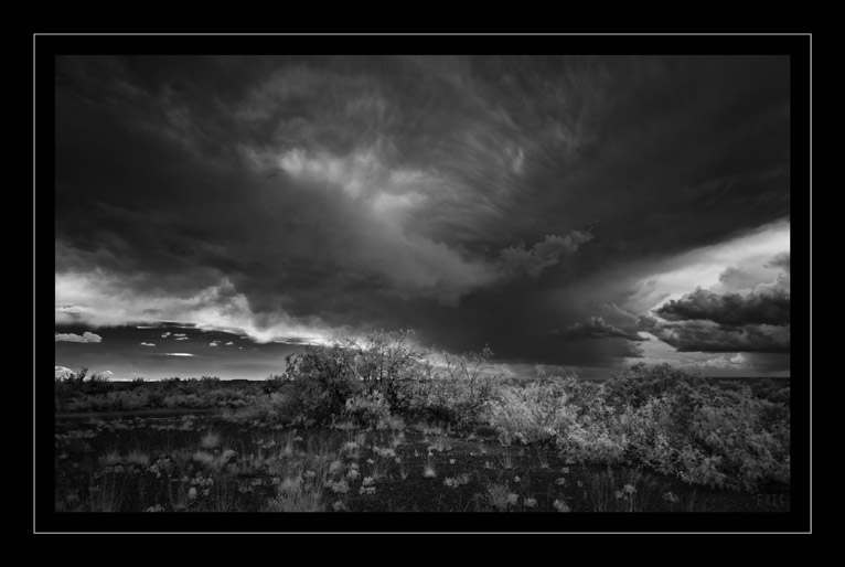
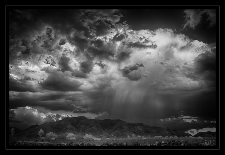
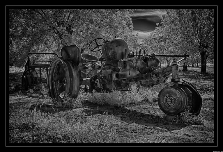
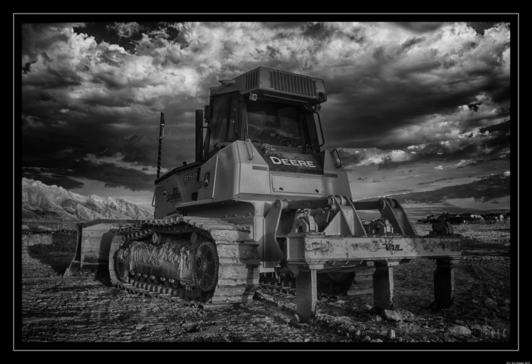
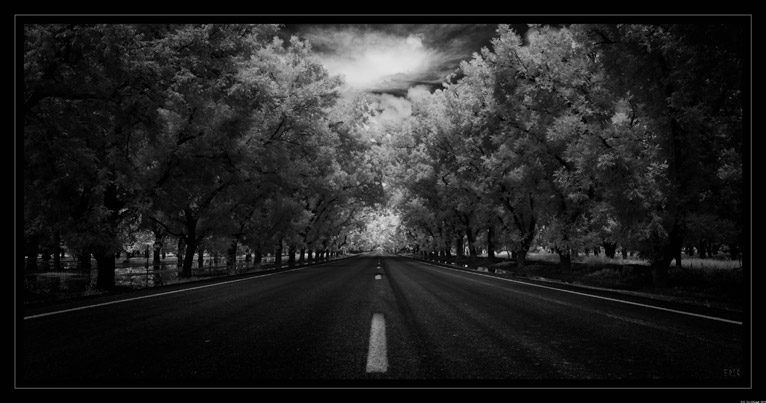
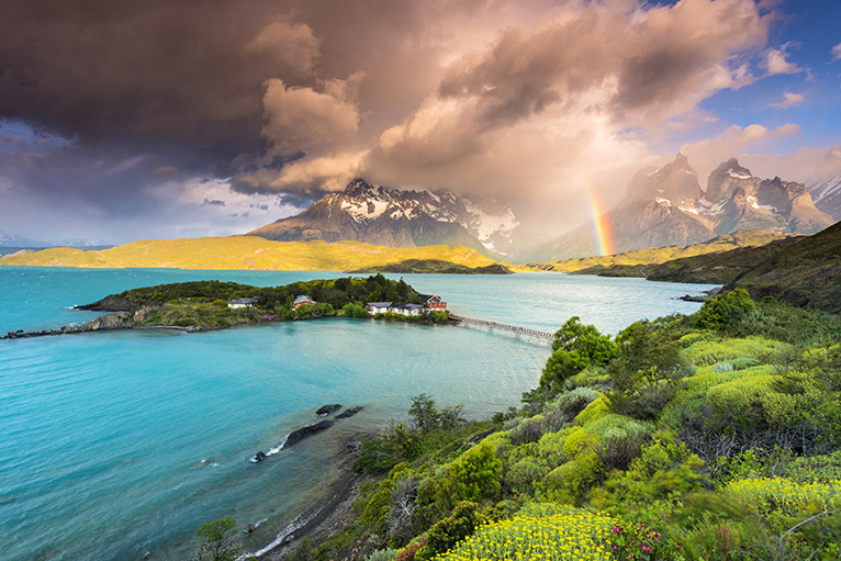
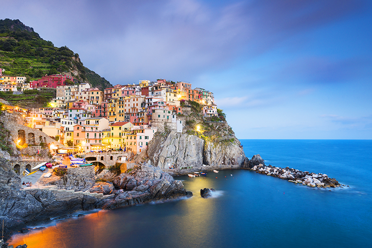
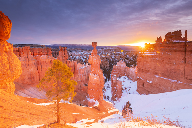
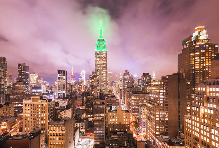
All images by Jordan Banks. All rights reserved. No usage anywhere online or in print without permission.

Interview by Kav Dadfar.

Filed Under: Inspiration Tagged With: documentary photography, interview, landscape photography, Travel photography

Bare Bones Photography: What Gear Do You Really Need?

What is the end game of photography? To make a photo, right? Not always a print but nonetheless an image of some kind is the final goal of most photographers. The tools needed to complete what can sometimes be a world altering task are simple. At their minimum, you’ll require some type of otherwise light-proof box which has a relatively small opening-i.e. a camera, and some way of recording the incident light which enters-i.e. film or digital sensor. You don’t even truly need a lens(pinhole cameras) to make a photograph but of course that helps immensely.

Now, that list of gear might sound incredibly lacking but when you think about it everything else that we throw into the mix simply expounds on or enhances those basic pieces. There are multitudes of cameras, both film and digital, with equally vast selections of lens and filters for each. Everything else aside, this article will help you if you’re just starting out on your photographic journey in that you will learn what basic photo gear you will actually need…not just what someone might want to sell you.

What You’ll Need

Below is a list of the bare-bones gear that you will need to get rolling in making photographs. Of course there are not real absolutes as you will soon find out but in order to reach the end result, a picture, you will need these few things:

The Most Important Item

The single most important tool you can possess isn’t actually a piece of gear at all but rather the correct mindset. I’m listing this first because everything else is secondary to your ability and to adapt and make the most of whatever camera or lens you have available. When I first started out in photography, eighteen year old me saved $265 and bought a 35mm SLR kit that included one 18-55mm F3.5-5.6. I shot on that one lens for about five years and managed to make some wonderful photographs despite it being a “kit” setup. After I switched to digital photography(I still shoot film as well) the progression evolved much the same way with me beginning with a kit lens and later branching out as I learned more about the craft.

Don’t think that you need incredibly expensive cameras or lenses to get started doing photowork. Granted, there are some things that even the most determined effort can’t make happen without the necessary equipment but you might be surprised how much you can get out of “low end” gear when you approach the problem with creative solutions.

A Camera

The importance of a camera can’t be overstated but that doesn’t mean that it has to be the latest and greatest piece of tech to roll off the line. In fact, if I could back in time I would have spent much less on my first digital camera and much more on the lens. More on lenses in a minute but ironically the camera you use usually plays much less of a role in the final image quality(sharpness/color/contrast) than you might think.

Whether it be film or digital, find a camera that is well built and feels good to you. If you can’t readily handle the camera before you buy then become a review hound and learn everything you can about other users experiences. Luckily, most digital cameras today are so good in terms of ISO performance and build that you won’t really go wrong in most cases. Again, if I can offer a little advice in hindsight, invest more in your glass instead of your camera.

A Lens

The lens is the eye through which your camera sees and there are apparently hundreds of different eyes out there. Like I mentioned earlier, the quality of your lens is a huge factor in the final quality of your photos. If you put a poorly made, blurry and sluggish lens on the most expensive camera in the world you will still get poorly made, blurry and sluggish photos in turn

In short, if you aren’t sure yet which genre of photography you’ll gravitate towards, what’s called a “normal” focal length lens will be the best bang for your buck. The term “normal” refers to a lens approximately equal to the field of view of the human eye which is arguable in the 30-50mm range. Most kit lenses included with cameras hover in the normal range. In any case, find the fastest lens(small F-number/large aperture) that will fit the most situations be it landscape, portraiture or street photography. Fortunately, a fast 50mm lens remains of the cheapest lenses you can currently buy.

Finishing Up

Yes, that really is all you need. While there are a few accessories like film or memory cards that you’ll require the overall basic gear to start making images really is as simply as that.

As you progress you will learn what makes you tick photographically and you can adjust your tools accordingly. Find a camera, find a lens, and start shooting.

Filed Under: Gear, Inspiration Tagged With: camera, cameras, Getting started, inspiration, landscape photography, lens, lenses, Lifepixel, Photographer, photographers, Photography, photography tips, Travel photography, tripod, Wildlife photographer

The Case for Black and White Photography

Brace yourself because here it comes…it’s another discussion about black and white photography. Don’t worry, it’s not going to be the same old “which is better?” or even worse, another “how to convert your photos to black and white” type of articles. Admittedly, I have written on both of those subjects extensively before but this time will be a little different.

Today, we’re going to strip down the idea of black and white photography and attempt to locate how this tried and true area of photography has managed to maintain its status in an arguably over saturated(pun intended) world of photographic modernism.

Monochrome and the Film Difference

It’s not secret that the black and white side of photo work is deeply rooted in film. Still, even though it makes for a solid title for this section, the term “monochrome” has been somehow mismanaged to the point where it is widely considered synonymous with black and white. This is wrong. Monochrome means “one color” or essentially an image made of shades of only one color. This color could be anything from black, yellow, red or pink. Grayscale might actually be a more appropriate term for true black and white. Even then the lines become somewhat blurred because it’s incredibly difficult to completely abolish all color toning from a black and white film negative. Take a look at these images of a 4×5 black and white negative(complete with film borders)and I’ll show you what I mean.

The first photo is a color rendition of the negative. You’ll notice that is is toned quite blue based on the development. This is due to a few factors but the point is virtually all black and white photographs aren’t exactly black and white. Rather, they are toned based on the type of film emulsion and the development techniques used. Now, look at that same piece of film after I have digitally converted it to black and white in Lightroom.

See the difference? I say all of that to say this: modern digital photography often paints a one dimensional representation of black and white images. True black and white photographs aren’t usually black and white at all or not even monochromatic. Instead, they are a carefully mapped presentation of tonal ranges. Remember this the next time you click a button to make your photo black and white. Sure, it might remove the color but the work shouldn’t stop there.

Speaking of color…

Is Color Necessary?

Yes, color is needed. Is it always needed? Absolutely not. There are times when a photo is suited to black and white and times when it is not. Well, who decides? That question is also deceptively simple to answer. It’s you, you’re the one who decides. Does the color play a role in the emotion or feeling you mean to convey or does it get in the way? These are most certainly murky waters to wade.

Today, we don’t even have to approach color or black and white photography the same way as we did thirty or even twenty years ago. Take the very site you’re reading this article on right now. LifePixel specializes in infrared converted cameras that brings the world of color into a new realm of creative exchange. Infrared cameras see light differently than our own eyes. As a result, completely familiar colors become foreign and black and white pictures take on a completely new feel. When you think about color and how it relates to photography you must understand that even the things we see are wholly subjective to our own perception.

Some Closing Thoughts…

If you haven’t been able to tell by now the purpose of this article isn’t to promote the merits of one type of photo over another. There’s plenty of room even now for both color and black and white photography. In fact, a lot of it comes down to personal taste and how we perceive the world around us. At the same time, remember to look deeper into your work and find what gives it meaning to you. Does color play a part? Does it make more of a connection in black and white? Whatever direction you choose just make sure that the original intent of the photo shines through.

Filed Under: Inspiration Tagged With: black & white, blackandwhite, bw, camera, color, inspiration, landscape photography, Lifepixel, lightroom, Photographer, photographers, Photography, photography tips, photoshop, processing, Travel photography, tutorial, Wildlife photographer

Speed Up Your Processing with Lightroom Import Presets

We all know about presets in Lightroom and all the great things they can do your post processing. Presets help make your editing easier and make achieving a constant styling much more efficient. The biggest benefit of using presets is that they speed up your post processing so you can get back to making photographs, baking muffins, building model airplanes, or whatever it is you might rather be doing instead of sitting in front of your computer screen. But did you know you can use presets jumpstart your post processing efforts before you even import your photos into Lightroom?

In this article I’m going to show you how easy it is to apply presets to your photos as they import into Lightroom. These presets aren’t even limited to develop presets…oh no. You can even add in metadata presets like copyright information and keywording along with camera and lens profile information. This is the kind of thing that the pros use and you should as well. If you find yourself editing large batches(weddings, portraits, events) of similar photos then you’re going to love using import presets in Lightroom. Let’s get started.

Applying Presets on Import

It all starts here in the Import screen of Adobe Lightroom.

If you look to the right you’ll notice an ‘Apply During Import’ panel.

This is where all the magic will happen. Click on that tab to open up your options. From here we’ll have a few choices.

Develop Presets and Camera Calibration

Applying develop and camera calibration* presets as you import your photos into Lightroom couldn’t be easier. The process is essentially the same as it is while editing your images in the Develop Module. To begin, make sure you have the photos you wish to import with the preset. Next, click the ‘Develop Settings’ drop down. This will bring up a list of all the develop presets you have currently installed in Lightroom.

From here it’s simply a matter of selecting the preset you want to apply to the images you’re importing.  After you’ve made you’ve made your choice click ‘Import’ and your photos will be brought into Lightroom with the chosen develop preset freshly applied.

**To apply camera calibration settings to your photos on import simply save them in a develop preset and then use the same steps as above.

Copyright and Metadata

Import presets aren’t limited to develop settings. We can also apply keywording and metadata(copyright information/location/creator) to each and every image we import. This helps to better organize or photos and perhaps more importantly, it allows us to protect them from unwanted use. Adding in keywords is super easy as you can type them right into the keyword box. Alternatively, you can add in keywords alongside your other metadata.

Assigning metadata to images is just as easy as applying develop presets. To start, click the ‘Metadata’ drop down arrow.

Select your preset or to add a new one click ‘New’. This launches the new metadata preset dialog box.

It’s here where you can add in virtually any information imaginable. When you’re finished be sure to name your new metadata preset. In the example above I’ve left the title as ‘Untitled Preset’ (I’m lazy) but it’s always a good idea to title any preset you make in such a way that you can immediately know what it contains. Once you’ve created the new preset it will then become selectable from the metadata preset drop down menu. After you’ve applied it, click ‘Import’. Your new metadata information will automatically be applied to each image you selected to import just as the develop settings were in the previous example.

Some Final Thoughts….

Import presets are a great way to easily jump start your processing workflow. By applying certain develop and metadata presets on import you can yourself a lot of time by having the settings you use the most already applied before any work actually begins. This becomes especially useful when you find yourself editing a large number of photos at once. Not only can import presets making editing a breeze but they can also play a big part in protecting your photos by attaching important copyright information to your photos. If you haven’t already give import presets a try and see just how much they can help you and your photography.

Filed Under: Tutorials Tagged With: camera, cameras, landscape photography, Lifepixel, lightroom, Photographer, photographers, Photographing deserts, Photography, photography tips, processing, tutorial

Smarter Sharpening with the High Pass Filter in Photoshop

What if I told you that sharpening as we know it in photography isn’t real? That might be a little hard to believe but the truth is that it is actually impossible to make an image physically sharper after it has already been made. Sharpening a photo is simply an illusion. We can make a photograph appear to be sharper. Our digital images can be made to look sharper by adjusting the contrast of the pixels around the edges of shapes within the photo and this is what we are going to talk about today. We will look at how you can easily make your photos more sharp quickly using the high pass filter in Photoshop.

What is the High Pass Filter?

The high pass filter is just a method of creating a sharpening effect to your photo based on the pixels surrounding the contrasted edges of the elements within the image. While Photoshop has some dedicated sharpening tools(unsharp mask, smart sharpening) the high pass filter is the method I tend to use the most because I love the total control it gives me over my sharpening.

Using the High Pass Filter

To get started with sharpening using the high pass filter it is highly recommended that you complete ALL of your edits prior to performing the sharpening. This means that if you’re like me and do most of your processing in Lightroom and then export to Photoshop for finishing you will leave your high pass sharpening for the very last step. When you’re ready to sharpen, open your image in Photoshop.

Next, duplicate the layer by using keyboard shortcut Ctrl+J(Cmd+J for Mac). This is the layer where the high pass filter will be applied. I’ve renamed it “High Pass Layer” so it’s easier to see.


Make sure the new high pass layer is selected and then click on the ‘Filter’ tab and then ‘Other’ and lastly select ‘High Pass’.

You’ll notice an abrupt change to your image. It will essentially go completely grey. Don’t panic because this is exactly what we want to happen. But we have a choice to make and that is what radius we set for the high pass filter.

The radius controls the amount of pixels which are targeted around the edges where the sharpening will be applied. There’s a lot of wiggle room here and it generally is based on the resolution of your camera. The higher megapixel your camera the higher you can set the radius without causing unsightly effects such as halos and glowing edges. Let me show you what I mean. Here is the high pass filter with a radius of ‘1’…

And now here it is with a radius of ‘36’.

The higher the radius the more of the image will be affected. This particular photo was made with a 36.4 megapixel camera and I find a radius of ‘4’ to be the proverbial sweet spot. Adjust your radius accordingly.

Click ‘OK’ to apply the high pass.

But wait, this still looks horrible and gray and not at all what we want.

The next step is key. We have to change the blend mode of our sharpening layer. There are multiple choices here but the ‘Overlay’ option tends to work best with virtually all images and is the blend mode I use. After the overlay blend mode is selected we have what is essentially our final sharpened image.

Have a look at the difference the high pass filter has made in terms of sharpness. Here is the unsharpened photo….

And now the freshly sharpened version….

Closing Thoughts on Sharpening with the High Pass Filter

Don’t forget, not only can the high pass filter be applied easily but like any other layer adjustment in Photoshop the opacity can be adjusted until you reach the exact level of desired sharpness. Furthermore, adding in a layer mask to the sharpening layer can allow you to take complete control over the sharpening effect and only apply it to the areas of the photo you choose.

The best bit of advice when it comes to sharpening an image using any method is that less is usually more. Always remember that an over sharpened image is often less appealing than one that is slightly soft. Enjoy using the high pass filter in Photoshop!

Filed Under: Tutorials Tagged With: adobe, landscape photography, Lifepixel, lightroom, Photographer, Photography, photography tips, photoshop, processing, tutorial

Review: K&F Concept TM2534T Professional Tripod

Often times I open my photo gear reviews by talking about what a great time it is to be a photographer. Really, I should specify that it’s an excellent time to be a buyer of photography products. There’s just simply so many choices out there these days than there was even ten years ago for the budget conscious shooter to obtain high quality tools to help them and their work. This is especially true when it comes to choosing a tripod.

Enter the K&F Concept TM2534T tripod, which is a recent entry to the budget line, but not necessarily budget quality, world of advanced hobbyist to professional grade tripods. I’ve spent the last few weeks working with the TM2534T. I’m going to show you what I liked and didn’t like about this unique tripod offering from K&F.

Out of the Box

I pleased to immediately see that the tripod comes with it’s own padded transport bag which has an included shoulder strap. The tripod itself looks great with a classy red/black color scheme and discrete logo placement, which I like. For a tripod with an extended height of 72 inches it is quite compact when folded.

It’s feels solid in hand without being overly heavy. All the paint and finishes on the tripod look very well done. The official specifications from K&F are as follows:

  • Folded height: 14.76in/37.49cm
  • Extended height: 72.24in/183.48cm
  • Weight: 3.48lbs/1.58 kg
  • Load rating: 17.64lbs/8kg

Also included is a short center column conversion attachment with bolt and a nifty storage bag for the ball head.

Build

The TM2534T is hefty and it feels quite sturdy with it’s all aluminum construction. The adjustment knobs are solid and lock the ball head in place securely.

Leg locks are the twist variety and feature rubber seals to protect against sand or dirt entering the locking mechanisms. The locks secure the four section legs securely. There are three angle options for the legs at 25, 50, and 80 degrees. These locks also lock crisply and allow for great versatility for low angle work.

One of the legs is padded and this leg is also the removable monopod. This is a great feature which essentially makes this tripod a two for one deal.

The entire center column assembly can also be attached to the convertible monopod which gives a total height of 77.56in(197cm) if you choose to carry it in this configuration.

Speaking of the center column assembly, it is somewhat puzzling. It’s not that the concept of the two piece center column isn’t a good idea, in fact, it adds an extreme amount of articulation especially for top-down product photography. The entire ball head and center column gives the user the ability to cover virtually in angle imaginable.

However, from a practicality standpoint the added stress points in the assembly don’t seem to be a worth while feature when you take into account the added weight and possibly stability issues. That being said, the ball head itself works smoothly and offers great fluid motion for panning.

The feet of the tripod legs give a great compromise between stability and variable surface suitability. They are rubber boots that terminate in a point that can dig into soft ground while protecting fragile floor finishes.

Also worth mentioning is the base plate that included with the tripod. It has rubber cushioning at the attachment surface as well as a “D” ring screw head which makes attaching/removing the plate MUCH easier especially when a coin or screwdriver isn’t readily available.

Real World Performance

This tripod worked as a tripod should during all my uses. The legs locked securely and remained so during shooting. There was no drift in the ball head during long exposures and all the movements worked smoothly. Something I want to again address is the center column assembly and just how much practical use it adds. The overall height the additional length of the column adds isn’t something most photographers of average height will likely need. Even with the added articulations it allows isn’t enough to justify the added chunkiness and bulk it adds to the total package.


In the time I’ve used this tripod it has held up to indoor and outdoor shooting well, with only a small amount of wear being noticed at the angle adjustment locks which is largely superficial.

I feel that the TM2534T should have no problem in terms of durability during heavy outdoor or studio use.

Final Opinion

For all practical purposed the TM2534T tripod from K&F Concept is solid option for those needed a well made platform for a wide range of shooting situations. It offers great looks, incredible articulation and versatility, all wrapped up in a package that’s great to look at and won’t break the bank. The overly bulky center column isn’t something that I feel is exactly worth it’s added weight and ungainliness but that is something the user will need to decide. Check it out for yourself and see if it fits your particular needs. It’s going for under $150US at Amazon* or the K&F Concept website.

*Note* The Amazon description lists the tripod(TM2534T) height incorrectly as 66in.

Filed Under: Gear Tagged With: camera, cameras, Canon, gear, gear review, K&F, landscape photography, Lifepixel, photo gear, Photographer, Photography, review, tripod, Wildlife photographer

A Quick Guide to Local Adjustment Presets in Lightroom

If you use Adobe Lightroom, I’m sure you’ve heard of develop presets and how they can jump start your creativity. But did you know that you can also create and save local adjustment presets just as easily? In this article I’m going to show you how to create and save your own local adjustment presets so you can make the most of your editing time in Lightroom.

What are Local Adjustments?

Local adjustment presets work a lot like develop presets in that they allow you to save certain combinations of edits for quick application later. The biggest difference between the two types of presets is that normal development presets generally work globally(affects the entire image) whereas local presets affect only the portions of the image you choose. These edits are applied either with either the local adjustment brush, graduated filter, radial filter, or a combination of the three. The great thing about local adjustment presets is that each preset can be applied by any of the local adjustment tools in Lightroom.

Here’s an example using the picture above. This is how it looked originally.

Let’s say we want to only lighten the leaf without disturbing the rest of the photo. Not only that, but the area could also use a little bit of a boost in clarity and sharpening. We can use the local adjustment brush and combine all this edits into one and apply them at the same time.

Now, that looks better.

This is an edit you might have use for in the future since adding a little exposure and clarity can might an image really pop. Instead of taking the time to go back in and adjust the sliders each and every time why not save this adjust as a preset? Saving local adjustments is even easier than saving a regular development preset because there’s no new folder to make and name, no check boxes to tick or untick. Everything is already set up for you and all you’ll need to do is make your adjustments and then name your new preset.

Saving the Preset

First, click the ‘custom’ drop down at the top of the local adjustments panel….

Find the bottom of the ‘Save current settings as new preset’ option at the bottom of the drop down menu and click on that.

Now it’s time to name your awesome new local adjustment preset. Just as with any other type of preset it’s a good idea to come up with a descriptive name that immediately tells you what the preset does. For this preset I’ve chosen ‘+Exp Clarity Sharp’.

And that’s it! Your new preset will appear as a freshly made preset name in the local adjustment presets dropdown menu.

Final Thoughts on Local Adjustment Presets…

Like any other preset in Lightroom, local adjustment presets save you time by eliminating the need to change multiple adjustment sliders each and every time you want to use a particular edit. Making a local adjustment preset is one of the easiest tricks you can use to speed up your post processing. Remember, every preset you make can be used with all the local adjustment tools in Lightroom. That means the adjustment preset we made above can also be applied using the radial and graduated filter as well. Local adjustment presets are great. Use this guide and find out for yourself!

Filed Under: Tutorials Tagged With: adobe, camera, cameras, Getting started, landscape photography, Lifepixel, lightroom, lightroom classic cc, Photography, photography tips, processing, tutorial

How to Use the Clarity Slider in Adobe Lightroom Classic CC

If you reach way back to Adobe’s Lightroom 1.1 build you will find the clarity slider. After its introduction wayyyy back then the clarity slider has been a favorite weapon of most landscape and even portrait photographers. This slider is a personal favorite of mine just as it is the professed secret love of many Lightroom users. It adds a little “punch” to your photographs and can work wonders with portraits, landscapes, and virtually any other image that appears to be a little visually flat.  And now in Lightroom Classic CC, the clarity slider is still going strong.

But what does the clarity slider do specifically? In this article we’re going to talk about how the clarity slider works and how you can use it more effectively to bring out the full potential of your images.

How Does the Clarity Slider Work?

When we adjust clarity, we are essentially adjusting the contrast of our photo.The difference is that instead of the entire tonal range being adjusted, the clarity slider targets the midtones only. This give the overall illusion of the image become more clear. Look at this histogram of the image above before the clarity was increased by+60…

Now, look at that same histogram after the boost in clarity

The blacks and highlights haven’t been affected very much but the midtones certainly have. And that’s the great thing about the clarity slider: it is far less likely to wash out detail in the areas which are already bright or already dark. This makes it a great tool when working with textures(insert link to texture article) with scenes which need a good bit more contrast without going into overkill in the shadows and highlights. Speaking of overkill…or rather over’clear’(haha)…the next section will talk about some things to watch out for when using the clarity slider.

How NOT to Apply Clarity

Granted, every photo is going to be different, so there are no real “rules” when it comes to using the clarity slider(or anything else in photography) to adjust your images. That being said, a general guideline that will help you immensely is the good ol’ fashioned “less is more” approach. While there clarity slider works great to add some extra power in your photograph it can also cause some unsightly side effects if abused.

Here’s a photo where the clarity has been cranked to +100. Notice anything?

On top of the entire scene now looking a little unnatural, when we zoom in we can see the real problem with using the clarity slider too liberally.

Zoomed to 3:1

Those dreaded halos. I hate them, and honestly, you probably should as well. They are caused by the pixels around high contrast areas becoming too separated from the pixels surrounding them which adds up to the bright banding around those areas. To remedy this, try adjusting clarity locally using the radial or graduated filter or the adjustment brush. If all else falls, simply back off the clarity a bit. In almost all cases less contrast will be more preferable than that dastardly halo effect.While Adobe has drastically refined the performance of the clarity slider in recent years the over clearing a photo can still be problematic. Also note the halo effect is worsened when coupling too much clarity along with too much sharpening as happened with the image above..

Final thoughts on Clarity

The clarity slider is a great tool. It helps us to increase contrast in the midtone luminosity range while avoiding blown out highlights and burnt out shadows. I use it to some extent in virtually every photograph I process. That being said, as awesome as the clarity slider can be, it can also work against you if you push it too far. Always remember to keep things in the scope of the reality you wish to present to the viewer and don’t over clarify your images. On the flip side of that you should also not be afraid to actually lessen the clarity in some of your images. It can actually smooth out skin tones and impart a nice soft contrast to a landscape. With a little bit of knowledge the clarity slider can open up entirely new post processing opportunities that you might not have considered!

Filed Under: Tutorials Tagged With: clarity, clarity slider, landscape photography, Lifepixel, lightroom, lightroom classic cc, mountain photography, Photographer, Photography, photography tips, post processing, processing, Travel photography, tutorial, Wildlife photographer

How to Add Instant Contrast in Photoshop

Adobe Photoshop is a beautiful thing. It allows an incredibly wide range of artists, designers, creatives, and especially us photographers to inject a little bit of creative juice into their work and see it come to life. And while Photoshop can be enormously complex there are so many simple, straightforward edits you can use to instantly transform your photographs.

One of these goes back to the basics of photo editing: exposure and contrast. There is a great way to quickly add contrast to your images by using PS blend modes, more specifically the “soft light” blend mode. You may be thinking “But why not just add contrast with the contrast adjustment?” Well, you can for sure…but it’s not exactly the same. And why not expand your photographic editing horizons to try something new?

Soft Light Blend Mode

The soft light blend mode is one of seven PS blends that make up the “contrast” group. These modes all use varying mathematical wizardry to accomplish a similar effect which is to make darks darker and lights lighter in relation to one another. While that is an incredible over-simplification it’s not entirely inaccurate.

The soft light blend mode bases itself on whether pixels are lighter or darker than 50% gray. If a pixel in your image is darker than 50% gray it will be darkened further. If a pixel is whiter than 50% gray it will be lightened. The result? More contrast. Not only that, but this contrast is wholly dependent on image and it’s tonal makeup.

Adding Contrast with Soft Light Blend Mode

First, duplicate your base photo layer by using the keyboard shortcut ‘Ctrl+J’(Cmd+J for Mac).

Next, select the soft light blend mode from the blend mode drop down list. Alternatively, use the keyboard shortcut ‘Ctrl+F’ to do the same thing a little faster. You will instantly notice a fairly drastic change to your photo. Namely the increased amount of contrast.

To really control the amount of contrast I highly recommend adjusting your layer opacity until you reach the overall level of contrast for your particular image. In the case of soft light the opacity and fill accomplish the same outcome so it is your choice which to use.

The real fun begins when you decide to add a layer mask. Don’t worry! Masks aren’t something to be afraid of(in most cases) and they allow you to completely take charge of how an edit is applied in PS. You’re about to see how easy it is right now.

Adding a Layer Mask

To add a layer mask to your soft light blend layer simply click on the “add a mask” icon at the bottom of the layer panel.

Guess what? You’ve just added a layer mask! It’s that simple. Now, you’re free to paint in or out the soft light contrast to virtually any degree and location you choose. Just adjust the size and opacity of your brush to achieve the desired effect.

Add in some a quick increase in exposure and we’re left with the finished product. All done within a matter of minutes.

Some Final Thoughts….

One of the fun and interesting aspects of post processing is discovering all the different methods of achieving certain editing effects. Adding contrast to a photograph is one of the most basic edits a photographer can make to instantly add power to a photo. There are many ways to do this and you’ve just learned one. Try using the soft light blend mode technique to add contrast in a smarter, more controlled way. The soft light blend mode in PS makes it easy to quickly and effectively add punch to your images and it is something I use to some extent on virtually every photograph I process.


Filed Under: Tutorials Tagged With: camera, cameras, Getting started, landscape photography, Lifepixel, lightroom, mountain photography, Photographer, Photography, photography tips, photoshop, processing, Travel photography, Wildlife photographer

Making Fall Colors Pop with Adobe Lightroom

Here in the Northern hemisphere Autumn is in full swing. The colors of the leaves are changing and giving their last big show as we head into winter. The frosty mornings and golden hues offer outstanding opportunities for photographers to capture these beautiful Fall colors before they’re gone until next year.

In this article we’re going to talk about how you can make those bright Fall colors really pop in Adobe Lightroom! It doesn’t take much to make your images of the season standout. Let’s get started!

Bringing Out the Color

The main focus of majority of Autumnal photos is of course color. Bright Earth-tones and muted flavors of of brown and gray intermingle together to produce an incredible palate of gold. Here’s how to make all those beautiful tones come to the forefront in your image. We’ll begin with the Vibrance and Saturation sliders in the basic Development Panel of Lightroom.

Vibrance

The vibrance slider brings out the mid tone saturation of colors. It comes in handy when you want only the less saturated colors in the photo to be amplified. Look at this image before the vibrance was adjusted.

And now after

With +50 Vibrance

The key use of increasing the vibrancy of a photo is to maintain a natural and pleasing look to the colors that need to be intensified.

Saturation

Saturation and vibrance are closely related but at the same time affect different aspects of your image. Whereas vibrance boosts the colors which are less saturated, the saturation slider increases the color saturation of all the colors. This means that if a color is already well saturated it will become even more so when this slider is used. Here we have an image with color already well saturated.

If we boost the overall saturation, it leaves the image looking overly saturated with the color appearing fake and unnatural.

With +40 Saturation

The saturation is increased to the point of looking gaudy. So, be very careful when applying the saturation slider to the entire image.

The HSL Panel

If you want to get a little more advanced when edited your Fall photos then look no further than the HSL panel in Lightroom. It’s here where you can take full control of color.

The aptly named HSL panel adjusts the hue, saturation, and luminance of color. This is the master control station for color within your photo. Use this to not only affect the brightness and saturation of specific colors but also their hue. Here’s a photo before any HSL adjustments.

And now with the orange luminance and saturation increased…

The hue adjustments make colors appear more or less true to their original tone. For example, blue can appear more green or more purple; oranges more yellow or more red. Here we’ve changed the oranges to a lighter, more yellow hue.

While here, to a darker red hue.

Some Final Thoughts on Fall Photos…

Fall is a wonderful time of year for photography. If you’re seeking to make your images of Autumn to stand out from the crowd, try these simple tips that will help all those beautiful colors of the season shine through! Don’t be afraid to adjust the hues of the colors until they reflect how you felt about the scene. Likewise, don’t hesitate to actually DECREASE the saturation and vibrance of the colors in order to reach the final look that you want.

Filed Under: Tutorials Tagged With: camera, cameras, landscape photography, Lifepixel, lightroom, mountain photography, Photography, photography tips, photoshop, processing, Travel photography

Working with Texture in Photography

As a word, “texture” carries quite a few meanings. For photographers, texture is a concept that is often difficult to explain. It’s almost as if it has to be shown instead of merely described. Texture is simply the pronounced visualization of the surface feel of an object which is photographed. Now, you may be thinking “well, everything has texture…”. While this is true, the way in which that tactile nature of whatever you’re shooting can play a huge role in the overall mood and expressiveness your final image. Understanding texture in photography means learning how to recognize the importance(or lack of) the portrayal of the physical surface of a substance will impact the viewer.

I know I know…how boring can you get, right? Just hang in there and read on. You might be surprised just how much incorporating and focusing on textures can strike increased interest in a photo. We’ll talk about how the directional properties of light morph the textural feel of a scene and how you can put that to work for you. Let’s get started!

Communicating Texture

How do you transmit a physical sense into a two dimensional photograph? It all comes down to the type of thing you happen to be shooting and how you position your focus and your camera. Generally, there must be some degree of angle involved between the subject and the camera. This essentially places the surface of whatever your shooting into profile and thereby better displays whatever the irregularities might be into sharper relief. Here, have a look at this. It was shot with the camera directly overhead and perpendicular to the cloth.

This is a rather mundane example but it does a good job at displaying the relationship between camera angle and texture. Notice how with the straight on camera position all the texture within the cloth is muted and visually flat. This next image is made after moving the camera to approximately a 45 degree angle to the subject.

This places all the nonuniform attributes of the cloth at an angle and makes its texture more pronounced. If you want to amplify the texture of a scene, try different shooting positions and avoid photographing the subject from 90 degree angles.

The Effects of Light

Extremely closely related to camera position is the directionality of the light falling on your subject. Shadows are key when showcasing texture. The textures of an image will be enhanced by the addition of contrast which is, afterall, the differences between lights and darks in a photo. The direction of the light will determine how and by how much the contrast of the texture will be determined. The more contrast, the more obvious the texture will become. If you’re ready for another effective yet basic example, you’re in luck. These next two images are of the same floor tile. The first was shot under very diffused natural light from above.

The next photo was shot with the window blinds open which produced a much harsher directional light. And the camera angle was lowered to enhance the lighting effect even more.

All the textures within the tile are brought out due to the shadows produced by the side lighting and camera angle. These were not at all evident with the previous lighting conditions.

Using Depth of Field

Photographs that center around textural elements work well when shot in abstraction and/or with shallow depth of field. The small plane of focus adds contrast to the texture by framing it with foreground and background blur. Here’s an image shot using an aperture of F8.

The entire subject is in focus. And while the texture is evident it’s not readily defined. Next have the the same little pine cone but this time shot at a much wider aperture of F2.8.

The softening around the edges help to focus the attention on the textures of the cone and seperate it from the rest of the frame. While not a rule(what are those?) wider apertures generally work well to isolate and draw focus to the evident textures present in a subject.

Final Thoughts on Texture…

Let’s face it, talking about texture in photography isn’t the most exciting thing in the world. Still, ignoring it completely means ignoring one of the most powerful techniques for adding interest to your photographs. Texture is all around us and can be made the centerpiece of your images if you understand how to put it at the forefront. Using textures effectively will open up so many more shooting opportunities that you might not have considered before now.

Filed Under: Tutorials Tagged With: camera, cameras, landscape photography, Lifepixel, perspective, Photographer, photographers, Photographing deserts, Photography, photography tips, texture

The Great Minor White and Infrared Photography

Born in 1908, Minor White was something different in terms of how and why he photographed. He incorporated as much of his own beliefs and philosophies into his work as he did photographic technique. His work is a mix of his mentality and the emotion he felt towards a scene or subject. He injected a part of himself into all the photographs he made. Bestowed by him are such words as “The photographer projects himself into everything he sees, identifying himself with everything in order to know it and to feel it better.” and one of my personal favorite quotes about us photographer’s mentality “…all photographs are self-portraits”.

Minor White-By Imogene Cunningham

It was with the existential mindset that White approached his photographs and perhaps there was none of his work as idealistically surreal as his adventures into the world of infrared. Not only was he a prolific photographer in the artistic and technical sense but he was one of the early practitioners of infrared photography who brought it’s incredible appeal to the masses. The IR images he made, just like his other works, projected a world blended with both the physical landscape and his own personal creativity.

By Minor White, 1958

By Minor White, 1955

By Minor White, 1955

Minor White and Infrared

How did Minor White make his IR photographs? With magic…. Well no, not exactly magic, but it certainly looked that way. Minor White used black and white infrared film, usually large format 4×5, to capture his dreamlike scenes. The infrared or more accurately “near-infrared” light spectrum falls around the 700-1200nm range and infrared film is manufactured to be sensitive to these wavelengths. However, seeing as IR film is also still sensitive to other wavelengths of light, IR filters must also be attached to the camera lens in order to filter out other types of unwanted light that falls in the more visible spectral range. It’s this filtration of the normally visible light and the inclusion of the near IR spectrum which we generally don’t see which gives IR photography their ghost-like quality. Development of the IR is surprising the same as many other conventional black and white films and requires basic darkroom techniques and chemicals.

IR Lens Filters

IR 35mm film


You may be wondering, “So why can’t I just use an IR filter on my digital camera to make IR photos?” And that’s good question. The answer lies in the very construction of most modern digital cameras themselves. IR wavelengths are generally unwanted and in conventional photography and therefore modern digital cameras have a built in IR filter that is placed in front of the image sensor to block out IR light. Even if an IR filter was placed on the lens the resulting transmitted IR light would in turn be filtered out by the camera’s own internal filter. So, how can you enable your digital camera to make IR photographs? Read on….

IR Photography in the Digital Age

As I mentioned earlier, the largest obstacle that stands in the way of making IR images with your currently digital camera is the built in IR sensor filter inside your camera. So if you want to venture into the world of IR photography this filter must be modified through an infrared camera conversion process.

New IR translucent filter being installed

This means that your camera’s sensor is now sensitive to incoming IR light. There are also many other possibilities to expand your infrared horizons with today’s digital camera bodies. Full spectrum, color IR, and a host of other tailored IR imaging effects can be produced depending on the type of conversion and IR lens filter combinations you happen to choose. The benefits to Find out more about infrared conversion possibilities here.

A Final Word About Minor White and Infrared Photography

The work of Minor White was profound, beautiful, innovative, provocative, and at times quite sad. His ventures into the world of IR photography showed us a the wonderment that is all around us, yet invisible all the same. His images speak volumes to the life he lived and to the way he approached the art of photography.

Today, we have so many ways to practice IR photowork whether it is with film and filters or with our digital cameras through a dedicated IR conversion. If you are considering the latter route, be sure to learn as much as possible about the possibilities and limits of digital IR conversions. Make sure whoever you trust your beloved camera to has the reputation for quality that you and your gear deserve. Read more about IR digital camera conversion here at LifePixel and be sure to check out what people just like you have to say about the level of service offered by the LifePixel team!

Filed Under: Gear, Inspiration, Tutorials Tagged With: black & white, camera, cameras, Canon, filters, full spectrum, gear, Getting started, Infrared, Infrared photography, inspiration, IR, landscape photography, Lifepixel, passion, Photographer, photographers

Previsualziation: Knowing Before the Shot

Previsualization, or simply “visualization”, is one of the most simply yet alarmingly difficult aspect of making your own photograph become more than just the some of their parts. When we “previsualize” our images it means that the appearance of the final outcome before we ever click the shutter button. The method of previsualization was championed by the photographically indomitable Ansel Adams who believed the best way to convey wholeness within a photograph was to strive to see it in your minds eye from the get go. Everything else would then be a matter of what needs to be done in order to reach your personally desired outcome.

But how is it done? Or more importantly, how can you learn to do it yourself? Ansel gave us a lot to go on and we can learn a lot from his legacy. At the same time, we can mesh together with modern digital techniques and expound into something I like to call dynamic visualization. We’ll get more into that in just a minute. But first, let’s talk about how you can begin to visualize the finished photograph before you actually make it manifest itself from your camera.

Learning to “See”

Teaching yourself to see the finished product on the front end of the process isn’t an easy thing to accomplish, especially not right out of the gate. The ability to visualize a finished photograph is somewhat paradoxical due to the fact that a large component of the skill involves shooting a lot of photographs. This means that visualization is a product of repetition. Each time you make a photograph, you see the effect of shooting at the technical factors you have selected. Pay close attention to what settings you use!

Once you begin to mentally catalog the cause and effect relationship between your techniques and their respective outcomes you will then gradually learn to approximate the particular look of a finished image before it is actually shot.

Be Patient

The largest detriment in learning how to visualize your finished photos is that confidence-killing frustration that often sneaks in from perceived failure. Will you be able to anticipate the exact outcome of your photographs each and every time? Of course not. Failure is an incredible teacher and this is especially true when it comes to learning the skill of photographic visualization.

So, don’t allow yourself to be discouraged by the tedium. Shoot as often as you can, practice seeing the finished photo in your mind, observe the results, and then apply those outcomes to future photographs. I assure you that being able to see a finished photo(or close approximation) will slowly begin to happen on its own.

Dynamic Visualization in the Digital Age

I want to speak briefly on the progression of the visualization process as it pertains to today’s digitally integrated world of photography. The technique is one I have coined as “Dynamic Visualization” and is a direct evolution of the visualization idea of Ansel Adams. It involves the instant feedback we now are capable of achieving with our digital photographs. As we no longer have to wait for development of our film to be completed before we see the results of our efforts, the process of visualization changes. We can now allow the readily displayed outcome of our photos to directly impact the mechanism of visualization in a much quicker and more dynamic fashion.

What I mean here is that we immediately view the image we have just captured and that quick feedback can organically spur our creativity in real-time. This can lead to alternative compositions and exposure combinations that we might not have otherwise considered, thusly changing the final visualized image in our minds. This dynamic visualization could in fact be the continuation of Ansels visualization method. We first visualize the finished photo we want to make, receive real-time feedback from our digital displays, and then use that information to mold alternate(possible better) visualizations.

Final Thoughts on Visualization

The hard truth about learning visualization is that it takes time, effort, and patience. There are no real shortcuts when it comes to teaching yourself to “see” a photograph before it’s made. Shoot as much as you can and observe the results carefully. See the results of your work and study your own work. Visualization happens as much by physical labor as it does by mental flexibility. The key is to keep trying until that visualization “aha” moment makes its way to you. Just keep shooting!

Filed Under: Inspiration, Tutorials Tagged With: black & white, camera, cameras, Getting started, inspiration, landscape photography, passion, perspective, Photographer, Photography, photography tips, Travel photography, visualization, Wildlife photographer

Review: K&F Concept 58mm Variable Neutral Density Filter

Neutral density filters(ND) are one of the staple components of virtually every serious landscape photographers gear bag(read some outdoor photography tips). The great thing ND filters allow us to do is shoot longer exposures in bright light without overexposure. A good analogy I always like to use is that ND filters are light sunglasses for your lens. Neutral density filters are a great way to remain flexible with your shooting even when conditions aren’t ideal.

Like most photographic equipment, you often get what you pay for…. That doesn’t mean that every piece of budget gear isn’t capable of yielding great results. The K&F Concept 58mm ND Fader Variable Neutral Density Adjustable ND Filter is quite a mouthful to say, but essentially it is a neutral density filter that is capable of shooting at various shades of darkening. This particular filter ranges from ND2-ND400. If we’re speaking in terms of f-stops, then it equates to 1-8 ⅔ stops of light reduction. The version I tested was the 58mm size and I used it with my trusty Canon EF 50mm F1.4.


Build Quality

The filter arrived well packaged and included a nice micro-fiber cloth along with a standard padded plastic filter case.

Overall, I was extremely impressed with the build of this ND filter from K&F. The material of the two elements is listed by the manufacturer as “optical quality glass” with the body of the filter likely being aluminum. Originally I had thought the housing was made from some type of resin but after a scratch test it turned out to indeed be metallic.

I was also pleased to note that both the stock lens cap and lens hood still worked perfectly while the filter was attached.

The filter itself functions by turning the outer ring to the desired darkening setting is reached. This ND filter functioned extremely smoothly with no binding or sticking points.

Optical Performance

As I mentioned earlier, there is most often an unavoidable compromise between cost and quality(with a few exceptions) when it comes to camera gear. The K&F Concept variable ND is a budget ND filter currently retailing for around $20US from both Amazon and Kentfaith.com. The performance of the filter was a mix of great to, well, not so great. When used at it’s lowest optical darkening setting, the results were wonderful for a filter at this price point.

1/100 second

Moving a little darker to approximately 3 stops of light reduction, the results were still great and allowed me to shoot long exposures with no real color tinting or vignetting to speak of from a practical standpoint.

1.3 seconds

Now, moving onto the darkest setting of ND400, or approximately 8 ⅔ stops, we see some extreme problems arise in terms of color tinting and image degradation.

25 seconds

For a $20 ND filter, I was honestly surprised at how well the filter performed up till now. And from a real world point of view, the filtration offered between ND2 and ND400(1-8 ⅔ stops) was outstanding. This lends me to believe that he overall results from this filter are perfectly workable from approximately 1 to 3-4 stops of darkening. Here are three more images showing the progression of image quality across the range of filtration. It’s interesting to note that while the last image shows significant quality reduction, the massively apparent purple tinting observed in the previous example is virtually nonexistent. This is possibly due to the lengthy exposure of 25 seconds used for the image above. The white balance of my camera was set to ‘Auto’.

1/200 second

1.6 seconds

4 seconds

Final Thoughts….

Given the low cost of this variable ND filter from K&F Concept, I have no problem with the limited performance results achieved from my tests.

Pros:

  • Low lost
  • Sturdy build
  • Looks great on the camera
  • Smooth operation

Cons:

  • Extreme color tint at dark settings

The fitler itself is well made, looks great, and lends itself to relatively respectable performance for a filter costing around $20US. Beginners will love it for its quality to cost ratio and even experienced photogs could find a place for it in their kit. The K&F Concept 58mm ND Fader Variable Neutral Density Adjustable ND Filter is a low cost option for those looking for a variable ND filter with good performance in the 1-4 stop range of light reduction. The diminished performance at the far end of the filters capabilities are indicative of the cost of the product and expectations should be tempered with that information in mind!

Filed Under: Gear Tagged With: Canon, filter, filters, K&F, landscape photography, Lifepixel, mountain photography, nd filter, neutral density, Photographer, photographers, Travel photography, Wildlife photographer

Four Ways to Rekindle Your Photographic Spark

As you progress more and more on your photographic journey you will encounter problems and challenges. Some of those challenge you expect while some can take you fairly by surprise. You will go through ups and downs, strikes and gutters. This cycle of peaks and valleys can affect you creatively, financially, even physically. Most common of these is the fact that sometimes we lose a little bit of our enthusiasm for the craft. This is normal and most definitely a problem you can overcome through all kinds of ways. In this article, we’re going to talk about a few ways that can help you rekindle your photographic spark.

Understand that it Happens to Us All

The first step to overcoming any problem is to understand that you have one and that it’s a natural part of growing as a photographer. Simply realizing that your loss of photo making zeal isn’t the end of the world can actually snap you out of your slump.

An important thing to remember is that whatever the reason you’ve lost your spark, you can get it back. The opposite is also true. If you continually find yourself dreading a shoot or not getting excited to get home to edit an awesome sunset image, ignoring the problem will only make it worse. Take a breath and work to identify what’s happening.

Learn about Great Photographers

We all have reasons why we got into photography. And the majority of us have certain “icons” whose work speaks to us especially loudly. The giants of the photography not only produced legendary photos but they also left behind lessons that we can learn from in order to strengthen our own craft. Take the time to learn the methods of the established masters.

Find books they’ve written and invest as much in your learning as you do in your gear…well, maybe not that much. When I get a little less that spritely to get out and make images, I open up a book of Ansel Adams photos. After seeing a few images of Half Dome and Taos Pueblo and I’m ready for action!

Shoot Something Different

If you find that you’ve grown tired of shooting, maybe you’re just tired of shooting the same things over and and over again. Sometimes it helps enormously to take a refreshing dip into another end of the creative pool.

Break the monotony and give yourself a fresh pair of eyes. If you shoot a lot of landscapes, then try some portraits. Shoot a lot of portraits? Try some landscapes. Changing things up a bit can open up entirely new creative outlets for your work.

Leave the Camera

Completely ceasing your shooting might sound counter intuitive but at times we can can photographic burnout. If this is happening to you try leaving your camera at home. Just focus yourself on the events, people, and environment around you without viewing everything through a viewfinder.

Live and breathe without making photos for a few days or even a few weeks. Much like switching up your shooting material, walking away from the camera for a while can hit your reset button and jump start your enthusiasm for making photographic once more.

Final Thoughts….

Whether most of us will admit it or not, we aren’t always super excited about making photographs 24 hours a day, 7 days a week. We have highs and lows of creativity and artistic energy levels. At some point you will experience this reduction in your photographic spark to some extent. Just remember that when it happens, and it will, that there are ways to combat the lack of motivation. While it all depends on your situation, some type of healthy change is usually the best remedy. This change can be taking a break from shooting or reading an autobiography about your favorite photographer’s life. Recognize that things just don’t feel right and take steps to bring yourself back into the photographic fold.

I love helping people overcome their hurdles so check out a couple more of my articles here at LifePixel, How To Be Successful in Photography and Real Talk: Reasons Your Photography Isn’t Improving. They deal with similar situations and can give you that lift that you need to get back into the game.

Filed Under: Inspiration, Tutorials Tagged With: camera, cameras, Canon, inspiration, landscape photography, Lifepixel, passion, perspective, Photographer, Photography, photography tips

Effective Black and White Conversion in Lightroom

In a way, black and white photographs were part of the reason I became interested in photography. I was no more than twelve or thirteen when my parents bought me a black and white Kodak disposable film camera. Remember those? It contained one roll of black and white 35mm film. Everything was set for you…just wind, click, and repeat. The thirty six exposures from that roll of film displayed an alien world. No colors, just shades of grey and contrasts of light. I was dumbfounded at the power that even these simple images could convey.

A picture from that magic roll of film….

Fast forward over twenty years and we find ourselves in the middle of the roaring age of digital photography. Now, we can see the world with two different sets of eyes: one in color, one in black and white. In our digital darkrooms it’s easier than ever to make professional quality black and white conversions from your RAW image files. In this tutorial we’re going to show you how to take your images beyond black and white using Adobe Lightroom.

More than Desaturation

There is more than one way to convert your images to black and white in Lightroom. We start with this image….

Sure you can grab hold of that saturation slider and simply set it to zero. This works. But you lose so much due to the nature of the desaturation.

The photo is somewhat flat after setting the saturation to “0”.

While the color has been removed, so too have the luminance values of those colors. Luminance values are the brightness values of the specific colors within the photo. It’s these differences in lights and darks that make a strong black and white image. Without being able to control each colors luminance we are left with a flat and often uninteresting image. The most effective method for converting your photo to black and white is to convert it to grayscale and then adjust the image with the black and white portion of the HSL Panel. It’s incredibly easy and powerful tool for working with black and white photos. You’re about to learn how to do it right now!

The Grayscale Conversion

Changing our images to “black and white” actually means we are converting them to “Grayscale”. No, grayscale isn’t some kind of mythological skin condition…. Grayscale is simply the term used to describe black and white photos which are in reality shades of gray and not only black and white. To convert your image to grayscale, click the black and white treatment option at the top of the Basic Adjustment panel.

Which gives us this grayscale image of our original photo.

You can also achieve the same result by jumping directly to the HSL panel and clicking the black and white tab.

Basic adjustments can be made for things like exposure, contrast, clarity, ect., but remember that we’re about to do more work on the photo using the color luminance adjustment in the HSL Panel. These adjustments can affect the overall contrast of the image so its a good idea to keep your initial edits at a minimum.

Adjusting with the B&W Section of the HSL Panel

Now that we have a black and white image to work with it’s time to adjust them color luminance and really make our image stand out. You can adjust the sliders for each color to either darken or brighten them within the image but an easier way is to use the target adjustment option. It’s the little dot at the top left of the B&W section.

Using the target adjustment tool is useful since we can select the area of color we want lighten or darkened without actually having to remember the original colors. Simply click the target adjustment tool and then click the area of color in the photo. Just drag up or down to adjust.

In this photo, the sky is made up mostly of blue, reducing the blue luminance values can add some great dramatic effects to the sky.

The same is true for the other colors. Greens and yellows in the bushes can be brightened. The orange color of the ponies hair can be darkened. After some final tweaking in the basic panel we have this final black and white photograph.

Final Thoughts

Converting and processing your black and white images in Lightroom is an incredibly easy and fast process. It also will open up a whole new world of creativity for you and your photography. Think your photos aren’t black and white material? Try the techniques in this article and I can virtually guarantee you might begin seeing your images in a completely different light.


Filed Under: Tutorials Tagged With: adobe, black and white, grayscale, landscape photography, Lifepixel, lightroom, monochrome, photography tips, Travel photography, tutorial, Wildlife photographer

Real talk: Reasons Your Photography Isn’t Improving

There comes a time when we feel as if our photography has hit somewhat of a creative wall. Our photos seem to have become stagnant. This kind of leveling off of our photo work is frustrating and can lead to self doubt about the quality of our work. In some cases, this self doubt can spiral out of control and leave us questioning our purpose as photographers. But there’s no need to despair! There are so many reasons why our photographs seem to be lacking that same fire they once had or why from a technical standpoint they have become lackluster.

Sometimes the problem with our work is only noticeable to ourselves. After all, each one of is our own worst critic. Whatever the personal reason for the dissatisfaction with our current progress as photo makers I can guarantee you are not the first one to share in the frustration. That being said, finding the cause of the problem requires being honest with yourself and the understanding that you are the only one who can pull yourself out of the rut.

Here a few common causes for why your photographs aren’t of the quality you feel they should be.

You’re not shooting enough

Practice makes perfect. Or if we’re being honest, practice makes “better”. If you find a way to shoot a “perfect” photograph please let me know! But the truth is, the more photographs you make the better your photographs will inevitably become.

Shooting more frequently will refine your craft not only from a technical and compositional standpoint but also in proficiency with our camera gear. Set a goal for yourself to shoot four or five “keepers” every week to keep your mind fresh and your creativity from growing stale.

You’ve become complacent

We all strive for success through our photography. Even though “success” is defined in many different ways all of us seek for a measure of accomplishment with our work; either personally, creatively, or financially. Oddly enough, the problem arises after we have began to achieve our goals and find success due to the fact we can become lazy.

In our minds, reaching a goal can be a culmination and if we don’t set higher and higher goals complacency can weasel it’s way into our work. Always be humble when you receive accolades for your photography and keep pushing yourself to go farther. Don’t ever feel like you have nothing else to learn, nothing else to do, or nothing new to shoot. There’s always a next level.

Not recognizing there’s a problem  

It might seem paradoxical, but never coming to the realization that your work isn’t what it could be is one of the most dangerous pitfalls of all. There’s no shame in understanding that your have more to learn. We all do. We should never blindly believe that we know all there is to know.

Just as with becoming complacent there is no way to move forward with our skill if we feel as if we’ve already reached the highest point we can achieve. Always strive to constantly triage your skills, your gear, and your mindset towards your own work. Again, be honest with yourself and if you see room for improvement actively seek ways to make a change for the better.

In closing….

Pinpointing the reasons why your photography isn’t improving the way you feel it should be begins with being real with yourself. Why do you feel your photos could be better? Are their technical hurdles you need to learn more about? Are you actively applying yourself to your work?

If you do feel like your photos could be more impactful or of better quality don’t be ashamed to admit it to yourself! It’s the only way you can improve. And believe me, every photographer, no matter what their perceived level of skill or experience, always has room to improve some area of their shooting. You are most definitely not alone.

Filed Under: Inspiration Tagged With: black & white, gear, landscape photography, Lifepixel, passion, Photographer, photographers, photography tips

Simple Ways to Improve Your Astrophotography

For eons, mankind has looked up into the night sky in wonderment. All the stars and celestial bodies which hover over our heads have always held a nearly indescribable allure. Since the advent of photography we have looked for ways to photograph all the beautiful happenings of our galactic home.


You might think that making photographs of stars or even our own galaxy requires special equipment or extensive knowledge of mind numbing photography concepts. Nothing could be further from the truth. In reality, it all comes down to a few simple techniques and basic camera gear. In this article we are going to look at a few key points that can help you start making great photographs of the night sky right now!

Use a Tripod

Having a stable shooting platform is always a good idea for any type of photograph. The introduction of sharpness-robbing camera shake is one of the largest hurdles to overcome for any photo maker and it is especially true in astrophotography.

Always use a tripod(like the one from this LifePixel article) so that you can eliminate as much motion as possible in your images of the night sky. Speaking of motion….

Make Use of the 600 Rule

We often forget that even though our cameras seem to be perfectly still they, and ourselves, are moving along through space at around 67,000 miles per hour(30 km per second!). That’s not exactly slow. What this means for our astrophotography is that we are constantly working in a moving environment. Depending on the type of night photograph we want to end up with there is a very simple way to make sure all those stars stay in place. It’s called the “600 Rule”.

This was shot at a 7 min 30 second exposure using a 14mm lens. Note the the visible star trails….

Well, it’s more of a guideline for exposure rather than a rule. Since, the earth is moving so fast, longer exposure times results in “star trails” which is the streaking of starlight due to motion. This can be a good or a bad thing. Luckily, we can estimate the longest shutter time we can use based on our lens so that we don’t see star trails. Conversely, we then know what the approximate minimum exposure time needed so that we do see them. And it really is a easy…I promise. The 600 Rule states that the focal length of your lens, be it 14mm, 50mm, 85mm, ect., should be divided into 600. Here’s the equation:

600/focal length of lens = Maximum Shutter Time in Seconds

See! That wasn’t so bad. There are a few versions of this rule which use different numbers such as 400 or 500. They all yield similar results so use whichever one works best for you. I use 600 but this is simply a preference.

Include Interesting Elements

Make your astrophotography more than just pictures of stars by including elements into your foregrounds. People, buildings, trees, even light pollution(unwanted artificial light) can add wonderfully interesting elements to your astro photos.

The fence and building light in the background works to lead the viewer up towards the beautiful Milky Way.

Make use of your entire environment to bring a unique perspective. Sometimes it helps to see just how small we really are in a wide universe.

Use a Remote Shutter Release or Timer

We’ve already learned that camera motion is our enemy when shooting long exposures. Even a small amount of camera shake can ruin a perfectly composed nightscape. You might not realize it, but the impact vibration of pressing the shutter button can cause enough motion to appear in your photo. To combat this, consider using a remote shutter release. Most cameras today have wireless remote capabilities(even budget cameras) and the remotes like these are cheap.

This wireless remote cost me about $11

No remote? Try putting setting your camera to a 2 second or even 10 second timer. This will make sure your camera is as still as possible.

Closing thoughts….

Astrophotography is an almost magical goal for some photographers. When I first began making photographs one of my personal goals was to make a photo of the full moon. It doesn’t take much to be able to make wonderful images of the night sky. Follow the simple tips in this article and you will see…dare I say…ASTROnomical improvement in your photographs! Photography jokes are fun….

Filed Under: Tutorials Tagged With: Astrophotography, camera, cameras, landscape photography, Lifepixel, photographers, photography tips, tripod

Going Vintage with Adobe Lightroom

Retro Made Easy

When we think of “vintage style” photographs what we may be actually envisioning is a photo that bears many of the characteristics of analog film photography. These characteristics include subtle nuances in film grain and development, toning, and contrasts. The variations and combinations of these traits are quite literally too many to count but generally most vintage style photo-looks can be accomplished with just a few ridiculously simply edits in Adobe Lightroom. Generally speaking, vintage looking photographs are slightly faded with significant contrast. There are also some very slight color tones that are thrown into the mix in order to give a finished photo that has that great earthy feel of a analog photograph.

We’ll show you how to go from a RAW image file to a fully processed final image that has a nice vintage vibe. Here’s the before and after to give you an idea of just how impressive the results can be using just a few quick edits.

For this particular tutorial, we will look at a basic editing workflow for producing images with a vintage feel. But remember, this is just one look you can achieve. Don’t be afraid to experiment with color tones and contrast or even adding grain to your photo. The results can be fantastic!

Basic Edits First

We begin with a simple, and let’s face it, quite lackluster RAW file. Before we start with the vintage processing let’s do some basic edits to bring the image up to par for further processing. It’s always a good idea to do this before any other changes are made.

The edits applied here included some adjustments to color temperature and highlights as well as some adjustments to contrast and clarity. A couple of graduated filters were also used to even out the exposures of the sky and foreground. Here’s our processed RAW file that is now ready to go vintage.

Tone Curve

The tone curve has an undeserved bad reputation for being complicated to use. Nothing could be further from the truth once you have a basic understanding of how it affects your photo. For our vintage photo, most of the effects will be made using the tone curve adjustment. In most cases, begin with the tone curve set in “RGB” mode and the click the points to roughly an “S” shape with the curve. To add more fading, slightly drag the left most control point straight up the graph. In the case of this edit, I also moved the control point a small amount to the right to achieve the look I wanted.


I want to add a little bit of blue tone to the entire image. While still in the tone curve panel switch to the blue channel by selecting the dropdown menu below the graph. Keep in mind that you certainly don’t have to tone YOUR image with blue. The blue hue simply adds another element to the photo especially in the shadows which gives it a more vintage style. You could even use red or green if you like!

Final Tweaking in the Basic Panel

Now that we’ve reached a happy place with our tone curve it’s time to switch back to the Basic panel for a few final adjustments. In this case I increase the contrast while also reducing the highlights. After that I bring up the shadows. The colors in the photo are still a little too bright for me taste so I reduce the vibrance slightly. The color temp is just a slightly on the cool side so I also increase the temperature to warm the entire image a bit.

Vignette or Nah?

Our final step in the vintage conversion is to apply a slight vignette to help draw the viewers eye into the image. In come cases the vignette might not be desirable as in others. With this photo the darkening of the corners adds more appeal to the moody nature of the frame.

Careful not to go overboard here. Be sure to experiment with the feathering and shape of the vignette as well in order to get just the right look.

And here is the final vintage-styled photo. A considerable change from the dull and flat RAW file we started off with at the beginning of the article.

The fun thing about manufacturing vintage style photos in Lightroom is the shear enormity of the editing possibilities at your fingertips. Try out different combinations of color and toning to give different washes to your photographs. It’s definitely an easy way to add a little unique charm to your images without spending hours at the computer.

Filed Under: Tutorials Tagged With: adobe, landscape photography, lightroom, Photography, photography tips, Travel photography, Wildlife photographer

Southwest IR Photography

Like many other things in life, we think the grass is always greener on the other side of the fence. I enjoy digging through forums and seeing photographs of other photographers. I used to think that all these photographers had better subjects for photography. This is especially true when I got into IR photography. IR seems to do best with lots of greenery in the scene, or that’s what I used to think.


Living in the desert southwest, we don’t have much greenery. What we do have is lots of dust, rocks and cactus. When I first got started doing IR photography, I envied people that lived in greener locales. But that’s no longer the case. IR photography is so much more than the iconic white foliage on trees. After shooting IR for several years, I found that it is a great tool for any scenery.

During my early IR photography experiments, I tried the color swapping techniques. But I always returned to my B&W versions. I find it much more challenging to get an interesting B&W photo. I began to have an interest in B&W images with my astrophotography. It happened sort of by accident. I live in an area with fairly heavy light pollution. So it was much easier to shoot B&W images using a specific narrow bandwidth filter (called Hydrogen Alpha).


My IR photography spun off of my astrophotography, since modified cameras are sometimes also needed for shooting nebula. I started with the iconic photos of trees with white leaves and liked the results.


Shooting IR photos limited me to summer photography. So I began to experiment shooting in the fall and winter. It was then that I saw that IR had a lot of potential for B&W. I also learned what looks good in IR photos and began looking for other subjects. Not a leaf in sight in this photo.


IR is also great for adding interest to what might otherwise be considered junk. I shot this through a broken window of an abandoned building. I wasn’t expecting much from this photo, being hand held in a dark environment. It was windy & raining. I was holding an umbrella and my tripod wasn’t tall enough to reach the height of the window. But I loved the result.


We can have some fairly ugly weather here in the desert. Spring brings us wind, and a lot of it. At times the wind is strong enough to pick up the dirt. Voila, dust storm. I wouldn’t advocate taking your camera gear out in a dust storm. For those willing, there are some interesting shots to be had. This is probably one of my all-time favorite IR photos. Ironically, it was also one of my first. There was no live view focusing. The camera wasn’t focus calibrated (link here for focus calibration) and I had no tripod. To make matters worse, the camera I used was a first generation 6.3MP Canon 300D (Digital Rebel) that I had converted on my own to full spectrum, not something I’d recommend.


This was a shot that I probably could not have done at any other time. Behind the tree is the rest of the city, roads and mountains. Some years later, the tree looks much different (with broken branches and its age showing).   It also didn’t take long to find out that IR photography is great for landscape shots.


IR is also a fantastic tool for shooting clouds and inclement weather. So when other photographers are heading home, I’m usually heading out. It seems these days that my preference is to shoot IR in poor weather.

IR photos also seems to bring out the old-ness of subjects. I really enjoy shooting old, rundown buildings or vehicles. IR makes these attractive subjects even more interesting.

Modern subjects seem to be just as attractive in IR.  Combining the subject and the poor weather is always nice.


Although not really limited to IR, I find that shooting Panoramas gives my IR images a little punch, and also the ability to print them larger. There’s also the combination of all the techniques. It keeps the excitement in photography and the challenge in IR photography.


Nearly every IR photographer starts out by shooting the iconic white foliage. I’m no different. It’s what you do after this that makes IR so interesting. Most hang up their IR cameras and move on. For me, it’s basically started my photography world. I spent the last 40 years doing regular photography and the last 5 shooting IR. I’ve enjoyed the latter so much more. You may not think that you live in an area best for IR photography. I challenge you to find and shoot the subjects that you have in your area and make the most of them. You never know what emerges from the seemingly uninteresting.

Filed Under: Inspiration Tagged With: 5DII, Canon, Chesak, Clouds, El Paso, IR, landscape photography, Panorama, Southwest, Texas

  • « Previous Page
  • 1
  • 2
  • 3
  • Next Page »

Blog Topics

  • Tutorials
  • Inspiration
  • Locations
  • Gear
  • News
  • Other/Misc

What our customers say:

Life Pixel has been a life-changer for me. Continue reading
Eric GConnecticut
Read more reviews
I am more than satisfied with the service I received Continue reading
Christopher JCanada
Read more reviews
I am more than pleased with the conversion job that you did Continue reading
LOUIS MWaco, Texas
Read more reviews
I am VERY impressed with his knowledge of your products and his patience in explaining it to a novice like me. Continue reading
Lynn FEssex, Maryland
Read more reviews
Things will only get better from here thanks to all of you. Continue reading
Phillip FRedding, California
Read more reviews
The Lifepixel newsletter reminds me of not having expressed my gratitude for the excellent job you made. Continue reading
Michael GGermany
Read more reviews
Your staff went above and beyond the call of duty to make sure everything was handled in an excellent manner. Continue reading
Paige RPearland, Texas
Read more reviews
It has given my old camera a new life, I will enjoy using it again. Continue reading
William PAustralia
Read more reviews
Excellent service and the camera works just great Continue reading
Hans FairhurstAustralia
Read more reviews
I just got my converted camera back from you guys. THANK YOU!!!! Continue reading
Anne CutlerForest Knolls, CA
Read more reviews
infrared_filter_choices_sidebar
ir_conversions_explained_sidebar
----------- Watch More Videos -----------
infrared_quick_start_guide

Ready to start shooting Infrared?

Convert My Camera

Subscribe To Our Newsletter

Receive updates, tips, cool tutorials, free stuff and special discounts.

Learn the Basics

  • Video
  • Start Here
  • Filter Choices
  • Focus Calibration
  • Lens Considerations
  • Camera Considerations
  • Place Your Conversion Order

Resources

  • Galleries
  • Lens Hot Spot Database
  • IR Tutorials
  • FAQ
  • Infrared Filter Choices
  • Infrared Photography Guide
  • Infrared DIY Tutorials

Company

  • Why Choose Us
  • Get In Contact
  • Job Openings
  • Write For Us
  • Affiliate Program
  • Terms of Use
  • Privacy Policy
  • Home
  • Start Here
  • Galleries
  • Tutorials
  • FAQ
  • Blog
  • Why Choose LifePixel?
  • Shop
  • Contact

Copyright © 2025 Life Pixel Infrared - All rights reserved - LifePixel Infrared Photography IR Conversion, Modification & Scratched Sensor Repair