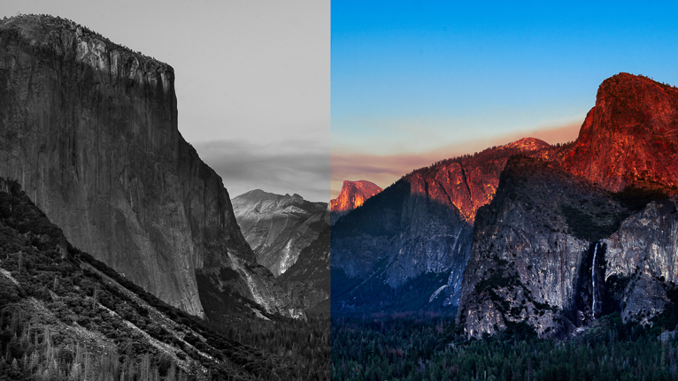
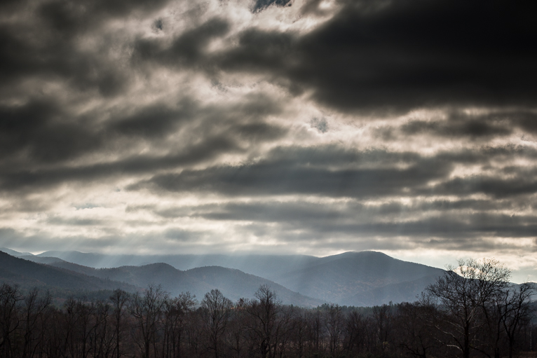
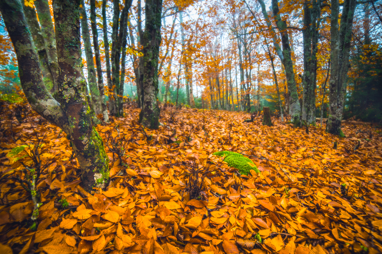
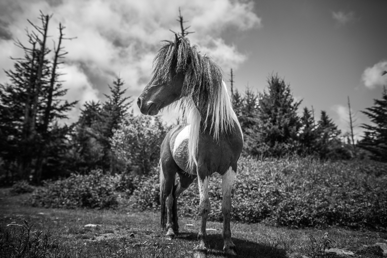
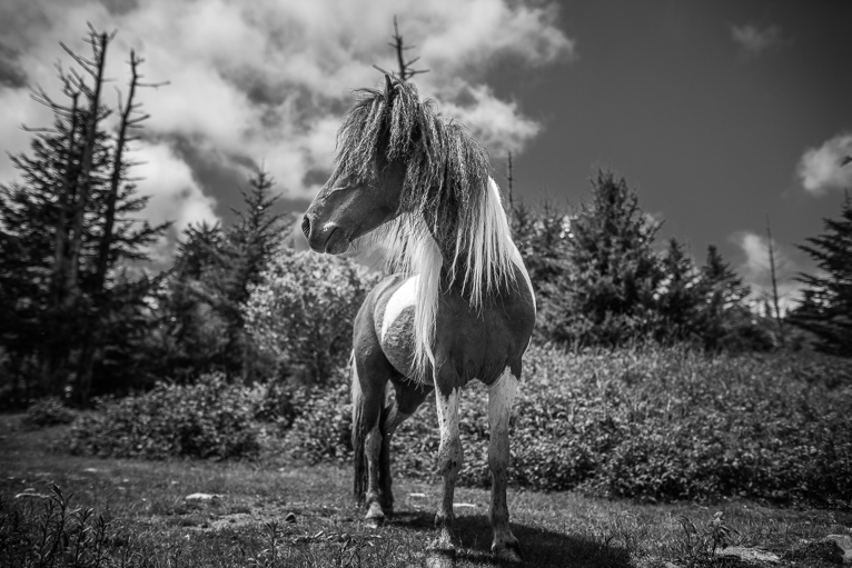
The blue hour is a wonderful time for photography, especially in cities. This is a time when the twinkling lights of a city can bring a photo alive. The great thing about blue hour photography is that it is relatively easy to do. As long as you have a tripod you won’t need much else. It is certainly easier than capturing sunrises and sunsets when the contrast in the light will mean filters are a must. Once you have captured your blue hour images, an important element in making them look as great as they can be is to edit them properly. So here are 6 quick Lightroom tips to help you edit your blue hour photos.
When is the blue hour?
Before going through the editing tips, it is important to know when the blue hour is. Because a common misconception for newbie photographers is that the blue hour is at night.
Firstly, the blue hour does not actually last for an hour. The exact amount of time it lasts will vary depending on the time of year and your location. It is also not at night. There is a big difference between “night” and the “blue hour”.
The blue hour occurs for a period of time before sunrise and after sunset. The difference between the blue hour and night time is that during the blue hour there is a cool bright blue hue in the sky. At night the sky becomes much darker. To know the exact time, it is best to download one of the many apps that shows the exact time and duration of the blue hour for that day, based on your location.
Now that you hopefully have a better understanding of the blue hour, here are some tips on how to edit your photos from it.
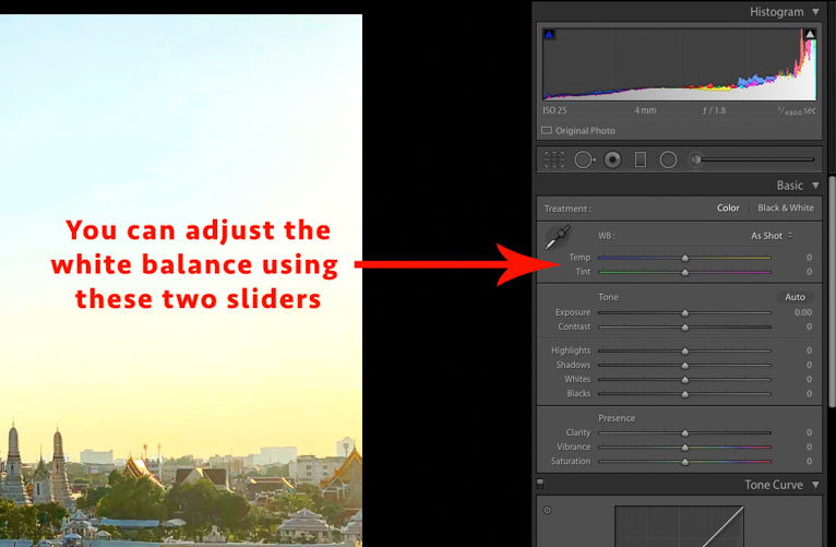
White balance
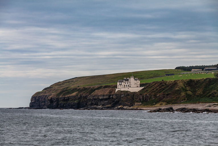
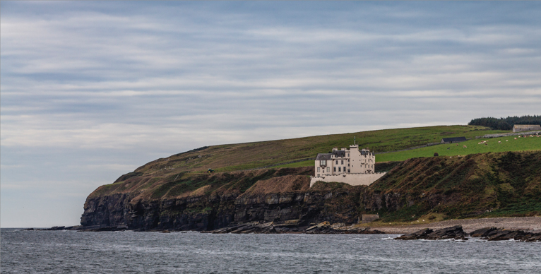
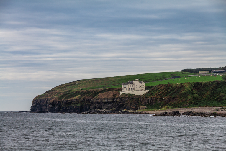
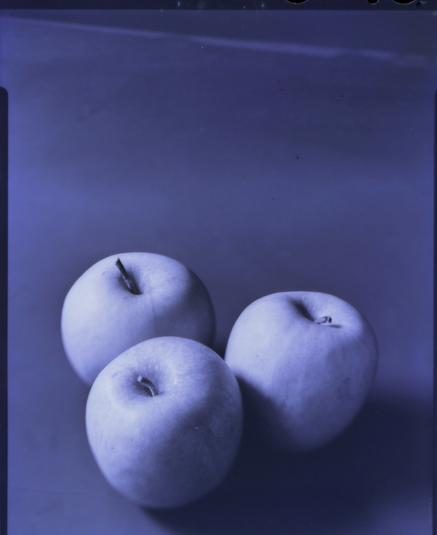
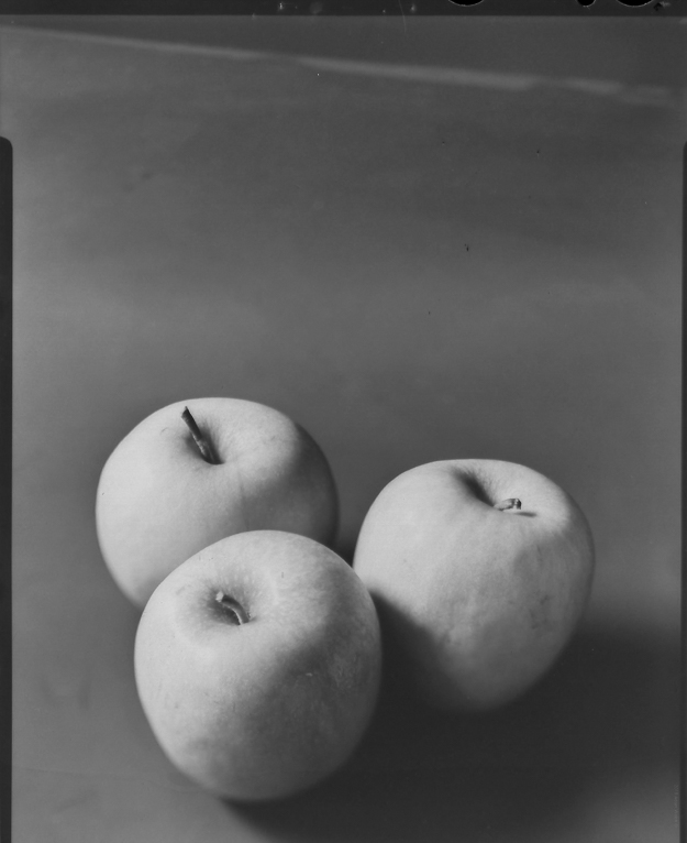
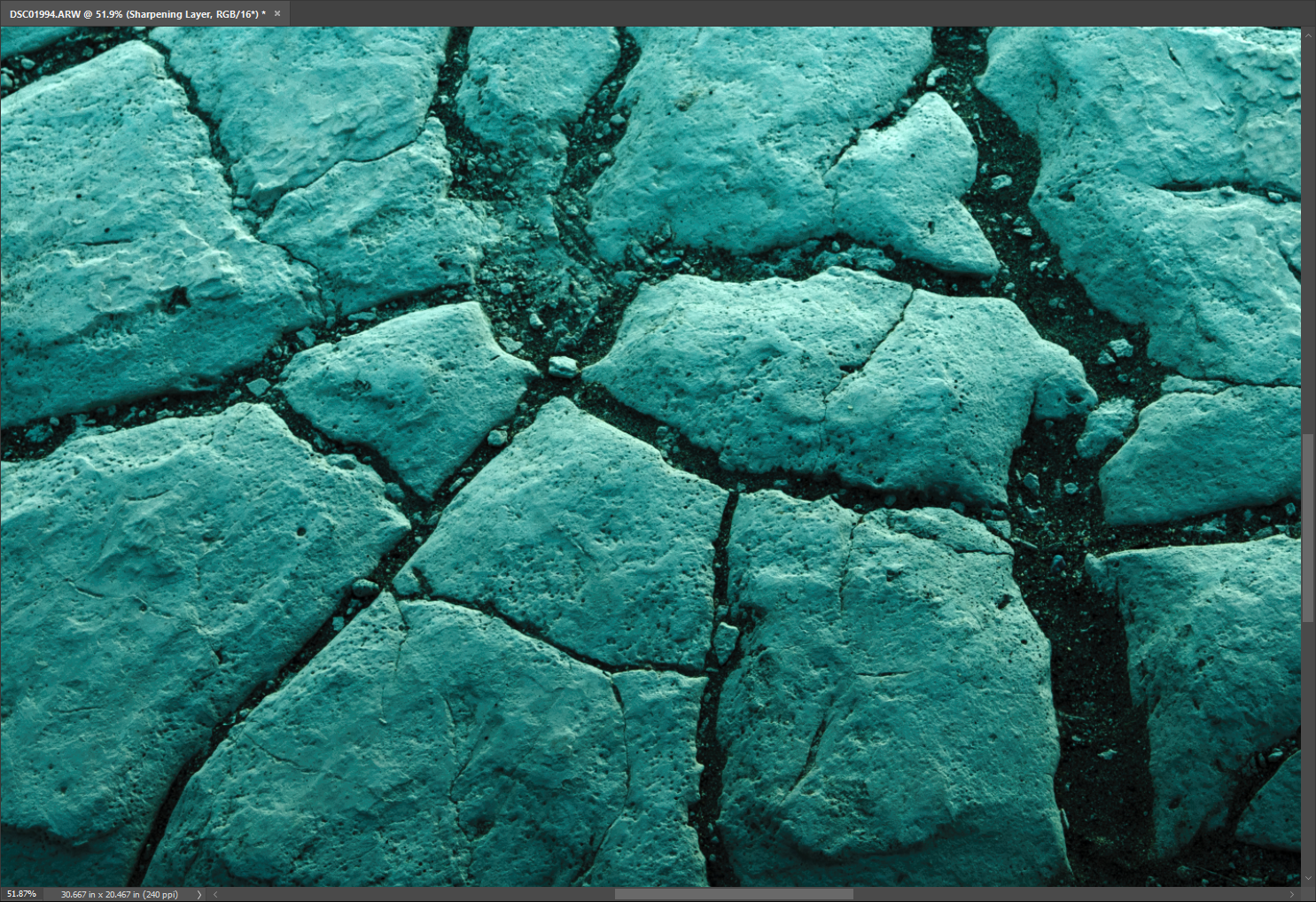
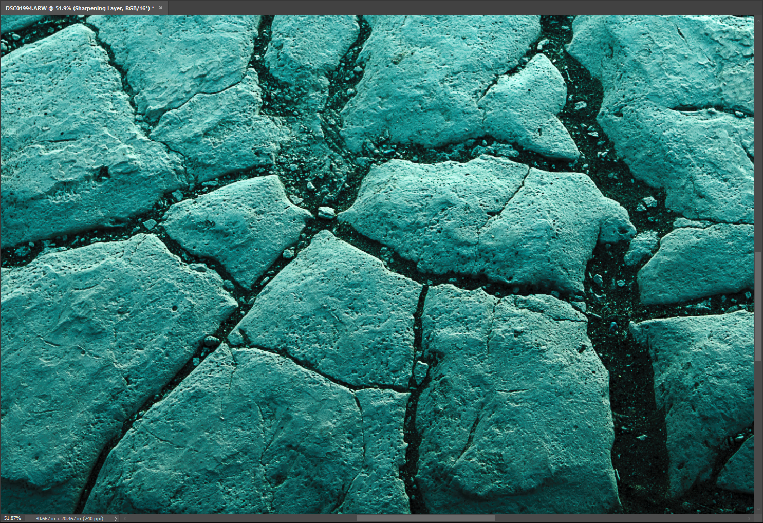
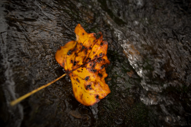
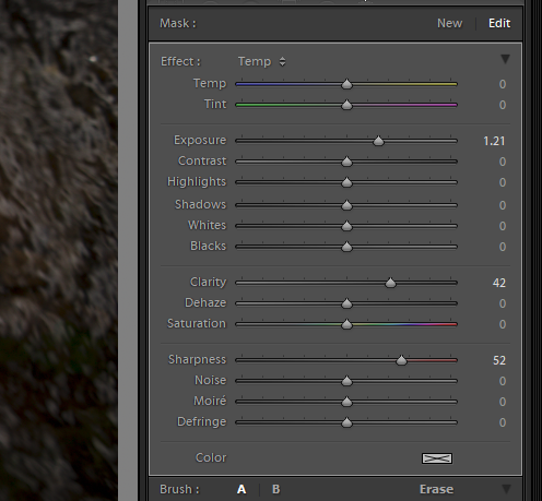
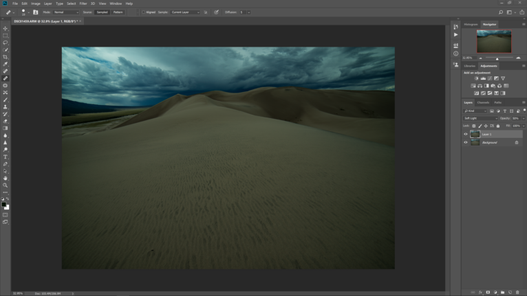
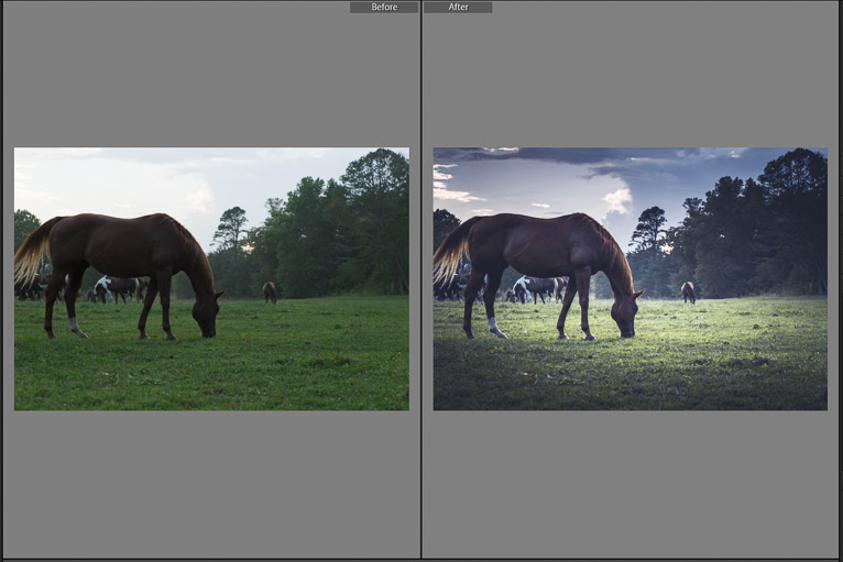
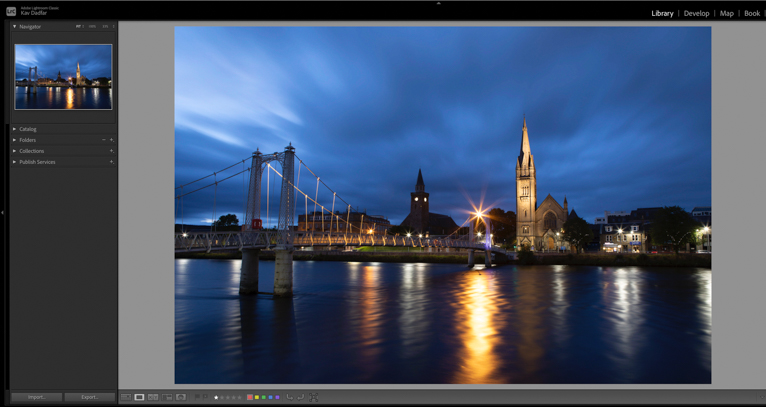
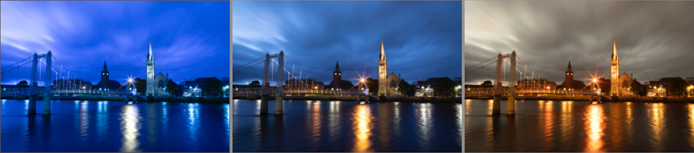
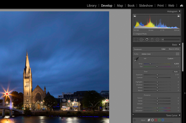
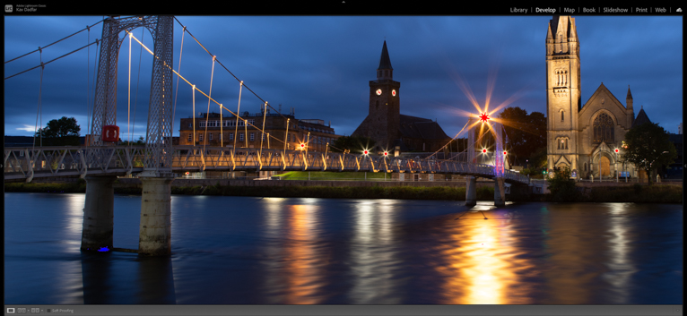
This is always one of the first things that I notice when I look at blue hour shots. If you have your camera set to Auto White balance, it will be more than likely that you will need to tweak your white balance a little when editing. Ideally, you should be aiming for a natural-looking photo which is neither too warm nor too cool (as per the example below). Generally, I would err on the cool side slightly as you will find that any areas which are artificially lit will look very saturated if too warm. The middle photo in the 3 images below is roughly what I like for this particular image.
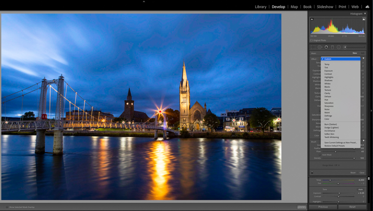
Highlights, shadows and more
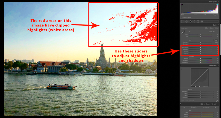
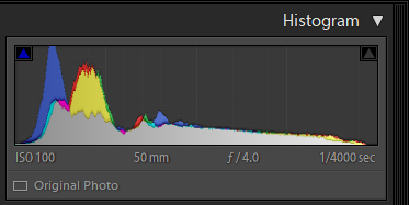
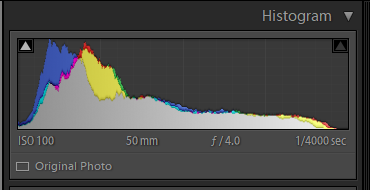
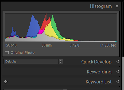
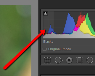
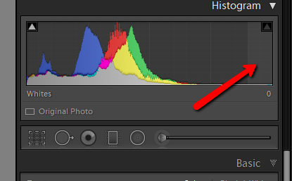
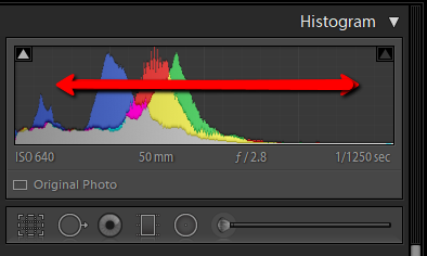
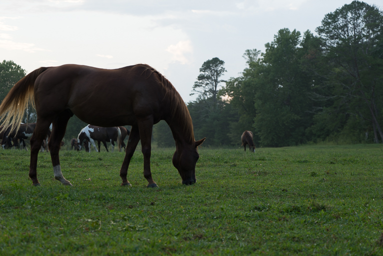
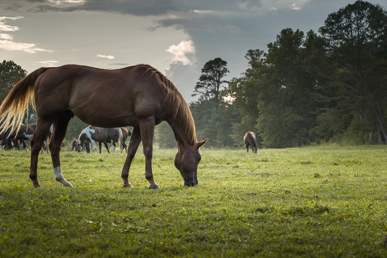
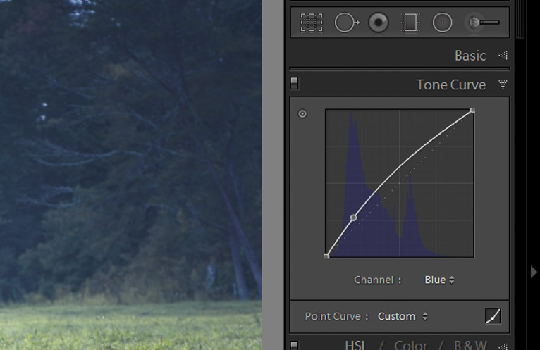
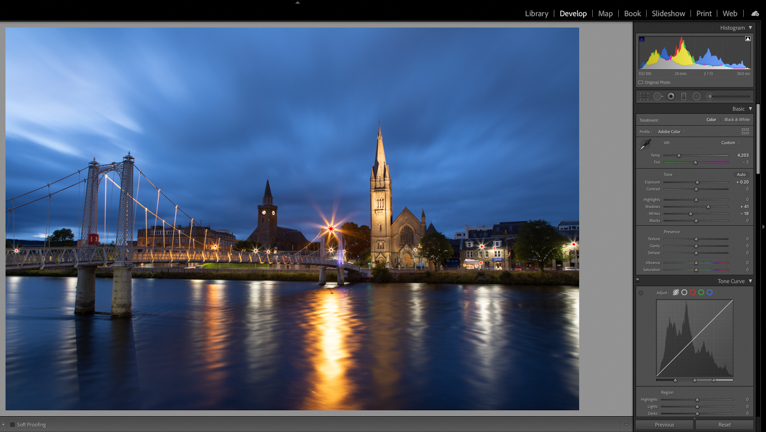
Looking at the histogram of this image, I can see that the histogram is slightly bunched up on the left. When looking at the image it is clear that some areas look a little dark. So, my next step is to tweak the sliders so that I have a better overall contrast in the image. By clicking the two arrows on either side of the histogram I can see on the image that there is some clipping happening.
At this point, I’m not too worried about the highlights clipping (in the bright areas) as I’ll come back to this later. For now, I’m going to add some brightness to the shadows area by using the “shadow” slider as well as some overall brightness.
For this image, I would then move the white slider to the left just to remove some of the clipping in the reflection of the light in the river. I will come back to the clipped areas in the lights later. You can of course play around with the sliders more for different levels of contrast.
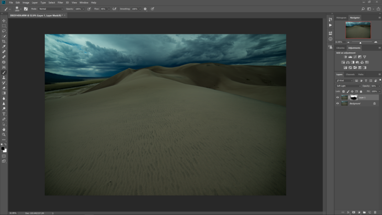
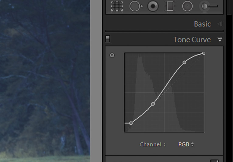
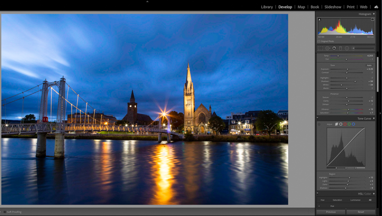
Contrast with curves
The tone curve is a really useful way of adjusting the contrast of an image. You can either use the actual graph to tweak the contrast of an image or the sliders below it.
Generally, most photos (not all) will benefit from what is known as an “S Curve”. It is when the line on the graph is curved like the letter “S”. The important thing here is subtlety, so you only want very slight curves. This will mean your “highlights” and “lights” sliders will be further right than the “darks” and “shadows” sliders. Again, you can tweak these as much as you want for the desired result.

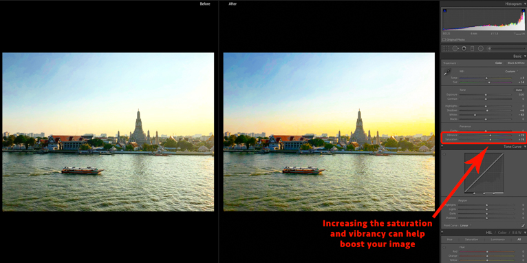
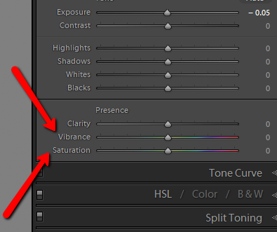
Saturation
At this point, I would also just add a small amount of clarity to the image, but again, be incredibly careful using this slider. Too much, and the image will look unrealistic and almost cartoon-like.
The “vibrancy” and “saturation” sliders are useful in all photos including blue hour shots. Keep in mind that you don’t always have to add saturation or vibrancy. Sometimes more muted colours in an image will make it look better.
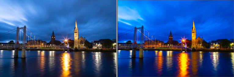
For this image I have will add a little bit of saturation and vibrancy as I want a bit more colour in the sky and on the cathedral. One of the biggest mistakes I see in blue hour shots is when the photographer has pushed these sliders too far and the image just doesn’t look right. Look at comparisons below. Which do you prefer? The subtle version or the oversaturated version?
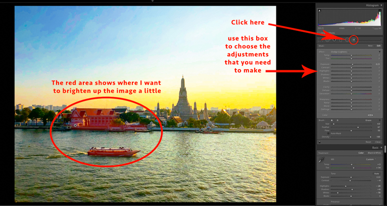
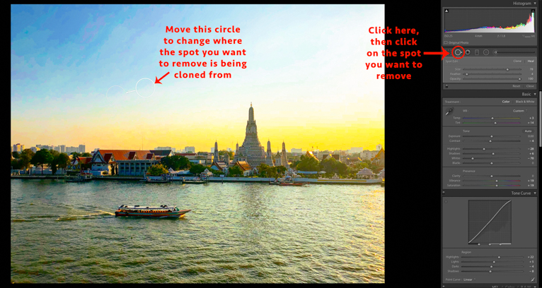
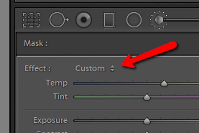
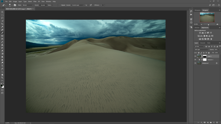
Local editing
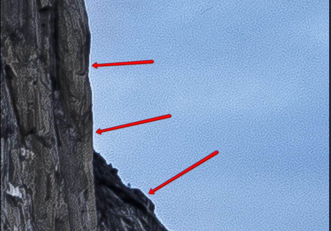
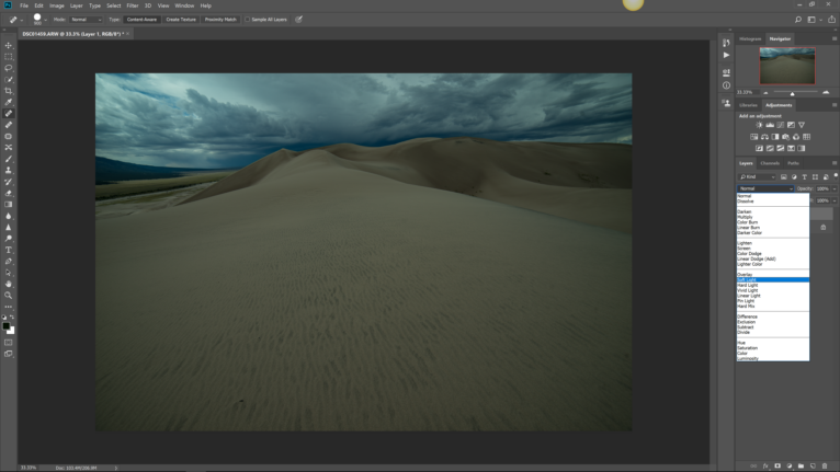
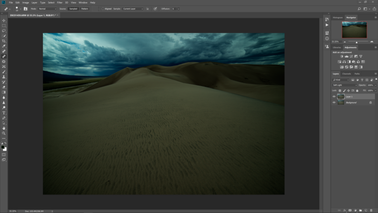
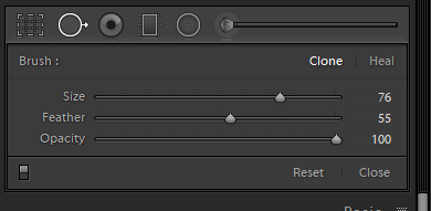
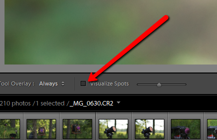
One of the most powerful attributes of Lightroom is the ability to edit at micro level. In that, you can tweak the smallest areas without affecting the whole image. This is what I will use to remove the clipped areas in the image. You don’t need to worry too much about clipped areas in light sources such as street lamps but if like me you care about the smallest details, then read on.
Press the “K” on your keyboard and the panel on the right will change to the adjustment brush panel. From here you can change the attributes of the brush you are going to use. For this image, I’m looking to remove the clipped areas so I will pull the “whites” slider to the left and then with a small brush paint over the effected clipped areas. You can now see how the highlighted red bits on the image have disappeared.
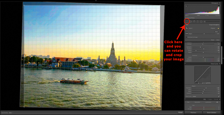
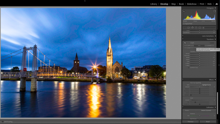
Straighten and crop
There is of course much more editing that can be done, but as a minimum, these should make your blue hour photo look better. The last part which is equally important is to straighten your image and crop if needed. This is really important in cityscapes or whenever there are buildings as you will usually find that vertical lines are not straight.
It is easy to straighten your image in Lightroom. Simply scroll down to the “transform” section of the editing panel and press “Auto”. For the vast majority of images, this will straighten the image with nothing else needed from you. However, there may be times when you may have to tweak things or even manually straighten the image using the sliders.
Just these simple Lightroom editing steps will make a big difference to your blue hour shots. Don’t skip the editing part of your workflow as this is equally as important for those amazing blue hour photos as actually taking the photo.
Photo credits: Kav Dadfar – All rights reserved. No usage without permission.