• Cart
  • Checkout
  • My Account

Infrared Conversions, IR Modifications & Photography Tutorials | Life Pixel IR

The world leader in infrared conversions, modifications & DIY IR conversion tutorials. Scratched sensor replacement, UV & Full spectrum conversions.

The world leader in infrared camera conversions

866.610.1710
  • Home
  • → Start Here ←
    • 1 – Introduction
    • 2 – Filter Choices
    • 3 – Focus Calibration
    • 4 – Lens Considerations
    • 5 – Camera Considerations
    • 6 – Start Shopping
  • Galleries
    • Infrared Photography
    • Infrared Time Lapse
    • Infrared Cinematography
    • Infrared Stop Motion
    • Ultraviolet Photography
    • Forensic Photography
  • Education
    • Training Sessions
    • How To Shoot Infrared
    • AR Coated Infrared Filters
    • Lens Hot Spot Database
    • Photoshop Video Tutorials
    • Infrared Issues & Solutions
    • IR Basics in Photoshop
    • Camera Quick Start Guide
    • DIY Conversion Tutorials
    • IR Photography Primer
    • Secondhand Cameras
    • Wall Of Shame
  • Workshops
  • FAQ
  • Blog
    • Tutorials
    • Inspiration
    • Locations
    • Gear
    • News
    • Other
  • Why Choose LifePixel?
    • Submit Your Review
  • Contact
  • Shop

The Case for Black and White Photography

Brace yourself because here it comes…it’s another discussion about black and white photography. Don’t worry, it’s not going to be the same old “which is better?” or even worse, another “how to convert your photos to black and white” type of articles. Admittedly, I have written on both of those subjects extensively before but this time will be a little different.

Today, we’re going to strip down the idea of black and white photography and attempt to locate how this tried and true area of photography has managed to maintain its status in an arguably over saturated(pun intended) world of photographic modernism.

Monochrome and the Film Difference

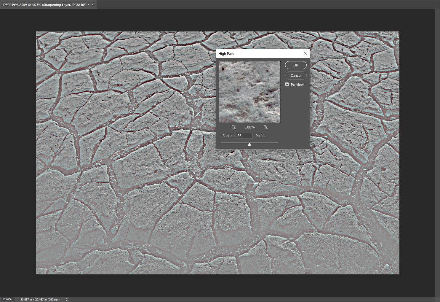
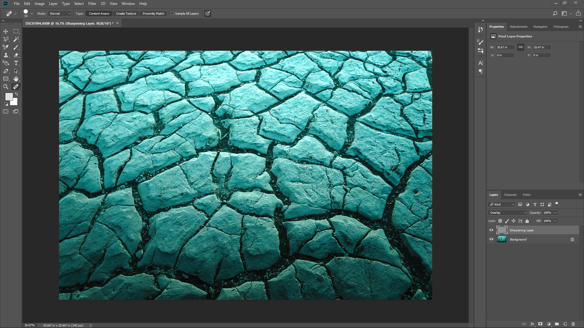
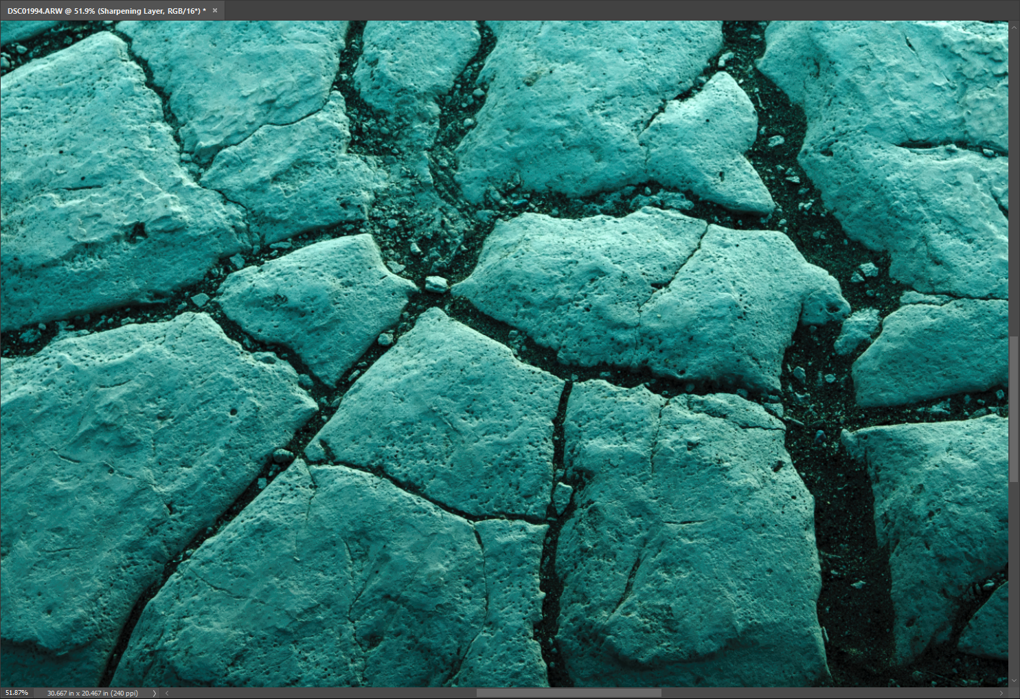
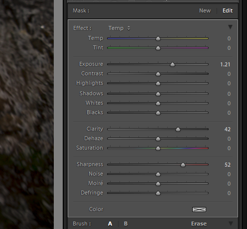
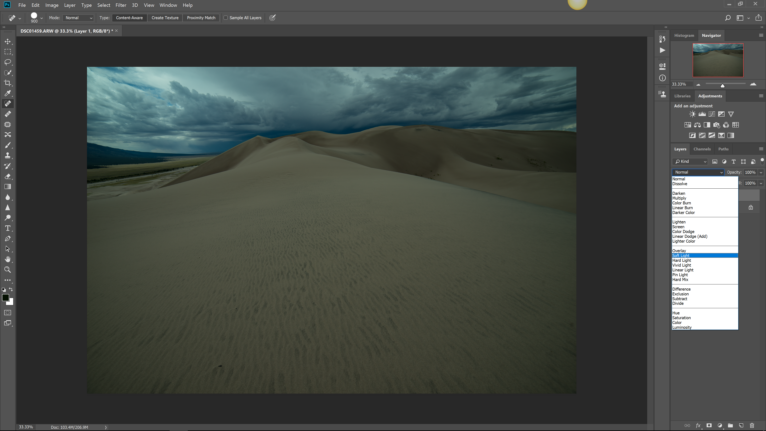
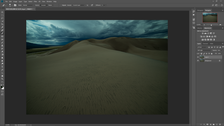
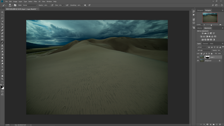
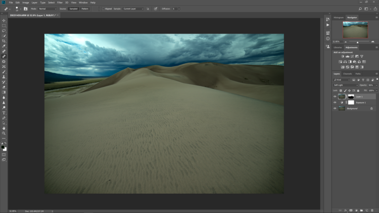
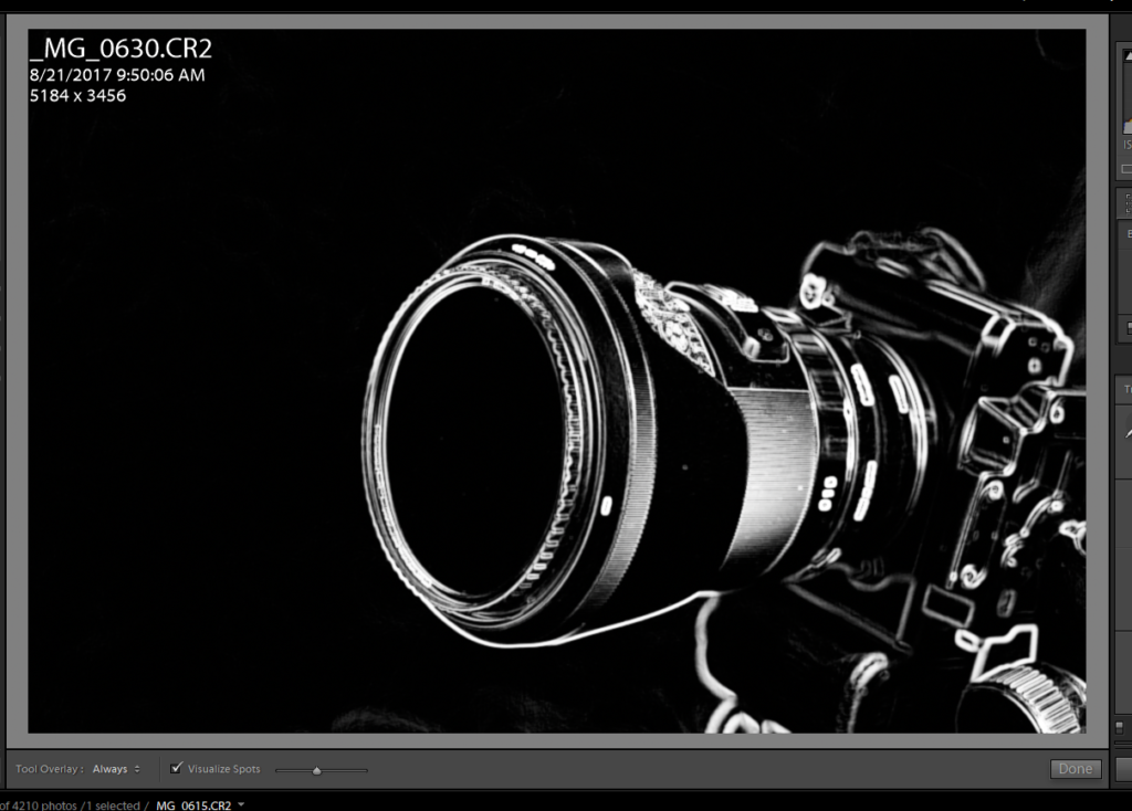
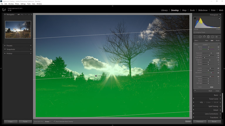
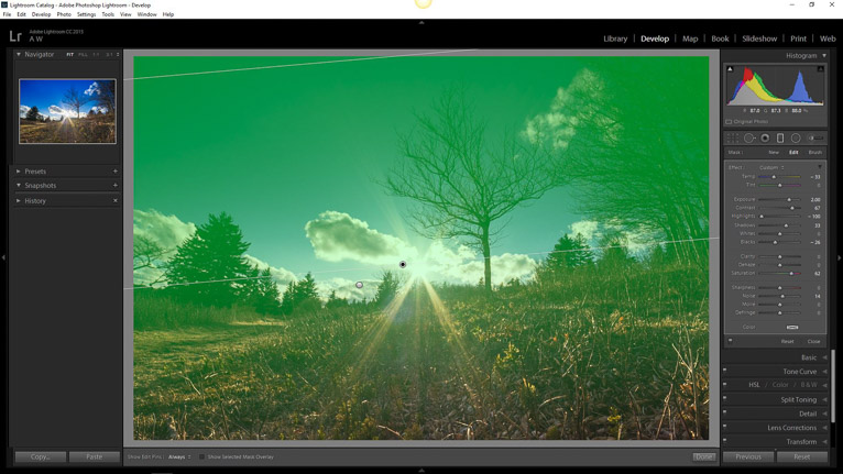
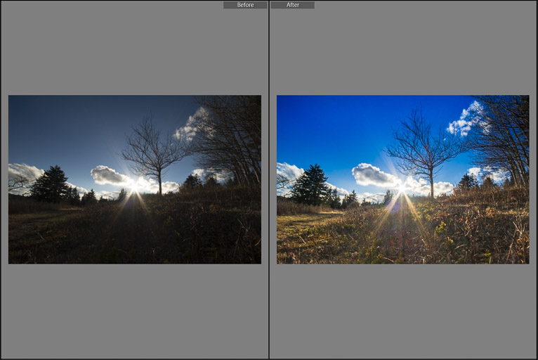
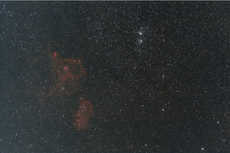
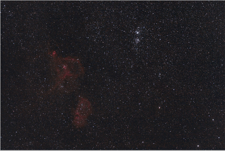
It’s not secret that the black and white side of photo work is deeply rooted in film. Still, even though it makes for a solid title for this section, the term “monochrome” has been somehow mismanaged to the point where it is widely considered synonymous with black and white. This is wrong. Monochrome means “one color” or essentially an image made of shades of only one color. This color could be anything from black, yellow, red or pink. Grayscale might actually be a more appropriate term for true black and white. Even then the lines become somewhat blurred because it’s incredibly difficult to completely abolish all color toning from a black and white film negative. Take a look at these images of a 4×5 black and white negative(complete with film borders)and I’ll show you what I mean.

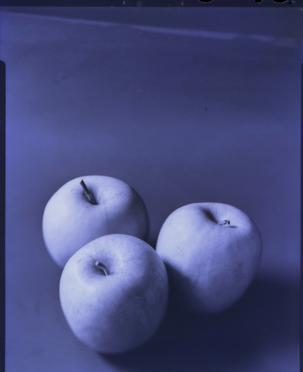
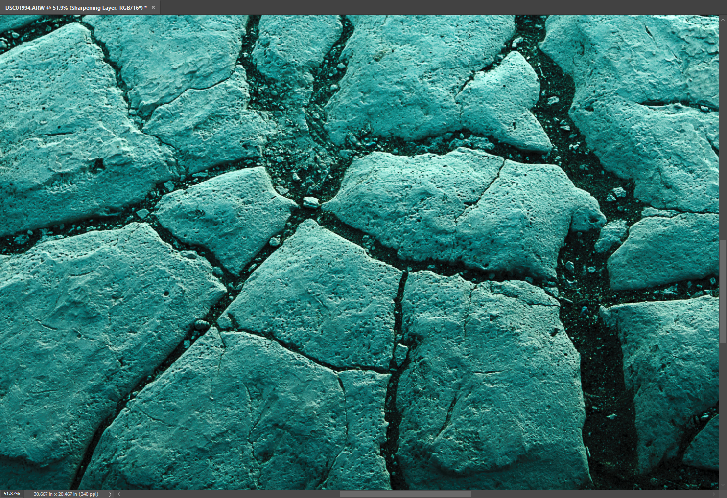
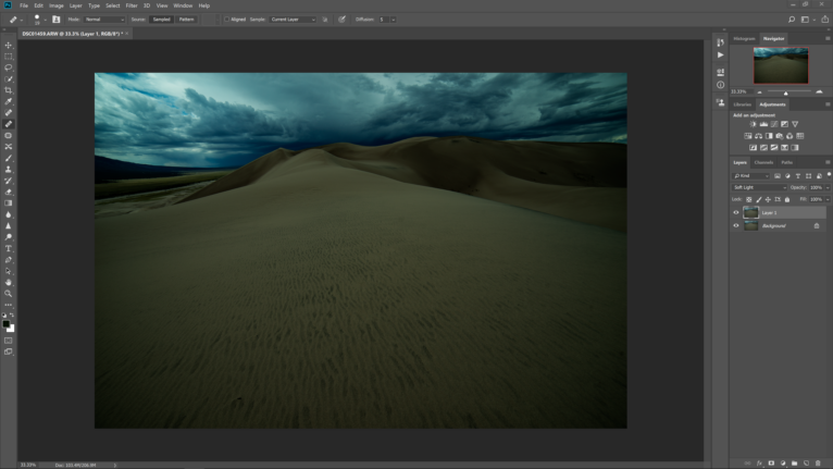
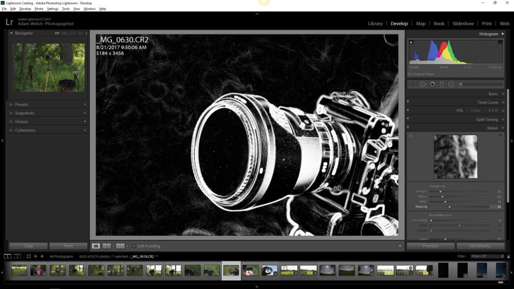
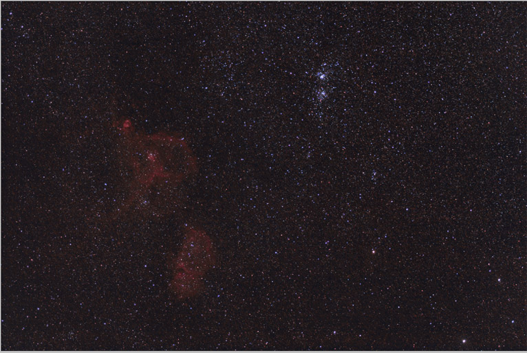
The first photo is a color rendition of the negative. You’ll notice that is is toned quite blue based on the development. This is due to a few factors but the point is virtually all black and white photographs aren’t exactly black and white. Rather, they are toned based on the type of film emulsion and the development techniques used. Now, look at that same piece of film after I have digitally converted it to black and white in Lightroom.

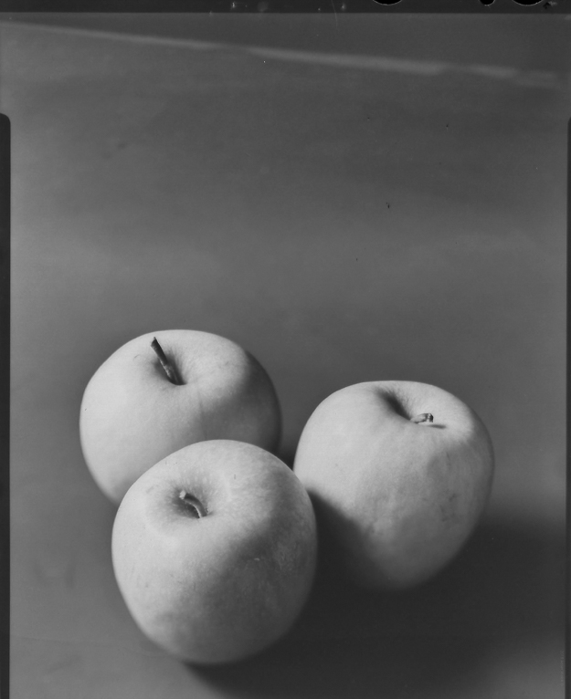
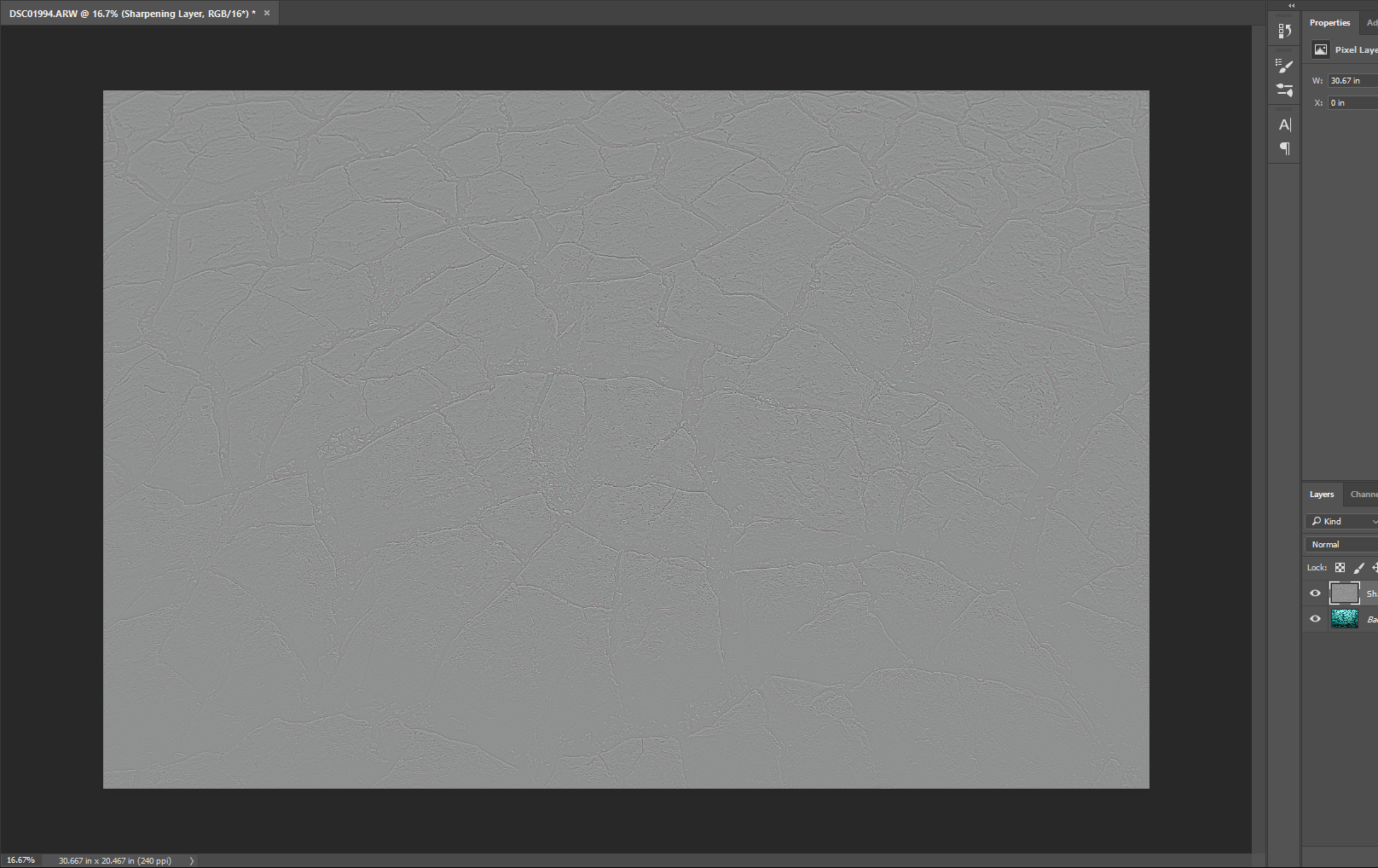
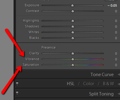
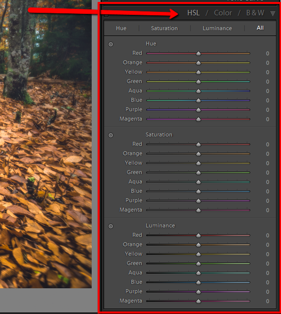
See the difference? I say all of that to say this: modern digital photography often paints a one dimensional representation of black and white images. True black and white photographs aren’t usually black and white at all or not even monochromatic. Instead, they are a carefully mapped presentation of tonal ranges. Remember this the next time you click a button to make your photo black and white. Sure, it might remove the color but the work shouldn’t stop there.

Speaking of color…

Is Color Necessary?

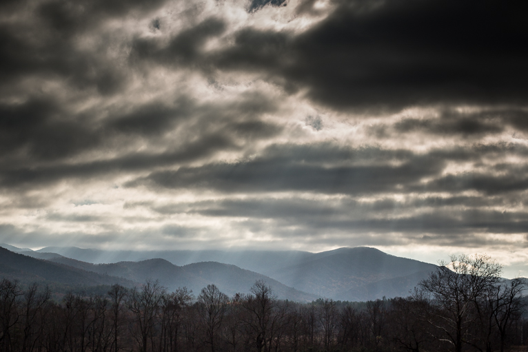
Yes, color is needed. Is it always needed? Absolutely not. There are times when a photo is suited to black and white and times when it is not. Well, who decides? That question is also deceptively simple to answer. It’s you, you’re the one who decides. Does the color play a role in the emotion or feeling you mean to convey or does it get in the way? These are most certainly murky waters to wade.

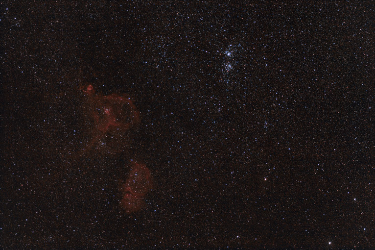
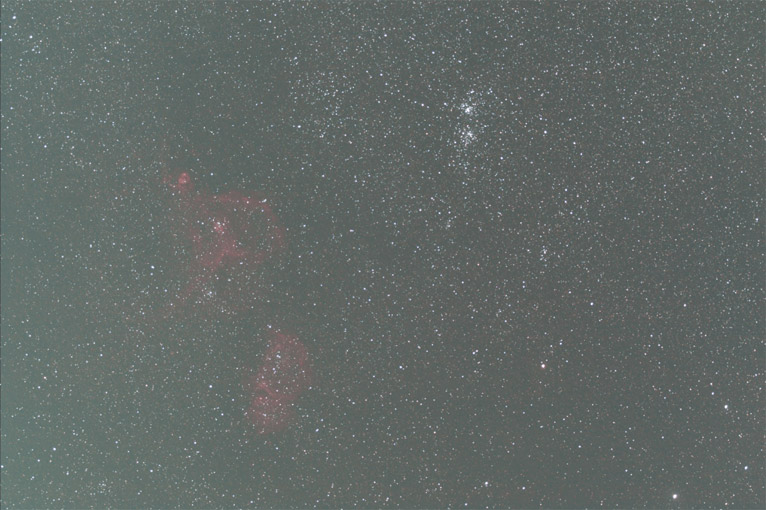
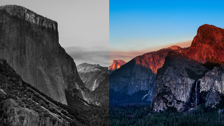
Today, we don’t even have to approach color or black and white photography the same way as we did thirty or even twenty years ago. Take the very site you’re reading this article on right now. LifePixel specializes in infrared converted cameras that brings the world of color into a new realm of creative exchange. Infrared cameras see light differently than our own eyes. As a result, completely familiar colors become foreign and black and white pictures take on a completely new feel. When you think about color and how it relates to photography you must understand that even the things we see are wholly subjective to our own perception.

Some Closing Thoughts…

If you haven’t been able to tell by now the purpose of this article isn’t to promote the merits of one type of photo over another. There’s plenty of room even now for both color and black and white photography. In fact, a lot of it comes down to personal taste and how we perceive the world around us. At the same time, remember to look deeper into your work and find what gives it meaning to you. Does color play a part? Does it make more of a connection in black and white? Whatever direction you choose just make sure that the original intent of the photo shines through.

Filed Under: Inspiration Tagged With: black & white, blackandwhite, bw, camera, color, inspiration, landscape photography, Lifepixel, lightroom, Photographer, photographers, Photography, photography tips, photoshop, processing, Travel photography, tutorial, Wildlife photographer

Speed Up Your Processing with Lightroom Import Presets

We all know about presets in Lightroom and all the great things they can do your post processing. Presets help make your editing easier and make achieving a constant styling much more efficient. The biggest benefit of using presets is that they speed up your post processing so you can get back to making photographs, baking muffins, building model airplanes, or whatever it is you might rather be doing instead of sitting in front of your computer screen. But did you know you can use presets jumpstart your post processing efforts before you even import your photos into Lightroom?

In this article I’m going to show you how easy it is to apply presets to your photos as they import into Lightroom. These presets aren’t even limited to develop presets…oh no. You can even add in metadata presets like copyright information and keywording along with camera and lens profile information. This is the kind of thing that the pros use and you should as well. If you find yourself editing large batches(weddings, portraits, events) of similar photos then you’re going to love using import presets in Lightroom. Let’s get started.

Applying Presets on Import

It all starts here in the Import screen of Adobe Lightroom.

If you look to the right you’ll notice an ‘Apply During Import’ panel.

This is where all the magic will happen. Click on that tab to open up your options. From here we’ll have a few choices.

Develop Presets and Camera Calibration

Applying develop and camera calibration* presets as you import your photos into Lightroom couldn’t be easier. The process is essentially the same as it is while editing your images in the Develop Module. To begin, make sure you have the photos you wish to import with the preset. Next, click the ‘Develop Settings’ drop down. This will bring up a list of all the develop presets you have currently installed in Lightroom.

From here it’s simply a matter of selecting the preset you want to apply to the images you’re importing.  After you’ve made you’ve made your choice click ‘Import’ and your photos will be brought into Lightroom with the chosen develop preset freshly applied.

**To apply camera calibration settings to your photos on import simply save them in a develop preset and then use the same steps as above.

Copyright and Metadata

Import presets aren’t limited to develop settings. We can also apply keywording and metadata(copyright information/location/creator) to each and every image we import. This helps to better organize or photos and perhaps more importantly, it allows us to protect them from unwanted use. Adding in keywords is super easy as you can type them right into the keyword box. Alternatively, you can add in keywords alongside your other metadata.

Assigning metadata to images is just as easy as applying develop presets. To start, click the ‘Metadata’ drop down arrow.

Select your preset or to add a new one click ‘New’. This launches the new metadata preset dialog box.

It’s here where you can add in virtually any information imaginable. When you’re finished be sure to name your new metadata preset. In the example above I’ve left the title as ‘Untitled Preset’ (I’m lazy) but it’s always a good idea to title any preset you make in such a way that you can immediately know what it contains. Once you’ve created the new preset it will then become selectable from the metadata preset drop down menu. After you’ve applied it, click ‘Import’. Your new metadata information will automatically be applied to each image you selected to import just as the develop settings were in the previous example.

Some Final Thoughts….

Import presets are a great way to easily jump start your processing workflow. By applying certain develop and metadata presets on import you can yourself a lot of time by having the settings you use the most already applied before any work actually begins. This becomes especially useful when you find yourself editing a large number of photos at once. Not only can import presets making editing a breeze but they can also play a big part in protecting your photos by attaching important copyright information to your photos. If you haven’t already give import presets a try and see just how much they can help you and your photography.

Filed Under: Tutorials Tagged With: camera, cameras, landscape photography, Lifepixel, lightroom, Photographer, photographers, Photographing deserts, Photography, photography tips, processing, tutorial

Smarter Sharpening with the High Pass Filter in Photoshop

What if I told you that sharpening as we know it in photography isn’t real? That might be a little hard to believe but the truth is that it is actually impossible to make an image physically sharper after it has already been made. Sharpening a photo is simply an illusion. We can make a photograph appear to be sharper. Our digital images can be made to look sharper by adjusting the contrast of the pixels around the edges of shapes within the photo and this is what we are going to talk about today. We will look at how you can easily make your photos more sharp quickly using the high pass filter in Photoshop.

What is the High Pass Filter?

The high pass filter is just a method of creating a sharpening effect to your photo based on the pixels surrounding the contrasted edges of the elements within the image. While Photoshop has some dedicated sharpening tools(unsharp mask, smart sharpening) the high pass filter is the method I tend to use the most because I love the total control it gives me over my sharpening.

Using the High Pass Filter

To get started with sharpening using the high pass filter it is highly recommended that you complete ALL of your edits prior to performing the sharpening. This means that if you’re like me and do most of your processing in Lightroom and then export to Photoshop for finishing you will leave your high pass sharpening for the very last step. When you’re ready to sharpen, open your image in Photoshop.

Next, duplicate the layer by using keyboard shortcut Ctrl+J(Cmd+J for Mac). This is the layer where the high pass filter will be applied. I’ve renamed it “High Pass Layer” so it’s easier to see.


Make sure the new high pass layer is selected and then click on the ‘Filter’ tab and then ‘Other’ and lastly select ‘High Pass’.

You’ll notice an abrupt change to your image. It will essentially go completely grey. Don’t panic because this is exactly what we want to happen. But we have a choice to make and that is what radius we set for the high pass filter.

The radius controls the amount of pixels which are targeted around the edges where the sharpening will be applied. There’s a lot of wiggle room here and it generally is based on the resolution of your camera. The higher megapixel your camera the higher you can set the radius without causing unsightly effects such as halos and glowing edges. Let me show you what I mean. Here is the high pass filter with a radius of ‘1’…

And now here it is with a radius of ‘36’.

The higher the radius the more of the image will be affected. This particular photo was made with a 36.4 megapixel camera and I find a radius of ‘4’ to be the proverbial sweet spot. Adjust your radius accordingly.

Click ‘OK’ to apply the high pass.

But wait, this still looks horrible and gray and not at all what we want.

The next step is key. We have to change the blend mode of our sharpening layer. There are multiple choices here but the ‘Overlay’ option tends to work best with virtually all images and is the blend mode I use. After the overlay blend mode is selected we have what is essentially our final sharpened image.

Have a look at the difference the high pass filter has made in terms of sharpness. Here is the unsharpened photo….

And now the freshly sharpened version….

Closing Thoughts on Sharpening with the High Pass Filter

Don’t forget, not only can the high pass filter be applied easily but like any other layer adjustment in Photoshop the opacity can be adjusted until you reach the exact level of desired sharpness. Furthermore, adding in a layer mask to the sharpening layer can allow you to take complete control over the sharpening effect and only apply it to the areas of the photo you choose.

The best bit of advice when it comes to sharpening an image using any method is that less is usually more. Always remember that an over sharpened image is often less appealing than one that is slightly soft. Enjoy using the high pass filter in Photoshop!

Filed Under: Tutorials Tagged With: adobe, landscape photography, Lifepixel, lightroom, Photographer, Photography, photography tips, photoshop, processing, tutorial

A Quick Guide to Local Adjustment Presets in Lightroom

If you use Adobe Lightroom, I’m sure you’ve heard of develop presets and how they can jump start your creativity. But did you know that you can also create and save local adjustment presets just as easily? In this article I’m going to show you how to create and save your own local adjustment presets so you can make the most of your editing time in Lightroom.

What are Local Adjustments?

Local adjustment presets work a lot like develop presets in that they allow you to save certain combinations of edits for quick application later. The biggest difference between the two types of presets is that normal development presets generally work globally(affects the entire image) whereas local presets affect only the portions of the image you choose. These edits are applied either with either the local adjustment brush, graduated filter, radial filter, or a combination of the three. The great thing about local adjustment presets is that each preset can be applied by any of the local adjustment tools in Lightroom.

Here’s an example using the picture above. This is how it looked originally.

Let’s say we want to only lighten the leaf without disturbing the rest of the photo. Not only that, but the area could also use a little bit of a boost in clarity and sharpening. We can use the local adjustment brush and combine all this edits into one and apply them at the same time.

Now, that looks better.

This is an edit you might have use for in the future since adding a little exposure and clarity can might an image really pop. Instead of taking the time to go back in and adjust the sliders each and every time why not save this adjust as a preset? Saving local adjustments is even easier than saving a regular development preset because there’s no new folder to make and name, no check boxes to tick or untick. Everything is already set up for you and all you’ll need to do is make your adjustments and then name your new preset.

Saving the Preset

First, click the ‘custom’ drop down at the top of the local adjustments panel….

Find the bottom of the ‘Save current settings as new preset’ option at the bottom of the drop down menu and click on that.

Now it’s time to name your awesome new local adjustment preset. Just as with any other type of preset it’s a good idea to come up with a descriptive name that immediately tells you what the preset does. For this preset I’ve chosen ‘+Exp Clarity Sharp’.

And that’s it! Your new preset will appear as a freshly made preset name in the local adjustment presets dropdown menu.

Final Thoughts on Local Adjustment Presets…

Like any other preset in Lightroom, local adjustment presets save you time by eliminating the need to change multiple adjustment sliders each and every time you want to use a particular edit. Making a local adjustment preset is one of the easiest tricks you can use to speed up your post processing. Remember, every preset you make can be used with all the local adjustment tools in Lightroom. That means the adjustment preset we made above can also be applied using the radial and graduated filter as well. Local adjustment presets are great. Use this guide and find out for yourself!

Filed Under: Tutorials Tagged With: adobe, camera, cameras, Getting started, landscape photography, Lifepixel, lightroom, lightroom classic cc, Photography, photography tips, processing, tutorial

How to Use the Clarity Slider in Adobe Lightroom Classic CC

If you reach way back to Adobe’s Lightroom 1.1 build you will find the clarity slider. After its introduction wayyyy back then the clarity slider has been a favorite weapon of most landscape and even portrait photographers. This slider is a personal favorite of mine just as it is the professed secret love of many Lightroom users. It adds a little “punch” to your photographs and can work wonders with portraits, landscapes, and virtually any other image that appears to be a little visually flat.  And now in Lightroom Classic CC, the clarity slider is still going strong.

But what does the clarity slider do specifically? In this article we’re going to talk about how the clarity slider works and how you can use it more effectively to bring out the full potential of your images.

How Does the Clarity Slider Work?

When we adjust clarity, we are essentially adjusting the contrast of our photo.The difference is that instead of the entire tonal range being adjusted, the clarity slider targets the midtones only. This give the overall illusion of the image become more clear. Look at this histogram of the image above before the clarity was increased by+60…

Now, look at that same histogram after the boost in clarity

The blacks and highlights haven’t been affected very much but the midtones certainly have. And that’s the great thing about the clarity slider: it is far less likely to wash out detail in the areas which are already bright or already dark. This makes it a great tool when working with textures(insert link to texture article) with scenes which need a good bit more contrast without going into overkill in the shadows and highlights. Speaking of overkill…or rather over’clear’(haha)…the next section will talk about some things to watch out for when using the clarity slider.

How NOT to Apply Clarity

Granted, every photo is going to be different, so there are no real “rules” when it comes to using the clarity slider(or anything else in photography) to adjust your images. That being said, a general guideline that will help you immensely is the good ol’ fashioned “less is more” approach. While there clarity slider works great to add some extra power in your photograph it can also cause some unsightly side effects if abused.

Here’s a photo where the clarity has been cranked to +100. Notice anything?

On top of the entire scene now looking a little unnatural, when we zoom in we can see the real problem with using the clarity slider too liberally.

Zoomed to 3:1

Those dreaded halos. I hate them, and honestly, you probably should as well. They are caused by the pixels around high contrast areas becoming too separated from the pixels surrounding them which adds up to the bright banding around those areas. To remedy this, try adjusting clarity locally using the radial or graduated filter or the adjustment brush. If all else falls, simply back off the clarity a bit. In almost all cases less contrast will be more preferable than that dastardly halo effect.While Adobe has drastically refined the performance of the clarity slider in recent years the over clearing a photo can still be problematic. Also note the halo effect is worsened when coupling too much clarity along with too much sharpening as happened with the image above..

Final thoughts on Clarity

The clarity slider is a great tool. It helps us to increase contrast in the midtone luminosity range while avoiding blown out highlights and burnt out shadows. I use it to some extent in virtually every photograph I process. That being said, as awesome as the clarity slider can be, it can also work against you if you push it too far. Always remember to keep things in the scope of the reality you wish to present to the viewer and don’t over clarify your images. On the flip side of that you should also not be afraid to actually lessen the clarity in some of your images. It can actually smooth out skin tones and impart a nice soft contrast to a landscape. With a little bit of knowledge the clarity slider can open up entirely new post processing opportunities that you might not have considered!

Filed Under: Tutorials Tagged With: clarity, clarity slider, landscape photography, Lifepixel, lightroom, lightroom classic cc, mountain photography, Photographer, Photography, photography tips, post processing, processing, Travel photography, tutorial, Wildlife photographer

How to Add Instant Contrast in Photoshop

Adobe Photoshop is a beautiful thing. It allows an incredibly wide range of artists, designers, creatives, and especially us photographers to inject a little bit of creative juice into their work and see it come to life. And while Photoshop can be enormously complex there are so many simple, straightforward edits you can use to instantly transform your photographs.

One of these goes back to the basics of photo editing: exposure and contrast. There is a great way to quickly add contrast to your images by using PS blend modes, more specifically the “soft light” blend mode. You may be thinking “But why not just add contrast with the contrast adjustment?” Well, you can for sure…but it’s not exactly the same. And why not expand your photographic editing horizons to try something new?

Soft Light Blend Mode

The soft light blend mode is one of seven PS blends that make up the “contrast” group. These modes all use varying mathematical wizardry to accomplish a similar effect which is to make darks darker and lights lighter in relation to one another. While that is an incredible over-simplification it’s not entirely inaccurate.

The soft light blend mode bases itself on whether pixels are lighter or darker than 50% gray. If a pixel in your image is darker than 50% gray it will be darkened further. If a pixel is whiter than 50% gray it will be lightened. The result? More contrast. Not only that, but this contrast is wholly dependent on image and it’s tonal makeup.

Adding Contrast with Soft Light Blend Mode

First, duplicate your base photo layer by using the keyboard shortcut ‘Ctrl+J’(Cmd+J for Mac).

Next, select the soft light blend mode from the blend mode drop down list. Alternatively, use the keyboard shortcut ‘Ctrl+F’ to do the same thing a little faster. You will instantly notice a fairly drastic change to your photo. Namely the increased amount of contrast.

To really control the amount of contrast I highly recommend adjusting your layer opacity until you reach the overall level of contrast for your particular image. In the case of soft light the opacity and fill accomplish the same outcome so it is your choice which to use.

The real fun begins when you decide to add a layer mask. Don’t worry! Masks aren’t something to be afraid of(in most cases) and they allow you to completely take charge of how an edit is applied in PS. You’re about to see how easy it is right now.

Adding a Layer Mask

To add a layer mask to your soft light blend layer simply click on the “add a mask” icon at the bottom of the layer panel.

Guess what? You’ve just added a layer mask! It’s that simple. Now, you’re free to paint in or out the soft light contrast to virtually any degree and location you choose. Just adjust the size and opacity of your brush to achieve the desired effect.

Add in some a quick increase in exposure and we’re left with the finished product. All done within a matter of minutes.

Some Final Thoughts….

One of the fun and interesting aspects of post processing is discovering all the different methods of achieving certain editing effects. Adding contrast to a photograph is one of the most basic edits a photographer can make to instantly add power to a photo. There are many ways to do this and you’ve just learned one. Try using the soft light blend mode technique to add contrast in a smarter, more controlled way. The soft light blend mode in PS makes it easy to quickly and effectively add punch to your images and it is something I use to some extent on virtually every photograph I process.


Filed Under: Tutorials Tagged With: camera, cameras, Getting started, landscape photography, Lifepixel, lightroom, mountain photography, Photographer, Photography, photography tips, photoshop, processing, Travel photography, Wildlife photographer

Making Fall Colors Pop with Adobe Lightroom

Here in the Northern hemisphere Autumn is in full swing. The colors of the leaves are changing and giving their last big show as we head into winter. The frosty mornings and golden hues offer outstanding opportunities for photographers to capture these beautiful Fall colors before they’re gone until next year.

In this article we’re going to talk about how you can make those bright Fall colors really pop in Adobe Lightroom! It doesn’t take much to make your images of the season standout. Let’s get started!

Bringing Out the Color

The main focus of majority of Autumnal photos is of course color. Bright Earth-tones and muted flavors of of brown and gray intermingle together to produce an incredible palate of gold. Here’s how to make all those beautiful tones come to the forefront in your image. We’ll begin with the Vibrance and Saturation sliders in the basic Development Panel of Lightroom.

Vibrance

The vibrance slider brings out the mid tone saturation of colors. It comes in handy when you want only the less saturated colors in the photo to be amplified. Look at this image before the vibrance was adjusted.

And now after

With +50 Vibrance

The key use of increasing the vibrancy of a photo is to maintain a natural and pleasing look to the colors that need to be intensified.

Saturation

Saturation and vibrance are closely related but at the same time affect different aspects of your image. Whereas vibrance boosts the colors which are less saturated, the saturation slider increases the color saturation of all the colors. This means that if a color is already well saturated it will become even more so when this slider is used. Here we have an image with color already well saturated.

If we boost the overall saturation, it leaves the image looking overly saturated with the color appearing fake and unnatural.

With +40 Saturation

The saturation is increased to the point of looking gaudy. So, be very careful when applying the saturation slider to the entire image.

The HSL Panel

If you want to get a little more advanced when edited your Fall photos then look no further than the HSL panel in Lightroom. It’s here where you can take full control of color.

The aptly named HSL panel adjusts the hue, saturation, and luminance of color. This is the master control station for color within your photo. Use this to not only affect the brightness and saturation of specific colors but also their hue. Here’s a photo before any HSL adjustments.

And now with the orange luminance and saturation increased…

The hue adjustments make colors appear more or less true to their original tone. For example, blue can appear more green or more purple; oranges more yellow or more red. Here we’ve changed the oranges to a lighter, more yellow hue.

While here, to a darker red hue.

Some Final Thoughts on Fall Photos…

Fall is a wonderful time of year for photography. If you’re seeking to make your images of Autumn to stand out from the crowd, try these simple tips that will help all those beautiful colors of the season shine through! Don’t be afraid to adjust the hues of the colors until they reflect how you felt about the scene. Likewise, don’t hesitate to actually DECREASE the saturation and vibrance of the colors in order to reach the final look that you want.

Filed Under: Tutorials Tagged With: camera, cameras, landscape photography, Lifepixel, lightroom, mountain photography, Photography, photography tips, photoshop, processing, Travel photography

Editing Secrets Revealed!: Five Lightroom Tricks

Adobe Lightroom is one of the most widely used software programs out there. When it comes to editing your digital photos it’s extremely difficult to beat Lightroom when it comes to ease of use, versatility, and powerful post processing tools. It’s safe to say that most of you reading this likely have had some experience using Lightroom but do you know about some of the hidden capabilities of the software? Well, maybe I shouldn’t say hidden. Perhaps “lesser known” is a better way for my point to be phrased.

In this article, we’re going to show you five lesser known tricks to be found in Adobe Lightroom. You might even wonder how you’ve managed without them for so long!

#1: Direct Histogram Adjustments

You know how to adjust exposure using the adjustment sliders in Lightroom but did you know that you can make exposure adjustments directly to the histogram?

Yeah, really! Not only that, but you can work with the blacks, shadows, and highlights independently. To do it, simply hover over different areas of the histogram and pay attention to the bottom left corner of the histogram. This tells you which area of the histogram you will be adjustment. At the far left is the blacks region…

And to the far right will be the whites region.

To adjust an area, click on it and hold as you drag left or right on the histogram.

In the middle areas you will have shadows highlights and overall exposure. All independently adjustable in the exact same way.

#2 Visualizing Spots in Clone/Heal Mode

The clone and healing tools are a great way to remove unsightly dust and dirt specks that show up on your finished digital photo. It’s easy to just make some of those things go away with a click or two.

Did you know that there’s a super easy way to make removing those spots a lot more precise? It’s aptly called the “visualize spots” mode and to access it click…you guessed it, the visualize spots box at the bottom of the view window when in clone/heal mode. You can also use keyboard shortcut (A).

Your image is instantly converted to a black and white relief. Spots show up in white.

You can control the sensitivity of the spot revelation by using the slider.

#3 Sharpening Mask

Don’t introduce unwanted noise by sharpening your entire photo! There’s a smarter way and it’s by using the masking slider when sharpening your images in Lightroom.

Holding down the ‘Alt’ key(Option key on Mac) while adjusting the masking slider sensitivity will convert the image to a black and white relief similar to the visualize spots mode from earlier.

Now it’s just a matter of healing or cloning out the spots!

#4 Developing Video

For some, the downside of Lightroom is that it doesn’t work well with video editing. Video isn’t supported in the Develop Module so you have to rely on quick develop settings and presets to process any of your video files. Or do you? There is in fact a work around to help you edit your videos more precisely in Lightroom. First, make an image capture from your video.

Then make any adjustments to that image capture just as you would a normal photo. When finished, go back to the Library module. Then hold down the ‘Ctrl’ key(Command on Mac) and be sure both your edited image capture AND the video thumbnail are selected.

Now, click on ‘Sync Settings’

A dialog box will appear showing the available settings which can be synced. Make your selections and click ‘OK’. And boom! You’ve just developed your video.

#5 Custom Name Plate

This last trick is possibly the easiest…and the most arbitrary. You can customize the “name plate” in Lightroom along with a couple other things. The name plate is that little bit of text in the upper left hand corner of the view window.

Here’s how to change it. Simply right click on the name plate and choose ‘Edit identity plate’ from the drop down.

This will open the identity plate edit dialog box.

Select ‘Personalize’ from the dropdown at the top left.

Now change the font color, style, and size to whatever you want! You can even upload a custom logo image form here as well!

Final Thoughts…

Lightroom, as powerful as it is, offers some hidden gems if you just know where and how to find them. The secrets of Lightroom aren’t limited to just the ones we’ve shown here! Have your own tricks that you’d like to share with the class? Post them in the comments below!

Filed Under: Tutorials Tagged With: camera, cameras, editing, Lifepixel, lightroom, Photographer, photographers, Photographing deserts, Photography, photography tips, post processing, processing, tutorial

Mastering the Graduated Filter in Adobe Lightroom

Graduated neutral density filters, or GND’s, have been a mainstay in the gear bags of landscape and nature photographers for years. The filter consists a piece of glass which is stained to darken only one half. The purpose of this is to give the photographer a tool to control extreme differences in exposure latitudes. Frequently, this these types of photographic conundrums generally occur when foreground and background elements require significantly different exposures while shooting landscapes where bright skies contrast with shadowed foregrounds. With the advent of digital imaging, post processing software has advanced so to the point where we can now replicate the effects(or at least come close)of many of the tools and techniques found in conventional photography techniques. And while the general concept of GND’s bleeds over from non-digital manipulation we have a great substitute available in Adobe Lightroom.

Understanding the Graduated Filter In Adobe Lightroom

The Graduated Filter(GF) in Lightroom is a digital amalgamation of the tried and true GND filter. Sure, it allows us to correct exposure selectively but it also goes much, much further than that. We can now add virtually any edit available in Lightroom more surgically with the GF. This includes not only exposure but also, contrast, temperature, and clarity…just to name a few of the big ones. In this tutorial, you will learn just how easy it is to put the power of the GF filter to work for your images in Adobe Lightroom.

Let’s get started with a RAW file displaying a basic happening encountered by most landscape shooters when a physical GND is not available.

Note the nearly complete lack of detail in the foreground.

In order to keep the clouds and sky from being blown out and overexposed the foreground has therefore been unavoidably underexposed. To solve the problem we will use the GF in Lightroom. When using this tool, we will be able to correct or at the very least improve the exposure range between the bright sky and the underexposed foreground. Along the way we will also add in a few more useful edits that we would not have been able to utilize if we were using the traditional GND. We will venture further. Go beyond. And all that….

Applying the Graduated Filter

Not only is the GF a great tool to help you gain control of your image but it will also allow you to make use of the other editing tools in Lightroom. To start, we begin in the Develop panel and click the GF icon. You can also use the keyboard shortcut “M” for both Windows and Mac.


Right now, all we want to do is to adjust the foreground only. To do this, beginning at the bottom of the image left click and drag the cursor upward to apply the GF filter. Don’t worry, the position of the filter is completely adjustable after the fact. To see exactly where the filter will be applying the edits, either hover over the filter pin(the dot in the center of the filter) or check the box at the bottom of the window labeled “show selected mask overlay”. The color of the mask is adjustable by using the shortcut key “shift+o”.

Once the filter was applied and positioned all my edits can be applied to only the areas covered with green. Note the adjustments include changes to clarity, saturation, contrast, sharpness, as well as a host of other slider changes which demonstrate just how versatile the capabilities of the GF truly are.

Let’s switch our focus next to the sky. To do this, we apply another GF by clicking “new” in the GF panel.

Drag the cursor from top to bottom.

Adjustments are made to the sky including exposure, highlights, and color temperature. Then click the “done” button.

And that’s it!

Well, at the very least you have a very normalized image which can be used to base your additional creative processing upon. Keep in mind we went from a completely unedited RAW file to a usable image just by applying TWO graduated filters.

Yeah…two graduated filters can make a huge difference.

Understanding how the graduated filter can help you to take control of your images is a great first step towards becoming a better shooter. Being able to harness the dynamic range of a scene in post processing will open up enormous creative opportunities for your photographs unlike never before. Using the GF is easy and, dare I say, fun. Don’t be afraid to experiment and see what happens. You may be unexpectedly surprised.


Filed Under: Tutorials Tagged With: cameras, digital photography, lightoom, Photography, processing

Astrophotography Image Processing

Here we are with the final installment of our astrophotography series. We’ve looked at doing astrophotography in the daytime, shooting simple objects at night, and some more advanced equipment and stacking techniques. If you missed any of these, you can catch them here.

In this series finale, we’re going to take a look at some of the processing techniques to get the most out of your astro images. Most of the work is done in Photoshop. But there are also some extra tools that I cover. These will further enhance the results of the images that you process in Photoshop. They are not necessary, but will make your processing go much smoother.

Let’s jump right in with a before and after example. First is an example of an image shot with a simple set-up, using my old first generation, astro modified Canon 300D Digital Rebel. It was shot through an EF 70-200 f/2.8 lens fixed at 200mm mounted on a small equatorial mount. This image is of the Heart & Soul Nebula, along with the double cluster (IC1805, IC1871, NGC 869 and NGC 884). This is basically how an image might look, right out of the camera.

1-Heart+soul-single-x-766

This image is what we’re striving to achieve, after some stacking and processing.

2-Heart+soul-stack-complete-766

There are probably a thousand ways to process these images. Sometimes it’s better to do a certain step before another step. It requires a lot of experimentation to get a good recipe. I’ve outlined what seems to work for me, in most of my images. There are always outliers that require something different, or some other tools. But generally, these basic techniques will help you get from a rough stack to a decent final image.

Again, here’s something similar to what you’ll have coming out of your camera. If you’re shooting from dark skies, your starting image may be much better. It’s always easier to process images shot from dark skies as much of the work in post-processing is removing the artifacts added by light pollution.

3-Single-Frame

After stacking, it will have a little more detail and less noise depending on your particular subject.

4-As-Stacked

Next, adjust the levels to reduce the black point. Just be aware that if you move the black pointer past the start of the histogram, you’ll be clipping valuable data. It’s also usually better to leave a little space between the black pointer and the start of the left hand side of the histogram.

5-Levels

This is the result after a levels adjustment.

6-After-Levels

Some astro images will develop a green hue to them. Many times this has to do with light pollution, other times it will arise from processing. But there is a free tool called HLVG that will attempt to remove the green hue. You can experiment with the level of strength required for your particular image. It’s free and well worth installing and using.

7-HVLG

Win a FREE Camera Conversion!

Here’s the appearance after running HVLG on the strong setting.

8-After-HVLG

Several of the next processes use a set of Photoshop actions from Noel Carboni. These actions were developed specifically for astrophotography and are available at very small cost.  They are one of my go to tools for post processing my images.  The tool used on this operation is Enhance DSO and Reduce Stars. This action generally helps pull out some of the faint detail and reduces some of the star intensity. Be aware that this action takes quite some time, so be patient and let it run. Here’s what you get when it’s done.

9-After-Carboni-EDSO

Similar to the green color filtered above, sometimes astro images will have a stronger gradient across the image.  This is especially true if you’re shooting from an area that’s light polluted.  The gradient is difficult to see in the small blog images.  It is also less severe than what I typically have.  These gradients are typically very difficult to remove manually, but luckily there is another tool that helps to remove them. It’s called GradientXterminator (GXT). This tool loads as a filter in Photoshop. This filter is also available at a small cost. But if you’re planning to get serious with astrophotography, it is almost a must-have addition to your processing toolbox.

10-Magic-Wand+Lasso+GXT

Here’s the result after GXT has been run on the coarse detail, medium aggressiveness setting. It was followed-up with a levels adjustment, exactly as performed before.

11-After-GXT-+-Levels

Then finally, depending on the image, I usually follow up the processing with another action from the Noel Carboni set called Increase Star Color. The change is subtle but many times the entire star field will all appear monochromatic.  Usually the stars are much brighter than the object being photographed.  So the stars can get saturated.  This action will help add the proper color to the stars, which adds more dimension to the image.

12-After-Carboni-Increase-Star-Color

There are loads of other tweaks and adjustments that can be done to the images. Here are a couple things to keep in mind when making the final adjustments. First, calibrate your monitor. This is important, but more so with astro images. Second, the sky background shouldn’t be jet black. A pure black background tends to make the images look synthetic and over processed. I generally try to keep my black point (as reported by the Photoshop info/cursor over the darkest areas) at about 20,20,20 (RGB), but certainly no blacker than 10,10,10. Third, I found that less is usually more when doing this kind of processing. Use a light hand and the image will look realistic. Heavy handed processing has an appearance that looks edgy and has many artifacts. Finally, have fun. This is a hobby and should be enjoyed as such.

I hope you’ve enjoyed this astrophotography series as much as I’ve enjoyed sharing it. Doing this kind of imaging has been a dream of mine since seeing my first astronomy magazine more than 40 years ago. Sharing what I’ve learned will hopefully help you shorten your learning curve that was nearly vertical for me. Good luck and dark skies.

Filed Under: Tutorials Tagged With: Astrophotography, photoshop, Postprocessing, processing

Blog Topics

  • Tutorials
  • Inspiration
  • Locations
  • Gear
  • News
  • Other/Misc

What our customers say:

Life Pixel has been a life-changer for me. Continue reading
Eric GConnecticut
Read more reviews
I am more than satisfied with the service I received Continue reading
Christopher JCanada
Read more reviews
I am more than pleased with the conversion job that you did Continue reading
LOUIS MWaco, Texas
Read more reviews
I am VERY impressed with his knowledge of your products and his patience in explaining it to a novice like me. Continue reading
Lynn FEssex, Maryland
Read more reviews
Things will only get better from here thanks to all of you. Continue reading
Phillip FRedding, California
Read more reviews
The Lifepixel newsletter reminds me of not having expressed my gratitude for the excellent job you made. Continue reading
Michael GGermany
Read more reviews
Your staff went above and beyond the call of duty to make sure everything was handled in an excellent manner. Continue reading
Paige RPearland, Texas
Read more reviews
It has given my old camera a new life, I will enjoy using it again. Continue reading
William PAustralia
Read more reviews
Excellent service and the camera works just great Continue reading
Hans FairhurstAustralia
Read more reviews
I just got my converted camera back from you guys. THANK YOU!!!! Continue reading
Anne CutlerForest Knolls, CA
Read more reviews
infrared_filter_choices_sidebar
ir_conversions_explained_sidebar
----------- Watch More Videos -----------
infrared_quick_start_guide

Ready to start shooting Infrared?

Convert My Camera

Subscribe To Our Newsletter

Receive updates, tips, cool tutorials, free stuff and special discounts.

Learn the Basics

  • Video
  • Start Here
  • Filter Choices
  • Focus Calibration
  • Lens Considerations
  • Camera Considerations
  • Place Your Conversion Order

Resources

  • Galleries
  • Lens Hot Spot Database
  • IR Tutorials
  • FAQ
  • Infrared Filter Choices
  • Infrared Photography Guide
  • Infrared DIY Tutorials

Company

  • Why Choose Us
  • Get In Contact
  • Job Openings
  • Write For Us
  • Affiliate Program
  • Terms of Use
  • Privacy Policy
  • Home
  • Start Here
  • Galleries
  • Tutorials
  • FAQ
  • Blog
  • Why Choose LifePixel?
  • Shop
  • Contact

Copyright © 2023 Life Pixel Infrared - All rights reserved - LifePixel Infrared Photography IR Conversion, Modification & Scratched Sensor Repair